Tuesday, February 14th 2012

Windows Flag Logo Gets a Facelift, Not A Flag Anymore

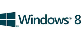
The waving flag logo of Microsoft's Windows trademark has reportedly undergone a facelift to keep up with the radically new user interface called "Metro". The new logo will take effect with the next major version of Windows. Metro is Microsoft's most drastic user interface change since Windows 95, and consists of organizing interactive information (smart application shortcuts, gadgets, images, and slideshows), in rectangular slices of the screen-space. The Windows flag logo is redesigned to reflect this change, it's now flat, angled, with all four rectangles in the same plane. CNBeta scored a 1-color version of the logo, and made mock-ups of what it could look like on devices (such as tablets and keyboards).
Source: CNBeta
Add your own comment

39 Comments on Windows Flag Logo Gets a Facelift, Not A Flag Anymore

#27
gumpty
NdMk2o1oOr maybe, you didn't read the part that said "CNBeta scored a 1-color version of the logo, and made mock-ups of what it could look like on devices (such as tablets and keyboards).
" and has been repeated several times since :laugh::toast:
[hangs head in shame and heads for the door]
Posted on Reply
#28
Delta6326
I do hope when released that they use the same colors as the current flag and not solid colors.
Posted on Reply
#29
Drone
The next move is: Windows become Tiles. LOL
Posted on Reply
#30
Yellow&Nerdy?
What's funny is, that my Apple-fanboy friend immediately claimed Microsoft to have ripped off the simplistic style from Apple.
Posted on Reply
#31
AphexDreamer
Yellow&Nerdy?What's funny is, that my Apple-fanboy friend immediately claimed Microsoft to have ripped off the simplistic style from Apple.
Anything an apple person likes is apple's.
Posted on Reply
#33
entropy13
WTF there's THE Jesus and then there's COLONEL Jesus???

TPU's going to implode now.
Posted on Reply
#34
Mega-Japan
Oh great, now it looks like tiles from that Metro crap.
Beh, I'm still waiting for Windows 8 to make an "educated" decision for my tablet shopping.
Posted on Reply
#36
keling
At least they're square tiles, referring to the tiles that will be a big thing for Win 8. I thought the mock up logo look too much like the freedom symbol (inspired by the window of the attic) used by the Caesar the super ape in the Rise of The Planet of the Apes.
Posted on Reply
#39
gumpty
pr0n InspectorIt's now official. And yes, it's monochrome
I think monochrome would be a mistake. But hey, who the fuck am I?
Posted on Reply
Add your own comment
Apr 25th, 2024 13:35 EDT change timezone

New Forum Posts

Popular Reviews

Controversial News Posts