Thursday, February 26 2009
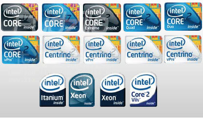
A notable inclusion of perhaps every processor-in-box product, apart from the processor, cooler and documentation, is the case-badge for the processor. The case-badge is a small sticker that shows the company logo for the processor installed in the PC. Intel is reportedly designing new logos (in effect case-badges) for at least 14 of its products. The logos, most of which are rounded-rectangle shaped seem to have been designed to give the processor box a new look, also indicating perhaps that the company is designing new packaging material as well, that use the new logos.

Intel has large volumes of Core 2 Duo, Core 2 Quad and Xeon processors in the making, that Intel feels need new clothing. Core 2 Duo and Core 2 Quad, get the distinct chrome-blue colour that one can find in the Core i7 (non-XE) logo. Core 2 and Core i7 logos look similar at the first glance. Core 2 Extreme gets the chrome-black colour the Core i7 XE logo has. All Centrino series badges stick to the silver-white colour scheme. The logo designs have small inlets on the top-right corner that have small portions of the die-shot. Core 2 and Centrino logos have die-shots of a portion of the Penryn core, while the Core i7 logos use those of the Bloomfield core. Interestingly, Xeon keeps its current logo, as well as a new one with chrome-slate colour, and design of the current Core i7 logo, perhaps making it clear the Xeon processor is based on the Nehalem architecture. The new logos will be effective from Q2 2009.


Source: Fudzilla
posted by btarunr - 6:12 PM |  Related News

User comments
1 to 26 of 30 | Go to Page 1 2    Previous | Next
by InnocentCriminal (February 26th - 6:22 PM) - Reply
I really don't like those. Yeah they make sense, but they're too cluttered for my tastes.

I much prefer the current stickers, specifically the Xeon/i7 ones. Then again, stickers annoy me and I won't have any branding (if I can help it) on my case.
by spearman914 (February 26th - 6:23 PM) - Reply
I don't like the shape.
by h3llb3nd4 (February 26th - 6:33 PM) - Reply
NOOOOO! Arrg my eyes!!! it hurts!!!
by human_error (February 26th - 6:38 PM) - Reply
Ahh good, looks like they have made it nice and difficult for anyone outside the enthusiast community to spot the difference between the centrino and centrino 2 versions, as well as core 2 and core i7, brilliant work intel! :wtf:

Not only that but i've now gotta change the i7 logo in my sig to the new craptastic one :shadedshu
by Oliver (February 26th - 6:49 PM) - Reply
I pay for the hardware, i'm not paid for advertisement............ughhh i hate those darn stickers ("case badge" what a nice marketing term for sticker:laugh::laugh::laugh:)
by newtekie1 (February 26th - 6:58 PM) - Reply
by: human_error
Ahh good, looks like they have made it nice and difficult for anyone outside the enthusiast community to spot the difference between the centrino and centrino 2 versions, as well as core 2 and core i7, brilliant work intel! :wtf:

Not only that but i've now gotta change the i7 logo in my sig to the new craptastic one :shadedshu
I'm sure they look a lot better in real life, or even in a better image that isn't covered in compression artifacts. I'm undecided on these, I'll have to see the decent resolution versions before I judge.
by lemonadesoda (February 26th - 7:24 PM) - Reply
Ah, a department with too many designers and too much time to waste. As though we care about case stickers? LOL.

I can see one area for cost cutting right there.
by zithe (February 26th - 7:46 PM) - Reply
by: lemonadesoda
Ah, a department with too many designers and too much time to waste. As though we care about case stickers? LOL.

I can see one area for cost cutting right there.


Those same designers would be doing a lot of other stuff for the company. You wouldn't want to cut your marketing team first. :
by to6ko91 (February 26th - 7:51 PM) - Reply
i liked the old ones more :mad:
by Sasqui (February 26th - 8:02 PM) - Reply
by: human_error
Ahh good, looks like they have made it nice and difficult for anyone outside the enthusiast community to spot the difference between the centrino and centrino 2 versions, as well as core 2 and core i7, brilliant work intel! :wtf:

Not only that but i've now gotta change the i7 logo in my sig to the new craptastic one :shadedshu
LOL! It took me a minute to find which ones said i7 and "2". WTF are they thinking?
by tkpenalty (February 26th - 8:05 PM) - Reply
The transition from the old northwood P4 sticker style, to the Prescott ones (the current style) was impressive; it looked good. But this? The hell?
by PVTCaboose1337 (February 26th - 8:15 PM) - Reply
Those are pretty ugly on the top... I don't get why they would do this!
by BazookaJoe (February 26th - 8:18 PM) - Reply
THATS what Intel's been doing with my Q6600 money?!
by spearman914 (February 26th - 8:46 PM) - Reply
by: BazookaJoe
THATS what Intel's been doing with my Q6600 money?!
lol :laugh: I agree, it's hard to tell between the core 2's and i7.
by lemonadesoda (February 26th - 8:55 PM) - Reply
by: zithe
Those same designers would be doing a lot of other stuff for the company. You wouldn't want to cut your marketing team first. :
If that was the quality of your marketing team, then YES, you would want to cut them first. If they can come up with nothing better than to change a good, simple, clean logo, to a "me too" glass effect, then YES, dont just fire them first, fire them today!
by CDdude55 (February 26th - 10:21 PM) - Reply
by: Sasqui
LOL! It took me a minute to find which ones said i7 and "2". WTF are they thinking?
Same here,:twitch:
by ShadowFold (February 26th - 10:23 PM) - Reply
They should take notes from EVGA. I loved the one that came with my 280. HIS also makes some good ones.
by D4S4 (February 26th - 11:19 PM) - Reply
naaaaaaaaaaaaaaaah!!!
by alexp999 (February 26th - 11:21 PM) - Reply
Hmm, coming from fudzilla, I have my doubts over the genuinity of these. I cant imagine Intel would design something so fugly and go back to a square shape. Surely they will just be sticking with this:

by D4S4 (February 26th - 11:22 PM) - Reply
they should put bad cores in some kind of transparent plastic and make them stickers for extreme editions :p
by cdawall (February 27th - 4:18 AM) - Reply
Ugly
by Haytch (February 27th - 10:16 AM) - Reply
I hope they didnt waste too much time or money researching those logos. I dont mind them, and prefer them over the previous styles. I like AMD's better, cant beat black.
by kiriakost (February 27th - 10:20 AM) - Reply
by: Haytch
I like AMD's better, cant beat black.


Hey this guy its not one of us , shoot him . :laugh:


Edit: do not shoot the piano player about orthography :D
by InnocentCriminal (February 27th - 10:53 AM) - Reply
You mean us.
by to6ko91 (February 27th - 2:10 PM) - Reply
by: kiriakost
Hey this guy its not one of as , shoot him . :laugh:
:laugh::roll::laugh:
1 to 26 of 30 | Go to Page 1 2    Previous | Next
8795 Users online, 5.57 mbps
Quick Search
Already a member?
Username:
Password:
Register Here!
TechPowerUp on Facebook 
TechPowerUp on Google+ 
New Forum Posts
15:08 by maleficarus
When To Change The PSU? (40)
15:08 by Tatty_One
6970 + RBE Bios = BSOD (2)
15:01 by Fitseries3
[WTB][US] Maximus III Gene 1156 (5)
14:58 by Outback Bronze
[WTB] Want a core i7 9xx- 950/960 preferred (28)
14:55 by BumbleBee
*TPU's Gaming Headphone/Headset Thread* (627)
14:50 by Radical_Edward
Your PC ATM (19535)
Popular Reviews

Latest VGA Drivers

ATI Catalyst 12.1 WHQL

XP32 | XP64 | W7 32 | W7 64

NVIDIA GeForce 285.58 WHQL

XP32 | XP64 | W7 32 | W7 64