• Welcome to TechPowerUp Forums, Guest! Please check out our forum guidelines for info related to our community.

Latest Windows 8 Screenshots Reveal Ouster of Aero Glass UI

btarunr

Editor & Senior Moderator
Staff member
Joined
Oct 9, 2007
Messages
47,880 (7.38/day)
Location
Dublin, Ireland
System Name RBMK-1000
Processor AMD Ryzen 7 5700G
Motherboard Gigabyte B550 AORUS Elite V2
Cooling DeepCool Gammax L240 V2
Memory 2x 16GB DDR4-3200
Video Card(s) Galax RTX 4070 Ti EX
Storage Samsung 990 1TB
Display(s) BenQ 1440p 60 Hz 27-inch
Case Corsair Carbide 100R
Audio Device(s) ASUS SupremeFX S1220A
Power Supply Cooler Master MWE Gold 650W
Mouse ASUS ROG Strix Impact
Keyboard Gamdias Hermes E2
Software Windows 11 Pro
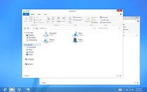
In June, Microsoft will unveil the first Release Preview of Windows 8, its next major version of the Windows (client). Some of the latest screenshots of the teething operating system made it to the web, and reveal some significant changes to the UI, apart from the Metro UI. With its Desktop workspace, Windows 8 embraces a new UI design, that does away with the glassy Aero design that was introduced with Windows Vista. What we have instead, are minimalist titlebars with centered window titles, flat window control buttons, and a blending of the titlebar's color with that of the other menubars. Microsoft justifies the design change by calling the older Aero UI "dated and cheesy." Microsoft assured users that it will assist in the transition between the two UIs, apart from the major change that Metro is.


View at TechPowerUp Main Site
 
I like Aero, guess this is another reason not to go to Windows 8 then.
 
It has something similar to google chrome for me and looks like unifying office, browser and explorer together
 
granted, the glassy aero is cheesy. But flattening the UI kinda like aero on safe mode.
 
It a terrible mix of windows 98 and the dreaded UI of office 2007 with a touch of OSX
 
Well, that's one GUI change that would take a while to get adapted to. For me at least. But I guess I'll probably stick to 7 for this release. See if they changed their minds and added options to tweak the GUI internally in a service pack.
Still it's a shame. People WILL get used to this thing. After all OEMs switch to Win8 as default OS.
 
First they gave as great things in Vista & 7 made them better, then they take it all away in Windows 8 and give us some bullshit claiming its better than 7 & Vista, this shit is no where near 7 or Vista. The metro shit Microsoft is smoking they better stop, damn, Bill Gates should takeover again maybe then a proper Windows 7 replacement will be released
 
It looks like the Windows 7 Basic theme. No thanks.
 
Looks like Office toolbar finally gave in to windows toolbar advances and had sex only to give birth to this :banghead:

I also thought this.

Just looks... childish
 
I also thought this.

Just looks... childish

Microsoft stated that most people are not bothered to use the functions hidden behind drop down menus, so they are making them more visible. Traditional power users will still ignore them and use their keyboard shortcuts :D
 
Microsoft stated that most people are not bothered to use the functions hidden behind drop down menus, so they are making them more visible. Traditional power users will still ignore them and use their keyboard shortcuts :D

I actually think this is a decent idea, but I really REALLY hope there's an option to hide it. Because it's true, a lot of people have no idea what so ever to do anything. How many times have you explained to someone how to select everything? For support this is awesome.
 
I think the arrow next to the question mark on the right of the taskbar hides it, but I am not sure.
 
Meh, I can live with that UI as long as I have the start menu back, and an option to completely hide metro from my sight ever.
 
Windows 7 will become the new XP lasting longer than M$ wants it too.
 
I wish they would implement a better way to select the GUI... or even modify it.


Perhaps it could ask during windows install or First logon... sure you can right click on your desktop but i feel it could be done better.
 
Hey Microsoft, thanks for making it easier (to stick with Windows 7).


As if there weren't enough reasons to ditch Windows 8.
 
Looks like shit. Neat.
 
It seems as though they didn't take anything we know and love from Windows 7 away. They just added so you can experience the PC through two worlds. The normal PC you like using with a mouse and keyboard and the quick and simple tablet like functions with touch and apps that you'd like using on your phone.

Not saying its great or a flop but I'd at least be inclined to try it out. Not sure if I'd pay for a new OS with tablet like features though. I do like the minimalistic look of the classic UI now.
 
every time they show something about windows 8 it makes me sadder.:(

unless this has some serious performance enhancements over 7(which I really really doubt) this looks more like a downgrade for mainstream pc users.

bring us back to the awesomeness of the windows 2000 days like you did for 7 again ms, don't send us to the windows me days.
 
and with the addition of classic start menu would be perfect too, XP number two. and why they created Glass UI with the vista and 7 at first place? they should stick with simple design forever and ever starting from now..... so, lets get rid metro ui (maybe in win9, for now, they still dont realized it).
 
This makes me not want windows 8 and i have a FX chip.....XD

EDIT: and why glassy on bottom toolbar but not else where? with them both on screen it clashes like digital effects in an analog filmed movie....
 
Back
Top