Tuesday, February 14th 2012

Windows Flag Logo Gets a Facelift, Not A Flag Anymore
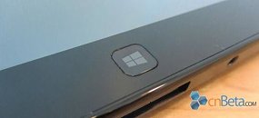
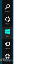
The waving flag logo of Microsoft's Windows trademark has reportedly undergone a facelift to keep up with the radically new user interface called "Metro". The new logo will take effect with the next major version of Windows. Metro is Microsoft's most drastic user interface change since Windows 95, and consists of organizing interactive information (smart application shortcuts, gadgets, images, and slideshows), in rectangular slices of the screen-space. The Windows flag logo is redesigned to reflect this change, it's now flat, angled, with all four rectangles in the same plane. CNBeta scored a 1-color version of the logo, and made mock-ups of what it could look like on devices (such as tablets and keyboards).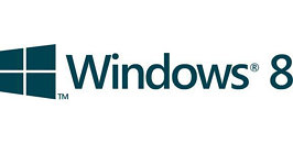
Source:
CNBeta


39 Comments on Windows Flag Logo Gets a Facelift, Not A Flag Anymore
Complements of Maddox:
www.winsupersite.com/article/windows8/windows-8-secrets-windows-8-dropping-start-button-142236
That logo is too straightforward and lacks the personality of the current one. Mock-up or not, it's not an improvement at all.
Might be NSFW:
i559.photobucket.com/albums/ss33/CAT-THE-FIFTH/Windows8-ItsallabouttheTOUCH.png
Why? Because any "Arrow" like shape should always lead the eye into a layout. Not out of it. This mock-up was done by a noob or a culture that reads from right to left instead of left to right.
A noob indead :rolleyes:Interesting... denial of flame-baiting by flame-baiting with the promise of infractions.
Or are they going to hold out on us.
But like I said I have a feeling this mock up was made by a culture that reads from right to left. IF that's the case then the layout is fine. It just wouldnt work as well in the western world as it would in the east.
If you took an American, Canadian, British (UK) or typically any other flag and placed it in a similar flat perspective orientation like this it would still be easily recognizable,…. So I don’t see the problem,….
My only question is when are they going to rename “Windows” to “Tiles”,……. ;)
My brother works there.
Without the word 'Windows' next to it there is nothing about that logo that would make me think of Windows or Microsoft. If they kept the same four colours as previous, then yeah, I could see this being used.
Time will tell I guess ... wait to we see it on retail boxes.
Could be a strategic release by the marketing agency to get some real-world feedback.
" and has been repeated several times since :laugh::toast: