• Welcome to TechPowerUp Forums, Guest! Please check out our forum guidelines for info related to our community.
  • The forums have been upgraded with support for dark mode. By default it will follow the setting on your system/browser. You may override it by scrolling to the end of the page and clicking the gears icon.

The TPU Darkroom - Digital SLR and Photography Club

Old school Photoshop. Really I try not to edit. But if I do its just some hue correction or curves

Hm, thats kind of the reason I was going to run with corel, I prob wouldnt have an issue with LR but this isnt like a job and I cant say I'll be taking a ton of photos.
 
yvlzrhbio7.jpg
 
NYC Skyline
K50P9932AC (1280x848).jpg


Panoramic Shot
NYC_Pano (1280x341).jpg
 
Last edited:
Trying to see how far I can push some sliders in lightroom without making the photo look super overprocessed.

370Z


Just standard editing for this one.
 
20191202_133750-01-01.jpeg

Using samsung galaxy A5 2017 then repacked by Snapseed
 
My plastic toolbox going into pieces, actually into sand
Then i try to make it like decaying by using snapseed

20191216_220423-01.jpeg
 
London Bridge, Lake Havasu City, AZ, USA

K3IM8517_lemur_C.jpg
 
These shots are of the bushfire we copped at the end of the year. Not taken with my DSLR, but my iPhone 11 Pro as I didn't have the time to be carrying a DSLR with me that night as we got burned at 9pm that night and shit it was quick and the second image shows the clouds of embers that were coming off the fire before it crested over the hill and burned through the valley. Once it got down into the valley, there are no more shots till the next day as there wasn't time any longer
IMG_0150.JPG
IMG_0160.JPG
 
where ya from nuckles, unfortunately a good chunk of the planets on fire right now
 
Last night I had a dream about a photo op involving a flying chameleon. I was at work when I saw it on a bush. Tried to inch towards it - just trying to comprehend why this chameleon was here, at a school right off of a busy main road... but it shot one side of its head my way as that big, extruded eye spun into mine... and that is when it spread its little gargoyle wings and flew gracefully over to an adjacent bush. It was one of those bushes with thick, spiral leaves that look like they've been splashed with a bunch of different colored acrylic paints, like someone just shook out the little bottles over it. I don't know what they're called, but they're real. And the moment it landed it instantly went from a greenish-brown to matching that vibrant looking bush with all of these sploitches of reds, yellows, greens, browns, and purples. All I could think was "Where's my camera?!"

For some reason, I actually brought my camera to work that day and in fact had it in the room right inside from where the bushes were. But I don't remember if I got the shot... it kind of spiraled into a few other dreams right at the point where I was making my way back and frantically dialing it in. I also remember thinking "Ahhh... I wish I had my telephoto on!" IRL, I always store that camera with my 32mm equipped. But as I was walking I already had the 50-200mm. It was like the perfect shot you never get that chance at.

I almost forgot about until I popped into this thread. Am I alone in this weird crap? Anybody else ever have photo op dreams?
 
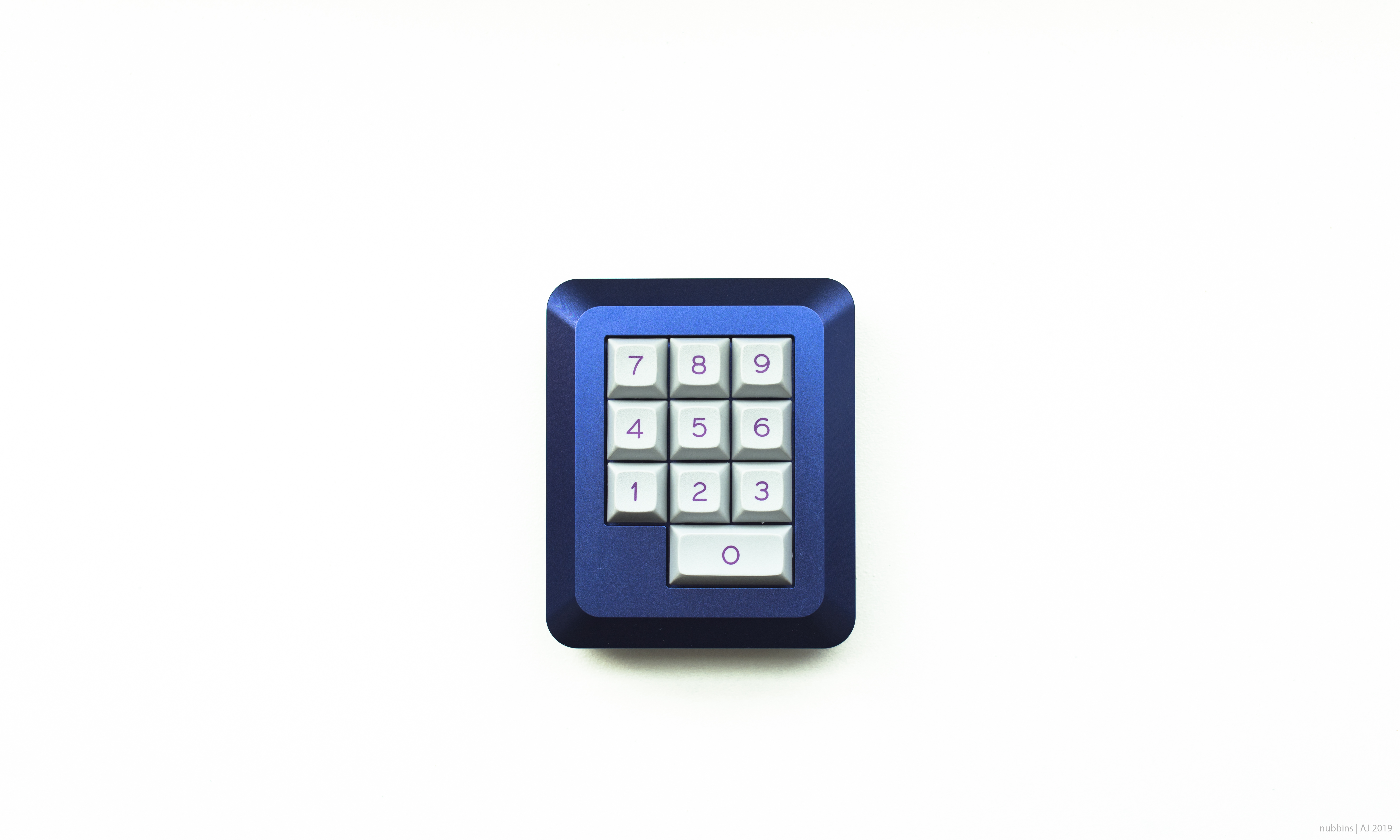
Shiny things are fun. Mostly just like the colors and textures. Smooth, warm copper and the darker, rougher hammered parts. Hand engraved stuff is pretty interesting up close. What I wouldn't give for a proper macro lens... or at least some extensions!

Would've been cool to hit it with a few small, dim lights at different angles and temperatures... I bet it would be cool using them to draw different 'beams' on the reflection. Copper is one of those rare things that really likes being shot under really warm light (IMO.) But if I could get a few smaller beams of whiter light reflected off, I bet it would pop the parts reflecting the warmer light even more.
IMG_1160.jpg
IMG_1161.jpg

I couldn't decide on color or B&W.
IMG_1160-2.jpg
IMG_1161-2.jpg

It's interesting to play with... a lot of different ways to alter the specular qualities of materials and even completely change the tones/textures. I decided to use a blue filter to hopefully pass everything through more faithfully - since it's all reds, oranges, and yellows everything should come through evenly. From there I shifted different colors around to try and bring out the different textures, as they are. Things like upping the yellow to smooth out the hammered parts and blend the surrounding areas of the bright reflection lines, while dropping the red to restore texture to them and make the dark parts of the reflection more prominent. Cranking blue/magenta/purple to bring out those two little reflections of blue light. Shifting orange's hue just a little towards yellow to smooth the gradient in the middle. Smoother, and yet in some ways higher-contrast, all without directly altering the overall luminosity.

Some slight tone and calibration (LR's calibration tool is the secret OG!) changes to bring in some glow. By biasing in more blue in calibration, you can get color hazing without grossly affecting detail, much like a blue filter does to skies and distant objects (which due to the atmosphere shift towards blue) in B&W landscapes - by adding blue this way I give something for the blue filter to pick-up and boost to soften without reducing sharpness or creating hazy haloing. It's like a global dynamic bloom slider in this configuration, because changing the color bias shifts the whole RGB base in favor of that color - everything gets a little blue and thus glows just a little bit, more or less depending on how close it was to blue originally and how much luminosity it already had. It all works in tandem with a slight vignette, to isolate the subject from the similarly colored/toned desk without looking stark, because the mod is a brighter 'blue' than the table it has the appearance of having a subtle targeted light or overlay, like a specular map on an object in a game. You up the global specularity of the source light (how hard it bounces) - and then the difference between more (lighter subject) and less (darker object) specularity become more apparent.

Does that make any sense? lol It's a strange way to go about things, but I love B&W for things like that. They can be really refreshing to edit because the rules and logical relations between things are so different. How does 'more blue' equate to 'more highlight glow'? B&W, man. That's how.

Basically trying to draw everything into the details in the reflections and engraving without resorting to things that add harshness like clarity/dehaze, clipping points, or curves. B&W makes you think differently - it is and isn't about colors in that you can't rely on the color for an interesting image, but the way it gets rendered is majorly dependent on the color content of the source. You want to think black-and-white, but I think it's better to avoid things that simply change blacks and whites. Better to change what passes through whatever B&W filter you use, and choose the filter that gives the effect you want when passing the color/saturation changes through. Call back to the original colors and rebalance them for more faithful (or more surreal) B&W renditions. It's powerful when used that way. I only use the 'colorless' sliders for exposure/gamma. I think in this case it allowed me a little bit more separation without cooking the image.

EDIT: Another little touch to add to the separation: verrrry gentle spit-toning. Gold on the highlights, blue-green on the shadows. No purple-and-orange, or any of those pronounced complementary splits that get incessantly abused to get that 'filmic' look... or as it's more known now, the 'Instagram' look. Blech. Unrelated, I can't STAND that these days. People ruin their images with that effect. For this case, they had to be close on the spectrum, or you'll see the tints and it won't look monotone anymore. From there I balanced it out so only the mod and the reflection would catch the yellows, while the darker regions catch some blue bleeding in to make green, before hitting that wall on the blue background. So it's not too jarring of a transition, even though the line is right there, just as the DOF rolls off into the table. If you didn't see those colors then I did it right :p It's funny, to me, the whole image looks just slightly warm but more of it is cool than not!

Another one of those things you can do with monochrome images. Using colors... not to add color, but to change dynamics. If you look really closely at the left edge of the mod, you can see it. But unless you're looking for it, hopefully it presents as a difference in contrast instead of color. I never thought of it this way before, but split-toning basically seperates highlights, midtones, and shadows, without adding contrast that eats details on the extreme fringes. Sort by luminosity, as the chosen tints. Nothing there saying it has to be so strong the overall color balance visibly changes to have an impact. I think found a neat little trick there. I like it. Kinda gives a false rim-lighting look, without having that distracting silver lining. Great for B&W where even the color image is mostly monotone. Something I'll have to explore more for bringing out certain details in B&W. Because sometimes messing with the actual tones or just adding contrast has too much collateral. This is almost more targeted, without masking off. It wound up so natural I forgot I added it! Think of it as virtual contrast.


I dunno... I think I still like it a little better in color, just because copper can have some gorgeous hues to it - especially in lower, more diffused light. It very quickly goes from pale and sanctimonious skin-like tones to very deep and rich, sort of earthy ones. With the right conditions you get a sparser, paler and yellower shine along with deep reds and oranges. Copper is an interesting metal - not many refelct the same range of colors naturally. As the hammered parts tarnish I'm sure this piece will get more interesting.

I think I would've gotten better results if I stuck with full color and just had a darker background to really put the color out there. Add on a few secondary light sources and have a real eye-grabber easily.


These mods are all hand-made to order. This one hasn't been made in a long time, but somehow I found one brand new. Should never be, but was. You can't find this one, period. They're pretty rare and not many nice pictures of them exist. I should donate these to Rogue's instagram :laugh:
 
Last edited:
@robot zombie incidentally that look reminds me of an older photo of mine. Not my proudest, as it's visually far from what I'd consider "good", but it's an interesting look I've not been able to reproduce since. There wasn't a lot of editing in this; natural light to my back, dark room, around f/2.8 or so.

teal is all you need.jpg

Past 2 weeks have been a bit of a keeb-mania for me so I've gone back to working on product photos. Inanimate objects allow endless flexibility to experiment and retry; I wouldn't be caught dead shooting portraits with my awful people-photography skills. I first adopted this look with my RAMA M10-B a number of months ago, and since I did a black background for my Hyper Red T60 and hardwood for the X60R, I thought I'd go back to the scratched up windowsill for the Night Blue T60.

HBpHJae.jpg

ZNvRc7Y.jpg


These actually take me the least amount of time - no masking work, unlike the other T60 and X60R. People keep on telling me they look like renders; I'm not sure which way to take that remark lol.
 
Inanimate objects allow endless flexibility to experiment and retry; I wouldn't be caught dead shooting portraits with my awful people-photography skills.
Bahaha, full endorsement for those statements. "Heyy... ummm, I like your face. It looks very nice. Will you accompany me to the park so I can take some hideous pictures of it?" "Don't worry, it's totally cool. You look great - just like an alternate reality entity. Just roll with it. Good, good! Now, give me a nice "trapped in the matrix" thousand-yard-stare."

Or... "Oh, no we don't have to go outside, if you don't want to. Just sit there for 10 minutes while I break out my gear." *person sits patiently watching as you meticulously set up a mad scientist's lab of odd equipment* "Okay. Now hold that pose for the next 2 minutes while I slowly cook and blind you with these bright-ass lights. Nonono! Do that! Not this... yknow... THAT! Here, let me sculpt you..."

I think I may be on a spectrum... probably all of them. I can't wrap my head around the interaction side and the mechanics of the whole shoot. I can only do one or the other. No problems talking to people or being confident. I can easily convince someone to help me out. I'm comfortable with set-up, too. It's just that my brain can't do both the interacting and the photography-ing at once. It has to dump one out.

I can't think of a way to not make it awkward. And having no idea what I'm doing and no interest in portraits only compounds it. And then it always feels like you're just staring at the person, which any other time would be very strange. I can't separate myself from it and get into a flow in my head. It's just a nope! :D

Objects definitely provide infinite opportunities. They give you endless ways to learn about how an image comes together, as you can literally just go variable by variable. Crawl through every single thing and distill it down. At first it can be pretty challenging. I feel like certain faces just kind of make for a nice image on their own. Someone skilled can make it even better, but a lot of a good portrait is in the face itself. Million ways to present a face, but I feel like there are also more obvious ways to make it work.

Sometimes even with the most interesting objects, you can only look at them pensively and think "Okay, so it's a ___. How do I make this look interesting? It's all about taking the aspects of them that most make them stand out and collecting them together in a single image. So many different compromises you can make to get a whole range of different images. But it's not plug-and-play. What works isn't immediate or intuitive.

I like to spend a while editing pictures of objects... more than anything else. A lot of times I don't even do very heavy editing. I like for the shot to already have most of it, because it pretty much already has to be there - you can't add in what it will need after... only accentuating it is possible. The more I stare at it and see the things it does and doesn't have, the more ideas I get for later photos. It all becomes a lot clearer. And it's usually stuff you NEVER see or think of when you're setting up your shots. It only comes from really combing over the images. Over time you can build them up. And then in doing so you start to see things in objects that you never noticed before, leaving you with even more to work with as you go along.

On the 'render' thing... I think a lot of people just prefer a more 'slice of life' style of image for objects these days. The super-clean, hyper-technical images are very impressive in their own way, but sometimes come off as dry because they leave nothing to the imagination. I think we've all just gotten used to seeing those images when shopping online, it's harder to see the art in it. Personally, I think it's still there - it's not easy to make something look so clean people think it is fake. That can be really cool. I'm kinda torn myself. When I see those 'render' photos I feel jealous, but in my own I prefer a more lived-with look. I think it's just easier to connect with because what you're seeing is closer to how you might actually see that object in the real world, only super condensed. It goes off when you can grab that tiny sliver-moment when everything sets off just right to catch your eye. From there, the imperfections stop being noticeable as flaws.

I guess that's the main difference, right? Rather than evaporating all traces of any flaws in the scene or the subject, you embrace these aspects of perceiving things and combine them to bring forth a gestalt. Even though it is technically inaccurate and less faithful, it replicates an actual experience that everybody has just being out in the world. Somewhere in your mind, it's registering as an encounter, rather than a simple image. You can see something with your eyes in a plethora of different ways, all missing and adding things, but you never see it in perfect form. Somehow I think the former triggers you to start processing what you're seeing in an extra sort of way. Your mind starts looking for ways to consolidate it all and 'make it real.'

A really clean shot can't do that, because you never have that perspective in real-life. But then, that's just a way of saying it cuts both ways. Because the 'render' is showing you things in a way that can't usually be seen, which is interesting it its own way. Just depends on what you're going for. To me it's not a derogatory term. Just sort of a declaration of preference. Neutral on its own.
 
Last edited:
Okay, now here's one that clearly HAD to be black and white. I really like this one.
IMG_1209.jpg


I mean... it's not bad in color either, but still. Just naw. Way too classy-looking to not be high-contrast B&W.

IMG_1209-2.jpg
 
Recently bought a second-hand Fuji X-T30 and then contracted G.A.S. Bought two more lenses for it: an 18-55mm f2.8-4 & a 100-400mm f4-5.5.6.

I have an older FZ330 (FZ300 in the US) with equiv zoom of 600mm and it was perfect for wildlife in BC, Canada (vacations in 2017 & 2019) but the small sensor bugged me. So, thought I'd go a bit more up-market; try to capture something I could print. Well, not back in BC till 2021, so until then, I have my garden Hooded Crows.

DSCF4893 (2).JPG


DSCF4894 (2).JPG
 
My lunch break place. Sorry same 3 shots from iphone xr
 

Attachments

  • 6C49CEAF-62FA-4651-A5D7-A73B10E8DA4A.jpeg
    6C49CEAF-62FA-4651-A5D7-A73B10E8DA4A.jpeg
    2.8 MB · Views: 146
  • D4984521-0EE3-4FC7-8FC0-BEF9D4FB9EA8.jpeg
    D4984521-0EE3-4FC7-8FC0-BEF9D4FB9EA8.jpeg
    2.8 MB · Views: 148
  • 7351DC45-FF81-482B-BF36-3115D4E39584.jpeg
    7351DC45-FF81-482B-BF36-3115D4E39584.jpeg
    1.4 MB · Views: 146
My lunch break place. Sorry same 3 shots from iphone xr
Haha, that's much nicer than my lunch break spot. I don't think anybody wants to see pictures of that. It's pretty rough. Though not nearly as cold. It's got a fridge though!

Any time you are starting a job and somebody tells you the breakroom has a fridge like that is something to be excited about, prepare yourself for years of crippling depression entering your eye holes. Best advice I can give anyone, honestly. I'm not wise but I know that much.
 
Lots of beautiful photographs. I don't get into photography much (although I went to art school), but my wife does. She has a knack for capturing moments in portraits that I can only make up in my drawings. Im jealous to say the least. This isn't a portrait, but it's one of hers that I really like. It was taken in the woods in the Midwest USA, near Wisconsin Dells in Wisconsin.
woods jpeg.JPG
 
Lots of beautiful photographs. I don't get into photography much (although I went to art school), but my wife does. She has a knack for capturing moments in portraits that I can only make up in my drawings. Im jealous to say the least. This isn't a portrait, but it's one of hers that I really like. It was taken in the woods in the Midwest USA, near Wisconsin Dells in Wisconsin.View attachment 146125
There was a spot with sugar pines that was like that somewhat near to me, and because of the bushfires we had this summer, they got burned out as far as I'm aware
 
Wow, sorry to hear that. Lots of fires all over the world it seems as of late.
 
Loving my 400mm fuji... (and a tiny smidge of RAW editing).

DSCF4976 (2).jpg
 
Back
Top