• Welcome to TechPowerUp Forums, Guest! Please check out our forum guidelines for info related to our community.

Microsoft Redesigns Windows 10 Icons

AleksandarK

News Editor
Staff member
Joined
Aug 19, 2017
Messages
2,225 (0.91/day)
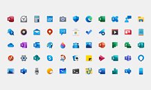
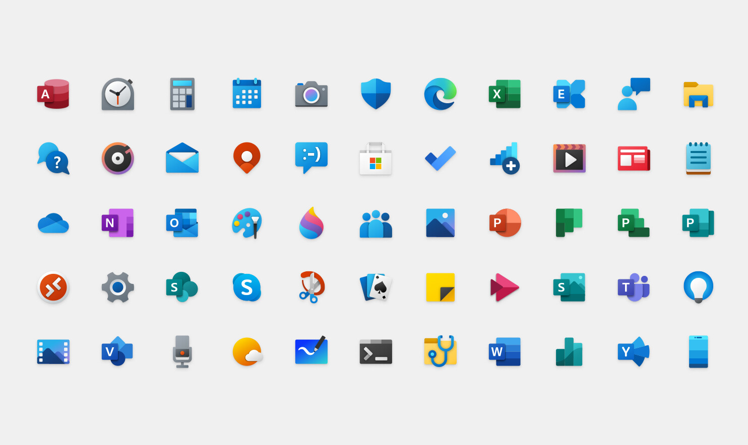
Microsoft's Windows 10 operating system has been a mix of old and new designs since its launch, however, Microsoft decided to modernize its UI look by providing a fresh set of icons. If you are a user of Microsoft Office suite, then you already know how the new icons look for Office applications like Excel and Word. The material design present on those apps is now transferring to the rest of Windows 10 stock applications like Calendar and Calculator. In the effort to modernize the look of Windows 10 and end the Windows 7 inspired UI, Microsoft will be pushing the updated icon set over few following months. The updates icons are already available for Windows 10 Insiders, and specifically for Preview Build 19569. Regular users can expect to get the update in the coming months.


View at TechPowerUp Main Site
 

TheLostSwede

News Editor
Joined
Nov 11, 2004
Messages
16,056 (2.26/day)
Location
Sweden
System Name Overlord Mk MLI
Processor AMD Ryzen 7 7800X3D
Motherboard Gigabyte X670E Aorus Master
Cooling Noctua NH-D15 SE with offsets
Memory 32GB Team T-Create Expert DDR5 6000 MHz @ CL30-34-34-68
Video Card(s) Gainward GeForce RTX 4080 Phantom GS
Storage 1TB Solidigm P44 Pro, 2 TB Corsair MP600 Pro, 2TB Kingston KC3000
Display(s) Acer XV272K LVbmiipruzx 4K@160Hz
Case Fractal Design Torrent Compact
Audio Device(s) Corsair Virtuoso SE
Power Supply be quiet! Pure Power 12 M 850 W
Mouse Logitech G502 Lightspeed
Keyboard Corsair K70 Max
Software Windows 10 Pro
Benchmark Scores https://valid.x86.fr/5za05v
Looks very Google-esque.
 
Joined
Oct 16, 2012
Messages
734 (0.17/day)
Location
Malaysia
System Name Cypher-C4
Processor Ryzen 9 5900X
Motherboard MSI B450 Tomahawk Max
Cooling Deepcool AK620
Memory 32GB Crucial Ballistix Elite 3200MHz
Video Card(s) Palit RTX 3060 Ti Dual
Storage 250GB Crucial MX500 + 2TB Crucial MX500 + 2TB WD Black + 4TB Toshiba + 1TB Samsung F3
Display(s) Acer XV272UP
Case Corsair Obsidian 750D
Audio Device(s) Behringher UMC202HD Audio Interface + Mackie HM-4 + Sennheiser HD 280 Pro + Shure SM58
Power Supply Corsair HX750i
Mouse Steelseries Rival 310
Keyboard Keychron K8 + Kailh BOX Crystal Jade switches + Ducky Good in Blue keycaps
Software Windows 10 Pro 64-bit
I think they look good, however, this new style needs to be applied to the desktop icons as well.

That's the plan though? Unless you're talking about something else
 
Joined
May 12, 2017
Messages
2,207 (0.87/day)
I already have one of those icons on windows 7, Microsoft Edge icon.
 

SL2

Joined
Jan 27, 2006
Messages
1,795 (0.27/day)
So they're basically dropping the W8 icon style. It's 8 years old, maybe about time.

I see the Groove Music icon in there, it's been discontinued for a while now..
 
Joined
Apr 18, 2013
Messages
1,260 (0.31/day)
Location
Artem S. Tashkinov
Wow, 24 bit colors, shadows, gradients.

Back to DESIGN, not childish pseudo-graphics which has been the bane of the industry since W8.

There's too much blue but I guess they'll fix that as well.
 
Joined
Apr 9, 2018
Messages
781 (0.35/day)
I must say, these new icons look waaaay better. Never liked the original plain white 2D look. It's amazing what a bit of color and depth can do. Icon art hasn't been this good since Windows XP.
 
Joined
Apr 18, 2013
Messages
1,260 (0.31/day)
Location
Artem S. Tashkinov
Now if they can apply this to the rest of the OS..

That would mean they'd have to admit the whole W8/W10/tablet design has been a huge mistake and W7 was the pinnacle of their design team. Not gonna happen any time soon I'm afraid.

God, I miss W7 so much - too bad it's barely functional on my Ryzen 3000 system, so I don't even boot into it :-(
 

SL2

Joined
Jan 27, 2006
Messages
1,795 (0.27/day)
Back to DESIGN, not childish pseudo-graphics which has been the bane of the industry since W8.
Dunno about childish, I've never seen a child draw like that. More like overly simplified, similar to bathroom sign-style.. :D

That would mean they'd have to admit the whole W8/W10/tablet design has been a huge mistake and W7 was the pinnacle of their design team.
Wasn't that a consequence of trying to get into the tablet market, with the intent to make the GUI less demanding? I'm sure I've read it, but it was a long time ago.
 
Joined
Oct 16, 2012
Messages
734 (0.17/day)
Location
Malaysia
System Name Cypher-C4
Processor Ryzen 9 5900X
Motherboard MSI B450 Tomahawk Max
Cooling Deepcool AK620
Memory 32GB Crucial Ballistix Elite 3200MHz
Video Card(s) Palit RTX 3060 Ti Dual
Storage 250GB Crucial MX500 + 2TB Crucial MX500 + 2TB WD Black + 4TB Toshiba + 1TB Samsung F3
Display(s) Acer XV272UP
Case Corsair Obsidian 750D
Audio Device(s) Behringher UMC202HD Audio Interface + Mackie HM-4 + Sennheiser HD 280 Pro + Shure SM58
Power Supply Corsair HX750i
Mouse Steelseries Rival 310
Keyboard Keychron K8 + Kailh BOX Crystal Jade switches + Ducky Good in Blue keycaps
Software Windows 10 Pro 64-bit
So they're basically dropping the W8 icon style. It's 8 years old, maybe about time.

I see the Groove Music icon in there, it's been discontinued for a while now..

Discontinued development. Still functional. Would be great if MS decided to open source it though. A lot of people are interested in contributing and adding more features to Groove.
 
Joined
Jul 5, 2013
Messages
25,559 (6.48/day)
That would mean they'd have to admit the whole W8/W10/tablet design has been a huge mistake
Not really. They don't need to admit what everyone already knows. All they need to do is introduce a new style and call it progress.

Dunno about childish, I've never seen a child draw like that. More like overly simplified, similar to bathroom sign-style.. :D
I do. Windows 8/8.1/10 UI has always looked like something for 5 year olds. It is unappealing. Windows XP, Vista and especially 7 all looked much better.
 

TheLostSwede

News Editor
Joined
Nov 11, 2004
Messages
16,056 (2.26/day)
Location
Sweden
System Name Overlord Mk MLI
Processor AMD Ryzen 7 7800X3D
Motherboard Gigabyte X670E Aorus Master
Cooling Noctua NH-D15 SE with offsets
Memory 32GB Team T-Create Expert DDR5 6000 MHz @ CL30-34-34-68
Video Card(s) Gainward GeForce RTX 4080 Phantom GS
Storage 1TB Solidigm P44 Pro, 2 TB Corsair MP600 Pro, 2TB Kingston KC3000
Display(s) Acer XV272K LVbmiipruzx 4K@160Hz
Case Fractal Design Torrent Compact
Audio Device(s) Corsair Virtuoso SE
Power Supply be quiet! Pure Power 12 M 850 W
Mouse Logitech G502 Lightspeed
Keyboard Corsair K70 Max
Software Windows 10 Pro
Benchmark Scores https://valid.x86.fr/5za05v
You know the old saying, If you can't beat them, join them..

I think they look good, however, this new style needs to be applied to the desktop icons as well.
I didn't say they looked bad, just that they looked quite a bit like the current Google style when it comes to app icons.
Almost anything is better than the current mishmash of icons being used.
 

btarunr

Editor & Senior Moderator
Staff member
Joined
Oct 9, 2007
Messages
46,362 (7.68/day)
Location
Hyderabad, India
System Name RBMK-1000
Processor AMD Ryzen 7 5700G
Motherboard ASUS ROG Strix B450-E Gaming
Cooling DeepCool Gammax L240 V2
Memory 2x 8GB G.Skill Sniper X
Video Card(s) Palit GeForce RTX 2080 SUPER GameRock
Storage Western Digital Black NVMe 512GB
Display(s) BenQ 1440p 60 Hz 27-inch
Case Corsair Carbide 100R
Audio Device(s) ASUS SupremeFX S1220A
Power Supply Cooler Master MWE Gold 650W
Mouse ASUS ROG Strix Impact
Keyboard Gamdias Hermes E2
Software Windows 11 Pro
I do. Windows 8/8.1/10 UI has always looked like something for 5 year olds. It is unappealing. Windows XP, Vista and especially 7 all looked much better.

Microsoft switched to simpler graphics for icons and buttons (across Windows and Office), due to the emergence of remote desktops, DaaS, VDIs, etc. It's easier on the network bandwidth.
 

SL2

Joined
Jan 27, 2006
Messages
1,795 (0.27/day)
I do. Windows 8/8.1/10 UI has always looked like something for 5 year olds. It is unappealing.
I know that bashing Windows has always been popular, even among those who use it, me included. I have yet to see a 5 year old make icons and symbols like that tho.

Compare W8 icons with train station and airport symbols instead, both one color, both overly simplified.

Edit: Oh, FOR children? Lots of colors is mandatory in anything for children, we all know that..
 
Last edited:
Joined
Jul 5, 2013
Messages
25,559 (6.48/day)
Microsoft switched to simpler graphics for icons and buttons (across Windows and Office), due to the emergence of remote desktops, DaaS, VDIs, etc. It's easier on the network bandwidth.
Now that's an interesting thought. However, most icons have several different color and resolution options so display of same over a network connection could easily be controlled by the host system selecting the lowest color and resolution state for transmission. But I digress..
 
Joined
Sep 17, 2014
Messages
20,906 (5.97/day)
Location
The Washing Machine
Processor i7 8700k 4.6Ghz @ 1.24V
Motherboard AsRock Fatal1ty K6 Z370
Cooling beQuiet! Dark Rock Pro 3
Memory 16GB Corsair Vengeance LPX 3200/C16
Video Card(s) ASRock RX7900XT Phantom Gaming
Storage Samsung 850 EVO 1TB + Samsung 830 256GB + Crucial BX100 250GB + Toshiba 1TB HDD
Display(s) Gigabyte G34QWC (3440x1440)
Case Fractal Design Define R5
Audio Device(s) Harman Kardon AVR137 + 2.1
Power Supply EVGA Supernova G2 750W
Mouse XTRFY M42
Keyboard Lenovo Thinkpad Trackpoint II
Software W10 x64
Looks very Google-esque.

I like how MS uses the gradients of colors to make them distinctive. The letters are also helpful to match old with new.

These icons look miles more fine tuned than everything Google has produced. I mean what can you do with an icon. They're no longer distinguised by color spaces (I do remember those 256 color days :D) so thats no longer special either ;)
 

ARF

Joined
Jan 28, 2020
Messages
3,934 (2.55/day)
Location
Ex-usa
I don't like these new icons. Look too childish, like made by or for children in the kindergarten.
 
Joined
Jan 31, 2005
Messages
2,053 (0.29/day)
Location
Denmark
System Name Commercial towing vehicle "Nostromo"
Processor 5800X3D
Motherboard X570 Unify
Cooling EK-AIO 360
Memory 32 GB Fury 3666 MHz
Video Card(s) 4070 Ti Eagle
Storage SN850 NVMe 1TB + Renegade NVMe 2TB + 870 EVO 4TB
Display(s) 25" Legion Y25g-30
Case Lian Li LanCool 216 v2
Audio Device(s) B & W PX7 S2e
Power Supply HX1500i
Mouse Harpe Ace Aim Lab Edition
Keyboard Scope II 96 Wireless
Software Windows 11 23H2
Let´s have the good old Win 3.0 icons back :roll:


TPU1.png
 

ARF

Joined
Jan 28, 2020
Messages
3,934 (2.55/day)
Location
Ex-usa
I prefer something with design, not animated, over-simplified and hard to understand MS proposals.


btarunr

Editor & Senior Moderator
Staff member
Joined
Oct 9, 2007
Messages
46,362 (7.68/day)
Location
Hyderabad, India
System Name RBMK-1000
Processor AMD Ryzen 7 5700G
Motherboard ASUS ROG Strix B450-E Gaming
Cooling DeepCool Gammax L240 V2
Memory 2x 8GB G.Skill Sniper X
Video Card(s) Palit GeForce RTX 2080 SUPER GameRock
Storage Western Digital Black NVMe 512GB
Display(s) BenQ 1440p 60 Hz 27-inch
Case Corsair Carbide 100R
Audio Device(s) ASUS SupremeFX S1220A
Power Supply Cooler Master MWE Gold 650W
Mouse ASUS ROG Strix Impact
Keyboard Gamdias Hermes E2
Software Windows 11 Pro
Now that's an interesting thought. However, most icons have several different color and resolution options so display of same over a network connection could easily be controlled by the host system selecting the lowest color and resolution state for transmission. But I digress..

For large organizations where tens of thousands of employees are carrying their work home (and connecting to their work machine or a VD), those few kbps of bandwidth saved add up (the organization's Internet pipe handling those many thousands of RDs/VDs).
 
Top