• Welcome to TechPowerUp Forums, Guest! Please check out our forum guidelines for info related to our community.
  • The forums have been upgraded with support for dark mode. By default it will follow the setting on your system/browser. You may override it by scrolling to the end of the page and clicking the gears icon.

I redesigned GPU-Z using the Fluent Design Language

Joined
Sep 9, 2017
Messages
282 (0.10/day)
System Name B20221017 Pro SP1 R2 Gaming Edition
Processor AMD Ryzen 9800X3D
Motherboard Asus ProArt X670E-Creator
Cooling NZXT Kraken Z73
Memory G.Skill Trident Z DDR5-6000 CL30 64GB
Video Card(s) NVIDIA RTX 3090 Founders Edition
Storage Samsung 980 Pro 2TB + Samsung 870 Evo 4TB
Display(s) Samsung CF791 Curved Ultrawide
Case NZXT H7 Flow
Power Supply Corsair HX1000i
VR HMD Meta Quest 3
Software Windows 11
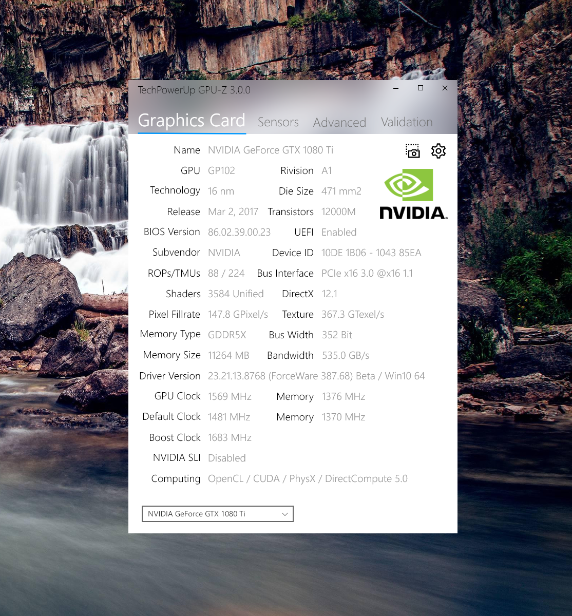
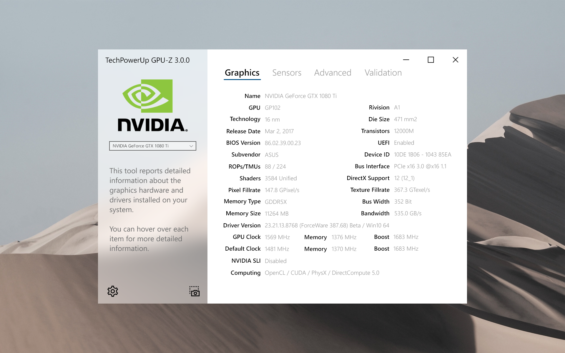
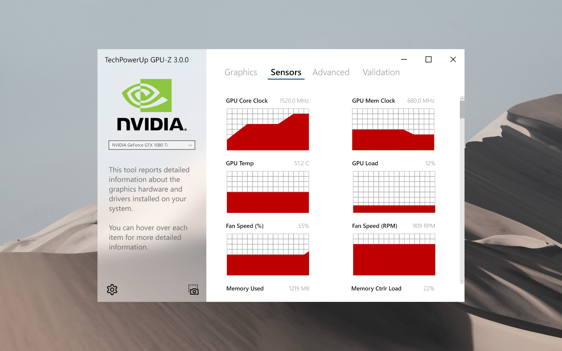
Got bored today, so I took a shot at redesigning GPU-Z based on Microsoft's Fluent Design Language. I made two concepts, one is based on how GPU-Z looks today, the other is a complete re-make.

Just thought it would be interesting to see how it looked. :)

Classic
GPU-Z Fluent Classic - Graphics Tab.png


Modern - Graphics Tab
GPU-Z Fluent Modern - Graphics.png


Modern - Sensors Tab
GPU-Z Fluent Modern - Sensors Tab.png


EDIT:
Just to answer the concerns below. This was made using Adobe XD. No GPU-Zs were harmed (modified) during the making of these concepts.

Also, added some refined concepts below.
GPU-Z Fluent - Graphics Tab.png GPU-Z Fluent - Sensors Tab.png GPU-Z Fluent - Graphics Tab – Dark.png GPU-Z Fluent - Sensors Tab – Dark.png
 
Last edited:
That looks really slick, nice work @Fahad
 
Did you get permission from @W1zzard to modify his code or GUI for it?
 
a black on red version would really be slicker then Teflon covered in Hi-T-Lube
 
That's a really clean design, I love it.
 
I like the new classic.. not so much the modern.

Graphs are big......


Looks like a great facelift to me, the classic.


You should do this to cpuz......
 
Last edited:
Ok? Sorry for intruding however W1zzard owns the software and is his IP.
And? The OP clearly stated he was just interested in doing it out of curiosity with no intent to distribute or appropriate the IP or claim that his creation is anything but a what-if rendering of GPU-Z using modern language. Either complement or critique his work or just say nothing at all. I personally think all of his mock-ups look great and that he did a wonderful job!
 
Things have to be done right here. How'd you feel if someone did something to what you created without your authorization?
 
Things have to be done right here. How'd you feel if someone did something to what you created without your authorization?
Wouldn't matter to me if it was done in a manner similar to the OP. You seem like your just looking to complain about anything honestly. Do you fuss at people who do song covers, fan art, fan fiction? People these days are always looking for something to make an issue out of where none exists.

Edit: Also see W1zzard's own words on this. 4th post in.
https://www.techpowerup.com/forums/...-for-organizations-and-business-users.180164/
 
link to desert background plz
 
I can give you a few proposals i gave W1zzard back in 2014 when i took over the database

doubt W1zzard will do this 99.9% because he wants the compact look and in that compact space nothing else can be arranged
not to say in the future he wont change his mind.
 
Things have to be done right here. How'd you feel if someone did something to what you created without your authorization?

Well, since I'm not an a-hole, as long as they aren't doing it for personal gain, I'd thank them.
 
Personally. Adding my legitimate 2C here. I like the fluent design elements. However as with @EarthDog I like the first more. But I also really like the second.

You want to know what kills the second for me? The same as Earth. the graphs. It goes a bit deeper though. to radeon Re-live driver CP. I absolutely HATE horizontal windows. It uses a tremendous amount of space that no matter the application fails to resize for whatever reason.

This goes beyond this example and even AMD drivers. but to what I consider at this point normal metro design. Lets take the windows calculator meme as an example. Everyone who gets it knows exactly what I'm saying.

RucjNFy.png


The problem is that I believe Fluent and "Metro" attempt to play towards humans handling horizontal space in their daily lives. from books to video, credit cards etc alot of our interaction is horizontal and I dont mean reading. I mean the consumption of data inside of a space.

However thats where the problem I think people are missing lies. Computers in general from websites to scripting, sorting through lists and processing formula is all done vertically. This makes fluent design nice to look at but difficult to use.

I often find myself unsure how to find an element or confused as to why something is portrayed so large. Maybe if a designer could make fluent design elements in a package that is more slender in usable space but just as pleasing to the eye I would bite. but alas.

We currently have and are offered

1200x1600 massive boxes of jumbled information.
 
I like the new classic.. not so much the modern.

Graphs are big......


Looks like a great facelift to me, the classic.


You should do this to cpuz......

Way too big, would not be able to show all the sensors for my card.

Nice to see another design although GPU-z to me is fine how it is., but would be nice for those who want a change or some thing.
 
Personally. Adding my legitimate 2C here. I like the fluent design elements. However as with @EarthDog I like the first more. But I also really like the second.

You want to know what kills the second for me? The same as Earth. the graphs. It goes a bit deeper though. to radeon Re-live driver CP. I absolutely HATE horizontal windows. It uses a tremendous amount of space that no matter the application fails to resize for whatever reason.

This goes beyond this example and even AMD drivers. but to what I consider at this point normal metro design. Lets take the windows calculator meme as an example. Everyone who gets it knows exactly what I'm saying.

RucjNFy.png


The problem is that I believe Fluent and "Metro" attempt to play towards humans handling horizontal space in their daily lives. from books to video, credit cards etc alot of our interaction is horizontal and I dont mean reading. I mean the consumption of data inside of a space.

However thats where the problem I think people are missing lies. Computers in general from websites to scripting, sorting through lists and processing formula is all done vertically. This makes fluent design nice to look at but difficult to use.

I often find myself unsure how to find an element or confused as to why something is portrayed so large. Maybe if a designer could make fluent design elements in a package that is more slender in usable space but just as pleasing to the eye I would bite. but alas.

We currently have and are offered

1200x1600 massive boxes of jumbled information.

Similar to how I feel about current widescreens in general. The move away from 16:10 to 16:9 made sense from a business perspective(more $$ in their pockets), put completely puzzled me on how consumers in general welcomed this change with open arms since nearly everything non-video related is presented and navigated in a vertical bias thus losing out on verticality means losing usable and practical space. I guess not seeing black bars when watching a movie once and a while beats having less of a page on screen and more frequent scrolling.
 
screen space be dammed this is what they make 4k ultra wides for
 
Looks kinda like NZXT Cam
 
id love to have a link to try the Modified skin out, and then judge with actual experience whether or not i like it. I dont know if thats "illegal" or something though. either way , id still like to try it out.
 
my proposal was to have a layout around this
Shaders: 3584
TMUs: 224
ROPs: 88

my ocd flips out at
88 / 224
3584
 
Back
Top