 7
7
Vortex Race 3 Keyboard Review
Disassembly »Closer Examination
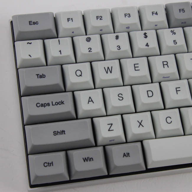
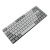
The keyboard looks and feels absolutely fantastic in person. It is without a doubt following the same ID as the CORE, which can be seen above, but a few changes have been made, and they are in my opinion changes for the better. The case is lighter in color and has a more subtly brushed finish; it is a lot more gunmetal in color now, which will have it go well with more things around you. The stock keycaps are also no longer the beige and gray and are instead more white and granite/gunmetal. In fact, mechanical keyboard enthusiasts might recognize the resemblance to the excellent DSA Granite keycap set here. There is no real rule here as far as placement of gray vs. white-colored keycaps goes, but the gray keycaps are on the periphery, mostly. It all works more than well enough for me personally!
As with the CORE, the Race 3 has next to no bezels, to the point where you really cannot see the case (which is low profile here) unless you look at the Race 3 at an angle. This helps with keeping it extremely compact, and yet the anodized aluminum case does provide a lot of structural rigidity as well. The form factor is 75%, as mentioned before, meaning it is close to a TKL and offers nearly everything as a discrete option. The primary changes would be the longer Esc and Del keys, and part of this is to help keep the top row staggered while maintaining some symmetry, but it will end up being a deal breaker for a lot of people who look at such keyboards as more of a long-term solution with personalization in mind. The included replacement keycaps help a lot here, but please do still take note of this. The top row is not the only culprit here either as the bottom row's modifier keys on the left side of the space bar are longer than those on the right side, for example. All this is a result of the 75% keyboard form factor not really being a standard, which has companies take the liberty to do as they deem fit. Vortex has a lot of things right here, but some will alienate potential customers.
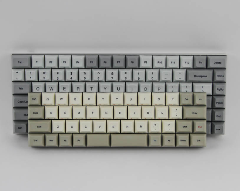
The legends' font is clean and professional, and the legends are printed onto the middle of the keycaps, in black, and some secondary legends have been printed onto the front in blue. These are dye sublimated on and thus have the limitation wherein the legend's printing color has to be darker than the keycap's for it to be visible well. The dye sublimation itself is very well done, better so than on my previous CORE sample, and the legends will as such not wear out before the keycaps themselves do.
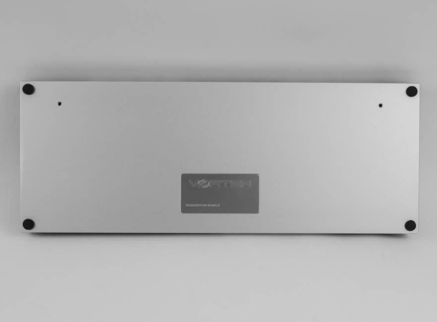
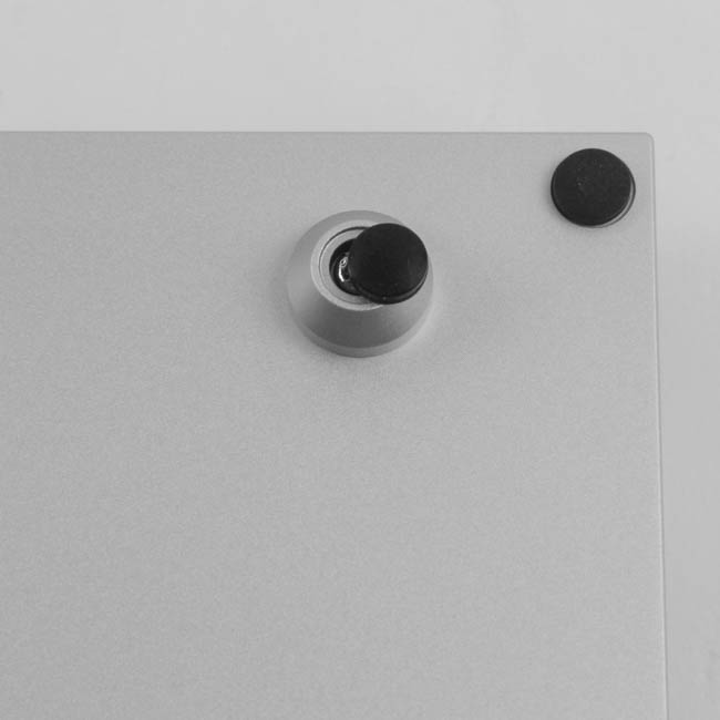
Turning the keyboard over, we see the case with a metal badge in the middle - this particular one is an engineering sample, and a laser engraving labels it as such. There are also four small hemispherical rubber pads on the corners to prevent the keyboard from sliding around on your desk, which also prevents the case from being scratched. The included feet screw into the two holes on top, with the rubber pads going on top to further help keep things tidy and consistent.
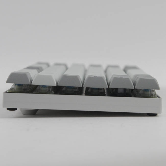
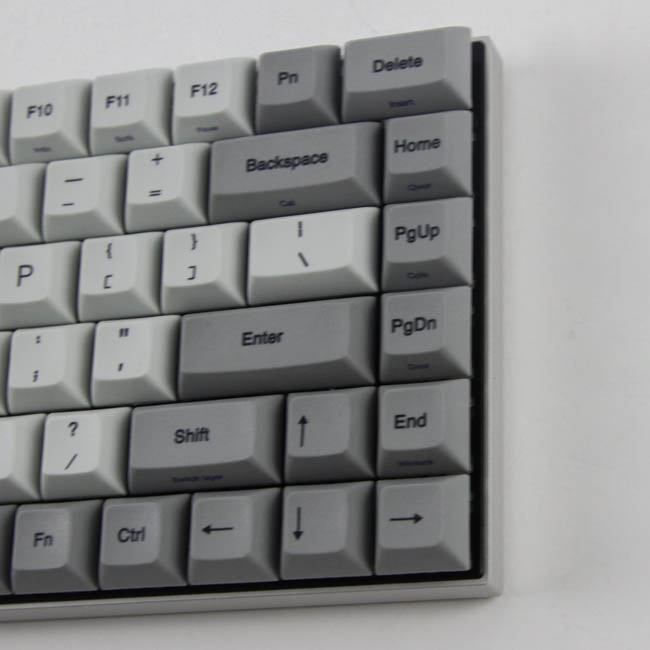
Here, we get a better look at how much the feet elevate the keyboard, and I suggest having it on to try out no matter what. From this angle, we also see that the keycaps have a DSA-like profile with a shorter height and a flat top with no curvature. I say DSA-like because that term is really for a different company (Signature Plastics) to use because they essentially created it with their keycap sets. Vortex is freely using and calling these DSA as well.
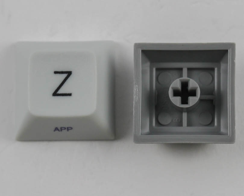
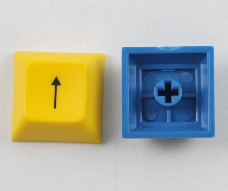

The keycaps, including the included replacement ones, are made out of PBT plastic and feel great to type on. This also means they will last for a while, and nor will these develop a shine due to finger oils as easily as ABS plastic keycaps. They are also really thick, with an average wall thickness of 1.36 mm for those who wanted to know. As far as backlighting goes, the stock gray/white keycaps are completely opaque, while the colored replacement keycaps are translucent in varying degrees, with the yellow and red ones transmitting more light than the blue and green ones. The retail keyboard in its first iteration will not have LEDs on all the switches, though, which makes their translucency a moot point.
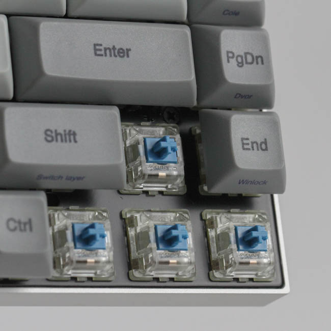
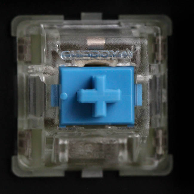
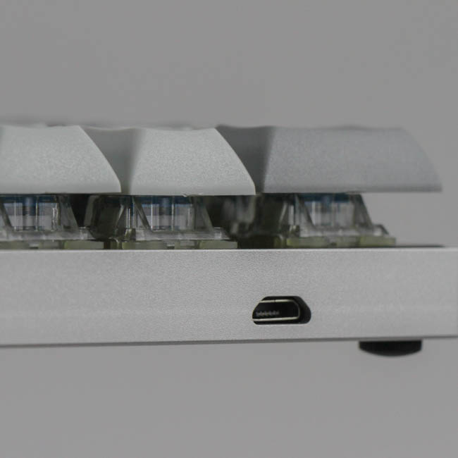
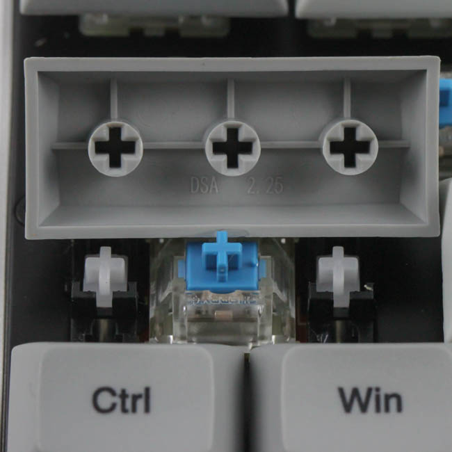
On this engineering sample are Cherry MX RGB switches, but note that the retail version will have opaque black housing switches since there is no RGB backlighting on the keyboard aside from a couple LEDs for function over form. The larger keycaps are held in place with Cherry stabilizers, and with a low-profile case, the keycaps end up being floating in design. We also see the female micro-USB port in the top-left corner here, as seen from the front.
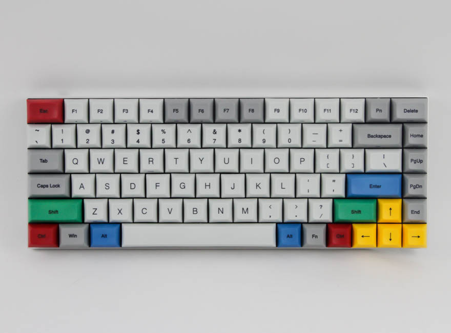
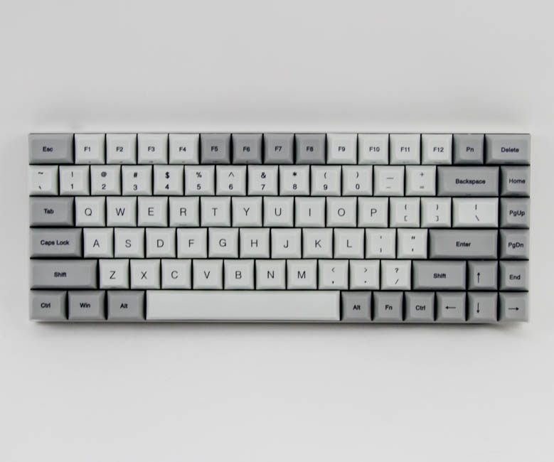
Here is a look at the keyboard with the Windows OS replacement keycaps installed. As can be seen, there is now a lot more color on the keyboard, and symmetry is still maintained somewhat with the same keystrokes having the same color (Alt being blue and Shift being green, for example).
Jul 24th, 2025 16:13 CDT
change timezone
Latest GPU Drivers
New Forum Posts
- Corsair RM850x (2021) 12V Rail Dropping — Causing Crashes While Gaming (3)
- [USA] [Newegg] PCCOOLER CPS RZ620 Dual Tower CPU Air Cooler $23 (regular $70) same cooler I own currently (it even beats 360 AIO water coolers) (8)
- Lexar NM790 (4TB) made my PC go back to Windows XP days, since it caused my PC to be SO slow and laggy! (21)
- Which Linux flavor? (54)
- AI Job Losses: let's count the losses up, total losses to AI so far 94,000 and counting (60)
- RX 9000 series GPU Owners Club (1193)
- Share your CPUZ Benchmarks! (2533)
- What are these keycaps? (1)
- Need some help finding correct VBIOS for my RX580 (8)
- What's your latest tech purchase? (24356)
Popular Reviews
- Noctua NF-A12x25 G2 PWM Fan Review
- MSI MPG B850I Edge Ti Wi-Fi Review
- Cougar OmnyX Review
- Thermal Grizzly WireView Pro Review
- UPERFECT UMax 24 Review
- TerraMaster F4-424 Max Review - The fastest NAS we've tested so far
- Sharkoon OfficePal C10 Review - Affordable and Decent
- Razer Blade 16 (2025) Review - Thin, Light, Punchy, and Efficient
- Upcoming Hardware Launches 2025 (Updated May 2025)
- VAXEE XE V2 Wireless Review
TPU on YouTube
Controversial News Posts
- Some Intel Nova Lake CPUs Rumored to Challenge AMD's 3D V-Cache in Desktop Gaming (140)
- AMD Radeon RX 9070 XT Gains 9% Performance at 1440p with Latest Driver, Beats RTX 5070 Ti (131)
- AMD's Upcoming UDNA / RDNA 5 GPU Could Feature 96 CUs and 384-bit Memory Bus (116)
- NVIDIA GeForce RTX 5080 SUPER Could Feature 24 GB Memory, Increased Power Limits (115)
- NVIDIA DLSS Transformer Cuts VRAM Usage by 20% (99)
- AMD Sampling Next-Gen Ryzen Desktop "Medusa Ridge," Sees Incremental IPC Upgrade, New cIOD (97)
- NVIDIA Becomes First Company Ever to Hit $4 Trillion Market-Cap (94)
- Windows 12 Delayed as Microsoft Prepares Windows 11 25H2 Update (92)