Tuesday, October 17th 2017

CORSAIR Launches Premium Gaming PBT Double-Shot Keycaps Kit
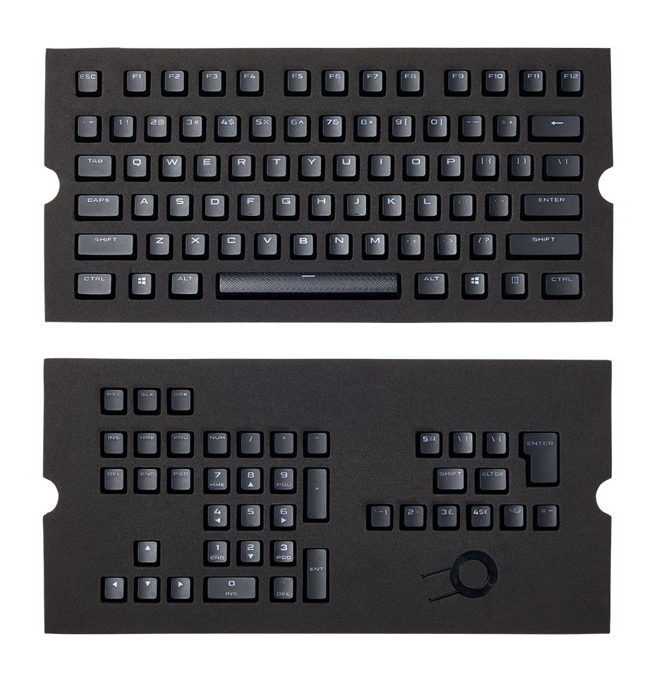
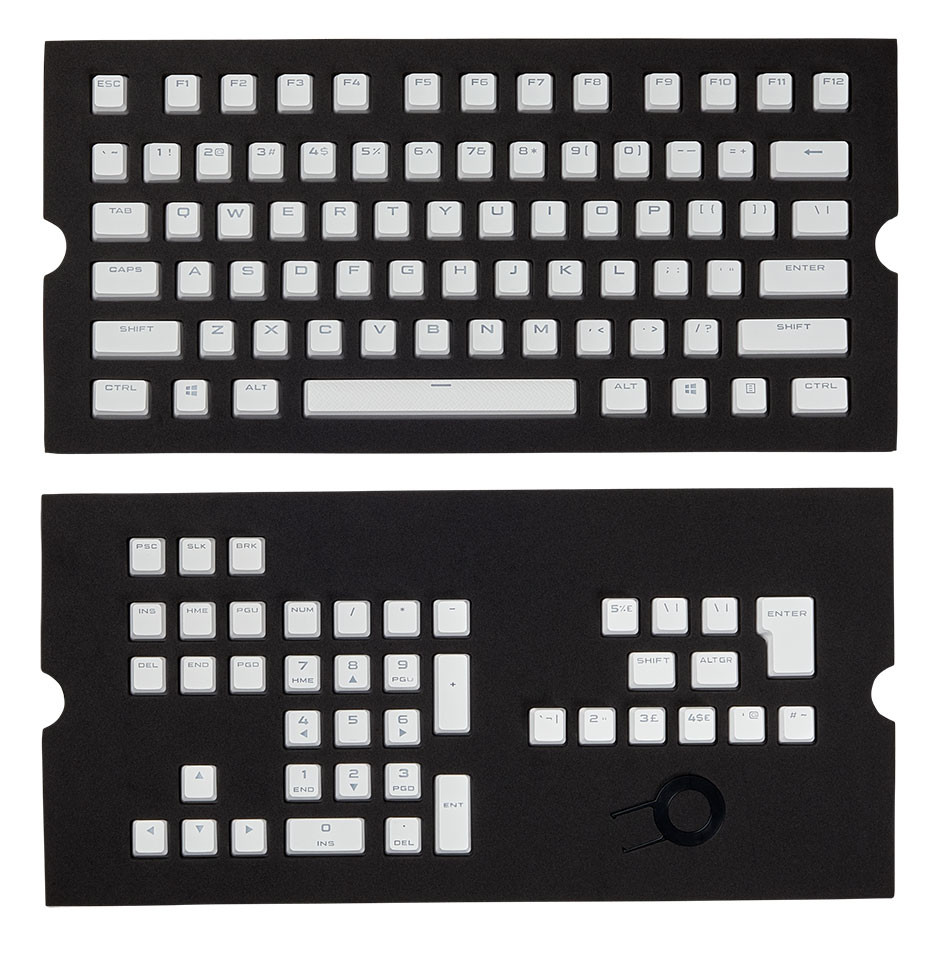
CORSAIR, a world leader in enthusiast memory, PC components, and high-performance gaming hardware today announced a new accessory for its industry-leading line of mechanical keyboards - a full set of performance PBT double-shot keycaps. Created using a special two-shot molding process, CORSAIR Gaming PBT Double-shot keycaps use a redesigned legend that always remains clear and legible, while still allowing LED backlighting to shine through brightly. Available in black or white and made from ultra-durable, shine resistant PBT, CORSAIR Double-Shot keycaps will never fade and boast a premium feel to complement even the most refined setup. Compatible with a wide range of CORSAIR mechanical keyboards, CORSAIR Double-Shot Keycaps are the ultimate upgrade for your CORSAIR mechanical keyboard.
CORSAIR knows that when it comes to PC gaming, standard just isn't enough. Now you can take your CORSAIR mechanical keyboard even further with CORSAIR Double-Shot Keycaps, replacing traditional laser etched keys with precision double-shot molded keys for the most premium of keyboard experiences.


 CORSAIR Double-Shot Keycaps are formed in a special two-shot mold process to ensure long-lasting durability and performance. Unlike traditional keycaps which are painted and then etched, the lettering on double-shot keycaps is physically molded into the body of each keycap, with two interlocking pieces combining to ensure that they will never fade or become illegible overtime. Available in either black and white, mechanical keyboards have never looked or felt this good.
CORSAIR Double-Shot Keycaps are RGB backlight compatible and made from ultra-durable shine resistant PBT, so keys will always stay clean and matte while allowing RGB backlighting to shine through and illuminate your setup, creating the ultimate professional looking gaming keyboard.
When it comes to gaming, every keystroke can mean the difference between a loss or a win. With key walls that are twice as thick as standard keycaps, CORSAIR Double-Shot Keycaps reduce key wobble, providing confidence and stability with every keypress. What's more, with a full 104/105 set of keys specifically made for CORSAIR keyboards in North American, British and International English layouts, you'll be able to fully upgrade almost any CORSAIR mechanical keyboard.
Made with gamers in mind, CORSAIR Gaming Gaming PBT Double-Shot Keycaps have an unmatched level of durability and performance in every key press; because true legends never fade.
Availability, Warranty:
CORSAIR Gaming PBT Double-Shot Keycaps are available immediately from the CORSAIR network of authorized retailers and distributors. CORSAIR Gaming PBT Double-Shot Keycaps are backed by a two-year warranty and the CORSAIR worldwide customer support network.
CORSAIR knows that when it comes to PC gaming, standard just isn't enough. Now you can take your CORSAIR mechanical keyboard even further with CORSAIR Double-Shot Keycaps, replacing traditional laser etched keys with precision double-shot molded keys for the most premium of keyboard experiences.

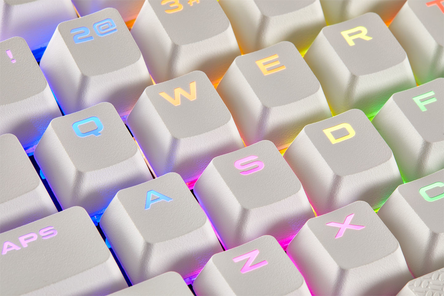

CORSAIR Double-Shot Keycaps are RGB backlight compatible and made from ultra-durable shine resistant PBT, so keys will always stay clean and matte while allowing RGB backlighting to shine through and illuminate your setup, creating the ultimate professional looking gaming keyboard.
When it comes to gaming, every keystroke can mean the difference between a loss or a win. With key walls that are twice as thick as standard keycaps, CORSAIR Double-Shot Keycaps reduce key wobble, providing confidence and stability with every keypress. What's more, with a full 104/105 set of keys specifically made for CORSAIR keyboards in North American, British and International English layouts, you'll be able to fully upgrade almost any CORSAIR mechanical keyboard.
Made with gamers in mind, CORSAIR Gaming Gaming PBT Double-Shot Keycaps have an unmatched level of durability and performance in every key press; because true legends never fade.
Availability, Warranty:
CORSAIR Gaming PBT Double-Shot Keycaps are available immediately from the CORSAIR network of authorized retailers and distributors. CORSAIR Gaming PBT Double-Shot Keycaps are backed by a two-year warranty and the CORSAIR worldwide customer support network.
22 Comments on CORSAIR Launches Premium Gaming PBT Double-Shot Keycaps Kit
Just because you dont like it doesnt mean others dont (such as myself) so therefore your opinion is just that, your opinion. You dont speak for everyone.
I really like for example the last font cherry used for their MX board 6.0, very futuristic, but i'd understand if few will like it, too bad the keyboard is only available in US and DE layout, otherwise i would've bought it pretty sure, need to replace my old-a$$ qpad mk80
edit: i actually meant 5.0, sorry
They've been slacking lately to the point of simply re-selling no-name products at triple the price.
Right now I have a much better set on my Aliexpress whishlist: just a regular lazer-etched translucent keycaps with a more traditional "non-annoying" font.
All for the low price of $10
Which is this
I also love the one Logitech used on the G413, too bad i don't like the position of the characters, and the fact it has romer-g switches :(
This one:
www.destructoid.com/ul/431236-review-logitech-g413-mechanical-gaming-keyboard/keycaps-noscale.jpg
My keyboard don't need to have traditional fonts.
Now small CORSAIR K60 silver become very nice keyboard with new switches.
RGB only spoil whole picture. Immediately I know that something like that can't work 10 years without problems. LED on my keyboard are rated to 20 years. I don't even use them. Only shine when I press some switch.
Only flaw is fact that Red switches is are not my favorites.
I like more Brown or Clear or even Black or Green are better than Red.
Double shot PBT or Dye Sublimited PBT without LED are best for keyboards.
I can't tolerate RGB.
It was expected to CORSAIR offer different fonts than default.
They're actually pretty exclusive.
Except.... when their apparently cheap LED's just burn out... I have 3 dark keys on my K70 in about 18 months time. I saw in reviews that others had mentioned the issue, but I got it for a great price on a SS deal that I felt it was worth taking the risk. I lost the bet I guess....