Friday, February 23rd 2007
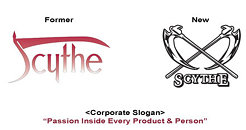
Scythe changes corporate logo and slogan
Scythe Co., Ltd announces the change of its corporate logo. The former logo was established in 2002 to introduce the "Scythe" brand as the manufacturer of unique fan-less and low-noise cooling solution to the worldwide enthusiastic market, yet due to the versatility of the PC market and potential expansion of our brand and knowledge into other part of the computer components, the new logo has been developed. This new logo is introduced to connect both enthusiastic users as well as the general PC users to get familiarize with current and the future Scythe products and brand as a leading manufacturer of computer components.The meaning what we would like to put into the new logo with "Cross Scythe" symbols is to connect both the manufacturer (Scythe) and our customers (business customers and users of Scythe products) with outstanding quality in products and services. Furthermore, we have also established the corporate slogan as "Passion Inside Every Product & Person" to further express the meaning of the new logo together with the slogan. We are all excited to announce this new corporate logo and slogan to the worldwide market, and continue to provide the outstanding service and quality products to the never-stopping development of the computer components market.
Source:
Scythe

8 Comments on Scythe changes corporate logo and slogan
Very bad brand management. Their design company should be fired.