Tuesday, April 8th 2025

FinalWire Releases AIDA64 v7.65

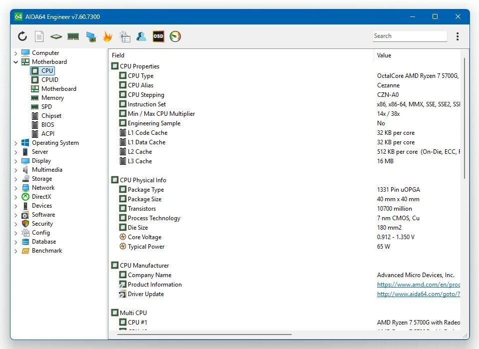
FinalWire Ltd. today announced the immediate availability of AIDA64 Extreme 7.65 software, a streamlined diagnostic and benchmarking tool for home users; the immediate availability of AIDA64 Engineer 7.65 software, a professional diagnostic and benchmarking solution for corporate IT technicians and engineers; the immediate availability of AIDA64 Business 7.65 software, an essential network management solution for small and medium scale enterprises; and the immediate availability of AIDA64 Network Audit 7.65 software, a dedicated network audit toolset to collect and manage corporate network inventories.

The new AIDA64 update introduces Greek localization, support for MSI MEG Ai1600T power supply units, and supports the latest graphics and GPGPU computing technologies by AMD, Intel and NVIDIA.

DOWNLOAD: FinalWire AIDA64 Extreme v7.65
New features & improvements
  • Greek localization
  • Improved support for Intel Panther Lake CPU
  • ASUS Astral RTX 5000 Series GPU sensor support
  • New hot key option to reset SensorPanel position
  • Improved support for Zhaoxin KX-6000G and KX-7000 Series processors
  • MSI MEG Ai1600T PSU sensor support
  • GPU details for AMD Radeon RX 7650 GRE
  • GPU details for NVIDIA GeForce RTX 5060 Ti
Add your own comment

9 Comments on FinalWire Releases AIDA64 v7.65

#1
star-affinity
It has to have a mid 1990ies Windows looking GUI? :fear:
Posted on Reply
#2
JcRabbit
star-affinityIt has to have a mid 1990ies Windows looking GUI? :fear:
Why?

Would it work better if it had a gigantic setting panels like Windows 11 does? Seems to me modern setting GUIs actually have the opposite effect on the quality of the software, as demonstrated by Windows 11 itself (perhaps because someone is prioritizing form over function when they should be doing the opposite lol)
Posted on Reply
#3
ZeDestructor
star-affinityIt has to have a mid 1990ies Windows looking GUI? :fear:
Yes, because it's meant to be fast to use, not wasting people's time with animation on every click and splitting each piece of info into it's own subsubsubsubsub-page.
Posted on Reply
#4
star-affinity
JcRabbitWhy?

Would it work better if it had a gigantic setting panels like Windows 11 does? Seems to me modern setting GUIs actually have the opposite effect on the quality of the software, as demonstrated by Windows 11 itself (perhaps because someone is prioritizing form over function when they should be doing the opposite lol)
ZeDestructorYes, because it's meant to be fast to use, not wasting people's time with animation on every click and splitting each piece of info into it's own subsubsubsubsub-page.
I think both a modern looking and speedy GUI could be achieved, no?

Does it have to be bad and slow just because it has the Windows 11 aesthetics?
Posted on Reply
#5
ZeDestructor
star-affinityI think both a modern looking and speedy GUI could be achieved, no?

Does it have to be bad and slow just because it has the Windows 11 aesthetics?
Full W11 aesthetic would "require" animations, which is a forced slowdown. Then you have the reduced information density, meaning more scrolling and clicking around before you get the info you want/need.

Getting something in-between is not impossible.. but at that point you've put in a lot of effort for at best equal actual usability/UX to what is already present and working very well. Don't discount user familiarity either - lots of people have been using AIDA64 for years (myself since the days they were called EVEREST, and other, older folks even further back to the AIDA32 days).

Personally, I'm far more happy that they "just" added not only a dark mode, but three dark modes, including a true black variant.
Posted on Reply
#6
JcRabbit
star-affinityI think both a modern looking and speedy GUI could be achieved, no?
Once upon a time there was one thing called Windows Common Controls (buttons, checkboxes, listboxes, etc), which everyone used, were rendered by the OS, and made Windows applications look like, well, standard Windows applications. As Microsoft released new versions of Windows, it also updated the look of those common controls. The GUI of older applications thus automatically blended in with the new Windows version without developers of 3rd party applications - which might not even be in business anymore - having to modify the code or the UI.

Since Windows 8-10 Microsoft and all those "modern" apps have basically abandoned Common Controls (although they still exist and are still supported). Have you noticed how little consistency there actually is in the GUI of different "modern" 3rd party apps nowadays? Sure, they all vaguely resemble something built for Windows 10 or Windows 11 in their style, but everything else is different and unique to that particular application (different button sizes, different text sizes, different look for checkboxes, etc, etc...

Can you guess what is going to happen to those apps when Windows 12 is released and Microsoft decides to go in a entirely different UI direction yet AGAIN?

So, to make an application blend in with the new Windows 11 look you basically have to abandon the Windows Common Controls and build/use your own. Trust me, that is NOT an easy task, much less a quick one. It's also a lot easier to do that when writing an application from scratch than it is to completely re-write the UI of an existing application. It's a HUGE effort for zero gains in functionality. For well established applications like AIDA64, especially those that have to constantly keep up with new hardware, I imagine the authors have better things to do with their time than manually change the entire UI everytime Microsoft farts a new idea.
star-affinityDoes it have to be bad and slow just because it has the Windows 11 aesthetics?
That is not the point, what really matters is that it does what it purports to do and does it well. That should be your focus. Function over form, always! Criticizing an application like AIDA64 that goes back so many years just because the UI looks outdated, especially when they just added support for dark mode?! Man... :)
Posted on Reply
#7
star-affinity
ZeDestructorFull W11 aesthetic would "require" animations, which is a forced slowdown. Then you have the reduced information density, meaning more scrolling and clicking around before you get the info you want/need.

Getting something in-between is not impossible.. but at that point you've put in a lot of effort for at best equal actual usability/UX to what is already present and working very well. Don't discount user familiarity either - lots of people have been using AIDA64 for years (myself since the days they were called EVEREST, and other, older folks even further back to the AIDA32 days).

Personally, I'm far more happy that they "just" added not only a dark mode, but three dark modes, including a true black variant.
JcRabbitOnce upon a time there was one thing called Windows Common Controls (buttons, checkboxes, listboxes, etc), which everyone used, were rendered by the OS, and made Windows applications look like, well, standard Windows applications. As Microsoft released new versions of Windows, it also updated the look of those common controls. The GUI of older applications thus automatically blended in with the new Windows version without developers of 3rd party applications - which might not even be in business anymore - having to modify the code or the UI.

Since Windows 8-10 Microsoft and all those "modern" apps have basically abandoned Common Controls (although they still exist and are still supported). Have you noticed how little consistency there actually is in the GUI of different "modern" 3rd party apps nowadays? Sure, they all vaguely resemble something built for Windows 10 or Windows 11 in their style, but everything else is different and unique to that particular application (different button sizes, different text sizes, different look for checkboxes, etc, etc...

Can you guess what is going to happen to those apps when Windows 12 is released and Microsoft decides to go in a entirely different UI direction yet AGAIN?

So, to make an application blend in with the new Windows 11 look you basically have to abandon the Windows Common Controls and build/use your own. Trust me, that is NOT an easy task, much less a quick one. It's also a lot easier to do that when writing an application from scratch than it is to completely re-write the UI of an existing application. It's a HUGE effort for zero gains in functionality. For well established applications like AIDA64, especially those that have to constantly keep up with new hardware, I imagine the authors have better things to do with their time than manually change the entire UI everytime Microsoft farts a new idea.


That is not the point, what really matters is that it does what it purports to do and does it well. That should be your focus. Function over form, always! Criticizing an application like AIDA64 that goes back so many years just because the UI looks outdated, especially when they just added support for dark mode?! Man... :)
I guess I'm used to macOS where many third party developers seem to care about graphic design. :)

I do have an issue with the lack of consistency of how things look in Windows. But I can also understand it because of the reasons you brought up and also that there is so good backwards compatibility in Windows. 32-bit apps still being supported for example.

And I do agree on function over form, it's just that if you stare so many hours a day at the operating system and its apps as some of us do, I think it's nice if there also is an aim to make things look good and coherent. But I understand we all might be different there. :)

Anyway, cool they added dark mode to it! :respect:
Posted on Reply
#8
ZeDestructor
star-affinityI guess I'm used to macOS where many third party developers seem to care about graphic design. :)

I do have an issue with the lack of consistency of how things look in Windows. But I can also understand it because of the reasons you brought up and also that there is so good backwards compatibility in Windows. 32-bit apps still being supported for example.

And I do agree on function over form, it's just that if you stare so many hours a day at the operating system and its apps as some of us do, I think it's nice if there also is an aim to make things look good and coherent. But I understand we all might be different there. :)

Anyway, cool they added dark mode to it! :respect:
It's more a matter of how easy it is to achieve a given look and feel. For something brand new built with no legacy baggage (like the deprecated Windows Phone build of AIDA64), it's very easy. For something like the full AIDA64 Win32 program that's still XP-compatible (iirc) that's built on a codebase over 20 years old, it's a *lot* of effort to move it along. Especially when the overwhelming majority of users (myself included) will immediately lash out and call the more modern-looking software "low-density reheated dogshit" (before you ask, yes - I have put that verbatim into feedback forms).

As for coherence, I really don't mind the lack of coherence - make the software intuitive and fast first, *then* worry about looks. And even when it comes to looks, there is a priority queue - dark mode first, then using modern GUI libraries (many are modern, but don't look very "Windows 11", like Qt), then maybe aesthetics - remember, these are tools, not decorations. There is absolutely care about visual outside of Apple, but the care manifests in a distinctly different flavour. Especially when it comes to more technical software

On macOS/iOS, the prioritization of general aesthetics and coherent looks is often at the cost of being fast software, starting by the mandatory animations that you're not allowed to speedup.
Posted on Reply
#9
star-affinity
ZeDestructorIt's more a matter of how easy it is to achieve a given look and feel. For something brand new built with no legacy baggage (like the deprecated Windows Phone build of AIDA64), it's very easy. For something like the full AIDA64 Win32 program that's still XP-compatible (iirc) that's built on a codebase over 20 years old, it's a *lot* of effort to move it along. Especially when the overwhelming majority of users (myself included) will immediately lash out and call the more modern-looking software "low-density reheated dogshit" (before you ask, yes - I have put that verbatim into feedback forms).

As for coherence, I really don't mind the lack of coherence - make the software intuitive and fast first, *then* worry about looks. And even when it comes to looks, there is a priority queue - dark mode first, then using modern GUI libraries (many are modern, but don't look very "Windows 11", like Qt), then maybe aesthetics - remember, these are tools, not decorations. There is absolutely care about visual outside of Apple, but the care manifests in a distinctly different flavour. Especially when it comes to more technical software

On macOS/iOS, the prioritization of general aesthetics and coherent looks is often at the cost of being fast software, starting by the mandatory animations that you're not allowed to speedup.
I guess I’d just like to see some GUI design by someone who is actually a designer. It seems to me that is relatively rare outside of the macOS sphere.

And again, I agree functionality and speed is more important than looks, but I don’t see why it should be so hard to achieve both. I’m not thinking so much about the animation aspect of macOS apps, rather the icons and typography.
I do agree there are some areas in macOS where animations are too long/slow, but I definitely think macOS apps can be fast and in general isn’t slow.

Look at the software Pixelmator (that Apple actually acquired not too long ago) to see what I mean.
Posted on Reply
Nov 15th, 2026 10:57 CST change timezone

New Forum Posts

Popular Reviews

TPU on YouTube

Controversial News Posts