
News Posts matching #Visuals

Return to Keyword Browsing

Sony Patent Turns Game Audio Into Visual Cues for Deaf and Hard-of-Hearing Players

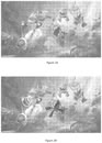
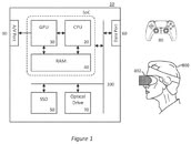
A newly published Sony Interactive Entertainment patent application, titled "Audio Processing System and Method," describes a way to turn in-game sounds into visual cues for players who are deaf or hard of hearing. The system classifies the intended effect of a sound before it plays, such as building fear or tension, warning of danger, or describing the environment, and then displays a matching visual element. That could be an icon, a shape, or even an onomatopoeic word like "Roar!" for a nearby monster. Properties such as color, brightness, or transparency are tied to the sound's volume and character.

The patent also describes directional lighting to show where a sound is coming from, either as LEDs around the display or as LEDs encircling the touchpad on a DualSense controller. The application, published on October 22, is a continuation of a US application filed in May 2023, which in turn claims priority from a UK filing dating back to June 2022. One interesting detail is support for older games, since the patent suggests the operating system or a helper app could tag a legacy game's sound files and generate the cues without changes to the game's code.

Jsaux Gaming's E-Ink and Pixel Matrix Faceplates for Steam Machine Are Now Available

JSAUX GAMING today announced that its new E-Ink Faceplate and Pixel Matrix Faceplate for Steam Machine are now available, giving Steam Machine owners a new third-party option for customizing their system. Designed as magnetic replacement faceplates, the two panels give Steam Machine owners a simple way to make the system their own.
Winnie Chen, Marketing Communications Manager at JSAUX GAMING"We designed these faceplates to do more than change the look of Steam Machine. They give the front of the system a new role—part personal design statement, part information display."

Open 3D Engine v25.10 Brings Sharper Graphics and Smoother Vulkan Performance

After more than four years since the initial release, the Open 3D Engine team has unveiled the O3DE v25.10 update, which improves visuals and bring smoother gameplay. This update improves textures, refines lighting, and introduces subtle post-processing that adds depth without increasing iteration time. The editor now starts up faster, asset imports are more reliable, and high-resolution surfaces display with fewer compression artifacts, allowing mods and user-created levels to better reflect their creators' visions. Motion blur and other camera effects have been refined for a cinematic experience that maintains performance, while shadows and ambient occlusion are more consistent, providing a stable environment as you move. Platform-specific improvements reduce graphical glitches on Linux and Windows, and VR users benefit from better headset compatibility with re-enabled OpenXR components. Textures, lighting, and reflections appear richer, and the Vulkan API has received bug fixes.

Behind the scenes, the update reduces bloat and speeds up workflows, improving playtesting and level building. Installers are smaller, and builds take up less disk space, making downloading and updating mods quicker for players and creators. The asset pipeline has been optimized for smoother texture and model imports, and the editor's debug memory footprint has been reduced, allowing for scene iteration without hardware upgrades. Shader and material handling have been reorganized to ensure effects like reflections and surface detail are more reliable across different GPUs, resulting in steadier frame rates when multiple effects are enabled. Simplified core subsystems mean faster iteration when testing changes, from tweaking textures to launching new levels, with fewer unexpected issues on different machines.

Microsoft Redesigns Microsoft 365 Icons With Brighter, Fluid Visuals

Microsoft has officially unveiled a redesigned icon pack for its core Office apps, which are found within the Microsoft 365 service. The 10 primary application marks now sport brighter colors, a more playful tone, and softer contours inspired by the company's Copilot emblem. This is the first large-scale update since 2018, and it will be available on web, desktop, and mobile platforms in the coming weeks. The 10 core apps include Teams, Word, Excel, PowerPoint, Outlook, OneNote, Defender, OneDrive, Designer, and Clipchamp. All 10 of these core applications now have redesigned icons following fluid forms and vibrant colors. On the surface, these are visual changes, yet the company frames them as a sign of context-aware tools that blend AI assistance with human intent.

Under the new look, the icons move away from blocky solidity and toward folded, curved forms that suggest motion and approachability. Designers simplified details to keep each mark clear at small sizes. For example, Word now shows three horizontal bars instead of four to improve legibility. The palettes are richer, featuring exaggerated analogous gradients designed to enhance contrast across various displays and support accessibility. Letter plates remain where brand recognition matters, but proportions, texture, and spacing were modernized, so the icons feel cohesive with Copilot and recent Microsoft products. For most people, the change will be a visual refresh, brighter, simpler tiles appearing across their devices, but Microsoft says the icons are intended to reflect a larger evolution in product making where interfaces and AI work together to help people reach their desired outcomes faster.
Return to Keyword Browsing
Nov 13th, 2026 23:08 CST change timezone

New Forum Posts

Popular Reviews

TPU on YouTube

Controversial News Posts