 0
0
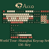
Quick Look: Akko World Tour-Shanghai Keycap Set
Introduction
It would be fair to say I like Akko products, be it in the form of keyboards or keycap sets. In particular, when Akko goes past simply taking inspiration from existing designs and does its own thing do some really cool designs come about. For example, take the Akko Monet's Pond design or even the recently seen King Koi, both of which take the same koi fish and pond theme that has been used by many but add a focused design language from Japanese and Chinese influences respectively. The World Tour series is another, with the World Tour-Tokyo theme doing quite well and there being a World Tour-Beijing keyboard family too. We weren't able to take a look at the latter, mostly because Akko informed me that a new World Tour entry is coming up. Here we are then, and thanks again to Akko for sending TechPowerUp a review sample!

Enter World Tour-Shanghai, and Akko is once again doing something original and paying homage to its own country. If Tokyo was all about popular cultural elements and Beijing far more old school, World Tour-Shanghai goes more with the early 20th century period. Even the photograph above is clearly paying homage to 1940s Shanghai, and this will be another example of the company going all in on a theme that will attract few globally. It clearly doesn't stop Akko, and I respect that. This was originally going to be a full keyboard review until plans changed with Akko no longer planning on making a keyboard or two in the World Tour-Shanghai theme. There is instead a keycap set only, so our own coverage is thus a quick-look article.
Packaging


Unlike the hard cardboard with an even harder plastic box packaging we saw employed for most of Akko's keycap sets, the World Tour series seems to adopt a simpler design with a thin cardboard sleeve over another cardboard box. This was the case with the World Tour-Tokyo keycap set as well, meaning that it is the hard box for Akko doubleshot keycap sets and this style for its dye-sublimed keycap sets. What it does allow for is a far more artistic rendition on the cover sleeve, with the vintage green base on the front along the product name and a render of a more modern-day Shanghai skyline that is a certainly an inspired touch given the focus on old Shanghai. On the back is a more authentic drawing, including a woman in cheongsam and an old school phonograph and dial telephone. The inner box simply slides out on either side as there are no seals.


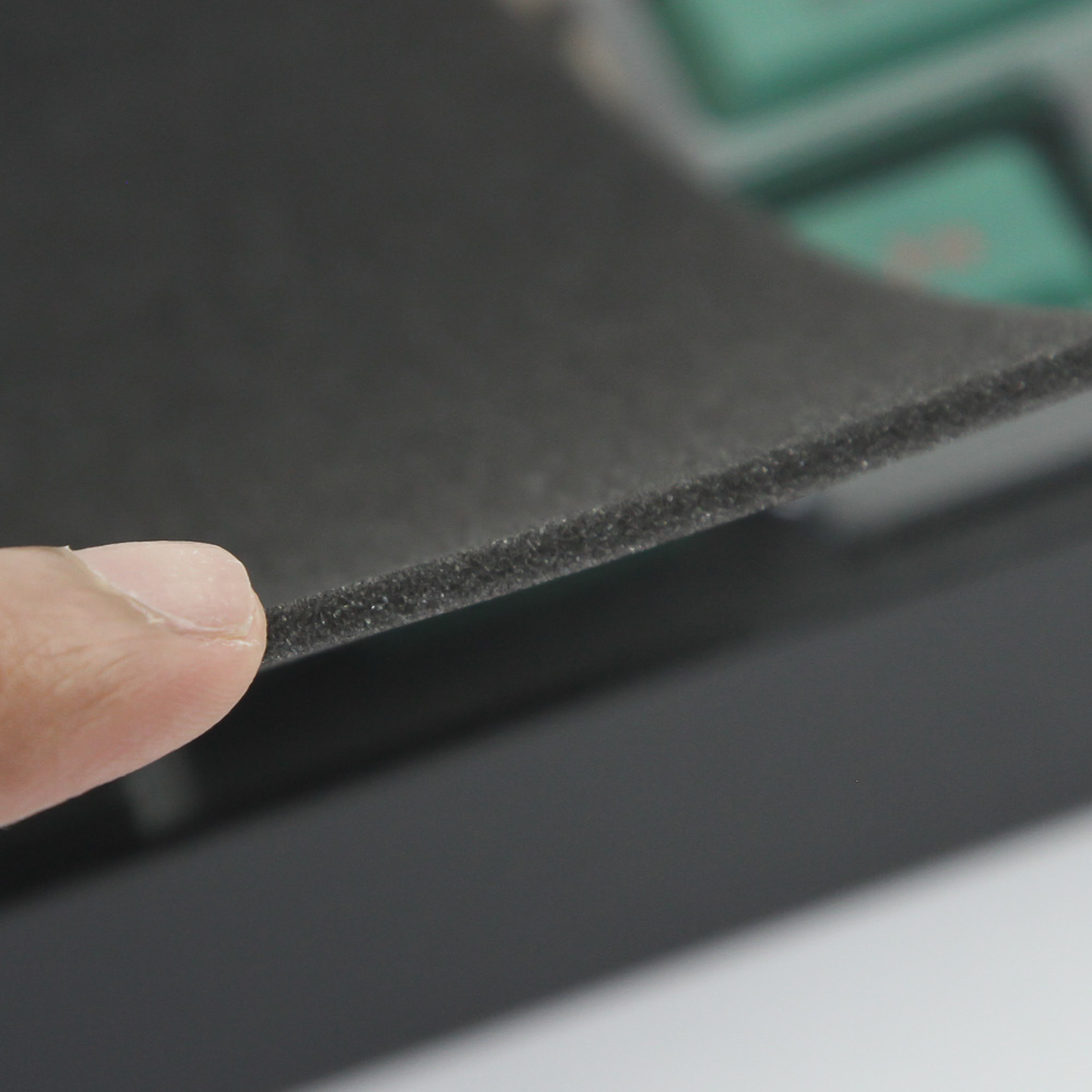
The inner box is black and has a purple Akko logo on the front. But unlike other Akko boxes with a double flap in the middle and the lid lifting upwards, we have a two-piece box with the upper section completely lifting up and away. Underneath is a thick foam sheet—it is almost as thick as my finger and adds protection to the keycaps below.


Two layers hold the 136 keycaps you get, with the top layer hosting all keycaps for the alphanumeric section, including the Fn key row. A second foam sheet separates the two layers, and the bottom layer has the other keycaps for other form factors, including TKL and full-size keyboards. These keycaps come inside plastic blister inlays with most keycaps in their own individual cells, which makes it quite hard to remove them individually. I do think this is ultimately a worse packaging design than for the other Akko keycap sets, and note that we don't even get a keycap puller.
Our Patreon Silver Supporters can read articles in single-page format.
Apr 24th, 2024 21:29 EDT
change timezone
Latest GPU Drivers
New Forum Posts
- (Anti) SFF fun house (347)
- Cinebench crashed my PC. My Wi-Fi stopped working, and I keep getting a "Please wait" screen when I boot up my PC. (30)
- The TPU UK Clubhouse (24783)
- Sharing experience with MSI RTX 3070 vBIOS update to enable Resizable Bar with MB Z490 (2)
- Share your AIDA 64 cache and memory benchmark here (2915)
- Will a RTX 4070 TI super bottleneck a Ryzen 9 7950X3D? (58)
- The best *budget* ATX PC case on the market? (24)
- GTX 1070 Ti - TDP Issues - Always Power Throttling (4)
- 2022-X58/1366 PIN Motherboards NVME M.2 SSD BIOS MOD Collection (656)
- Meta Horizon OS (15)
Popular Reviews
- Fractal Design Terra Review
- Thermalright Phantom Spirit 120 EVO Review
- Corsair 2000D Airflow Review
- Minisforum EliteMini UM780 XTX (AMD Ryzen 7 7840HS) Review
- ASUS GeForce RTX 4090 STRIX OC Review
- NVIDIA GeForce RTX 4090 Founders Edition Review - Impressive Performance
- ASUS GeForce RTX 4090 Matrix Platinum Review - The RTX 4090 Ti
- MSI GeForce RTX 4090 Suprim X Review
- MSI GeForce RTX 4090 Gaming X Trio Review
- Gigabyte GeForce RTX 4090 Gaming OC Review
Controversial News Posts
- Sony PlayStation 5 Pro Specifications Confirmed, Console Arrives Before Holidays (116)
- NVIDIA Points Intel Raptor Lake CPU Users to Get Help from Intel Amid System Instability Issues (106)
- AMD "Strix Halo" Zen 5 Mobile Processor Pictured: Chiplet-based, Uses 256-bit LPDDR5X (101)
- US Government Wants Nuclear Plants to Offload AI Data Center Expansion (98)
- Windows 10 Security Updates to Cost $61 After 2025, $427 by 2028 (84)
- Developers of Outpost Infinity Siege Recommend Underclocking i9-13900K and i9-14900K for Stability on Machines with RTX 4090 (84)
- TechPowerUp Hiring: Reviewers Wanted for Motherboards, Laptops, Gaming Handhelds and Prebuilt Desktops (78)
- AMD's RDNA 4 GPUs Could Stick with 18 Gbps GDDR6 Memory (73)