- Joined
- Oct 9, 2007
- Messages
- 47,690 (7.42/day)
- Location
- Dublin, Ireland
| System Name | RBMK-1000 |
|---|---|
| Processor | AMD Ryzen 7 5700G |
| Motherboard | Gigabyte B550 AORUS Elite V2 |
| Cooling | DeepCool Gammax L240 V2 |
| Memory | 2x 16GB DDR4-3200 |
| Video Card(s) | Galax RTX 4070 Ti EX |
| Storage | Samsung 990 1TB |
| Display(s) | BenQ 1440p 60 Hz 27-inch |
| Case | Corsair Carbide 100R |
| Audio Device(s) | ASUS SupremeFX S1220A |
| Power Supply | Cooler Master MWE Gold 650W |
| Mouse | ASUS ROG Strix Impact |
| Keyboard | Gamdias Hermes E2 |
| Software | Windows 11 Pro |
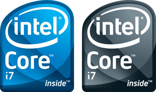
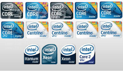
A notable inclusion of perhaps every processor-in-box product, apart from the processor, cooler and documentation, is the case-badge for the processor. The case-badge is a small sticker that shows the company logo for the processor installed in the PC. Intel is reportedly designing new logos (in effect case-badges) for at least 14 of its products. The logos, most of which are rounded-rectangle shaped seem to have been designed to give the processor box a new look, also indicating perhaps that the company is designing new packaging material as well, that use the new logos.
Intel has large volumes of Core 2 Duo, Core 2 Quad and Xeon processors in the making, that Intel feels need new clothing. Core 2 Duo and Core 2 Quad, get the distinct chrome-blue colour that one can find in the Core i7 (non-XE) logo. Core 2 and Core i7 logos look similar at the first glance. Core 2 Extreme gets the chrome-black colour the Core i7 XE logo has. All Centrino series badges stick to the silver-white colour scheme. The logo designs have small inlets on the top-right corner that have small portions of the die-shot. Core 2 and Centrino logos have die-shots of a portion of the Penryn core, while the Core i7 logos use those of the Bloomfield core. Interestingly, Xeon keeps its current logo, as well as a new one with chrome-slate colour, and design of the current Core i7 logo, perhaps making it clear the Xeon processor is based on the Nehalem architecture. The new logos will be effective from Q2 2009.

View at TechPowerUp Main Site
Intel has large volumes of Core 2 Duo, Core 2 Quad and Xeon processors in the making, that Intel feels need new clothing. Core 2 Duo and Core 2 Quad, get the distinct chrome-blue colour that one can find in the Core i7 (non-XE) logo. Core 2 and Core i7 logos look similar at the first glance. Core 2 Extreme gets the chrome-black colour the Core i7 XE logo has. All Centrino series badges stick to the silver-white colour scheme. The logo designs have small inlets on the top-right corner that have small portions of the die-shot. Core 2 and Centrino logos have die-shots of a portion of the Penryn core, while the Core i7 logos use those of the Bloomfield core. Interestingly, Xeon keeps its current logo, as well as a new one with chrome-slate colour, and design of the current Core i7 logo, perhaps making it clear the Xeon processor is based on the Nehalem architecture. The new logos will be effective from Q2 2009.
View at TechPowerUp Main Site