• Welcome to TechPowerUp Forums, Guest! Please check out our forum guidelines for info related to our community.

Windows 11 ISO Leaks to the Web, New Start Screen, Mac-like Centered Dock, Rounded Edges

btarunr

Editor & Senior Moderator
Staff member
Joined
Oct 9, 2007
Messages
47,683 (7.42/day)
Location
Dublin, Ireland
System Name RBMK-1000
Processor AMD Ryzen 7 5700G
Motherboard Gigabyte B550 AORUS Elite V2
Cooling DeepCool Gammax L240 V2
Memory 2x 16GB DDR4-3200
Video Card(s) Galax RTX 4070 Ti EX
Storage Samsung 990 1TB
Display(s) BenQ 1440p 60 Hz 27-inch
Case Corsair Carbide 100R
Audio Device(s) ASUS SupremeFX S1220A
Power Supply Cooler Master MWE Gold 650W
Mouse ASUS ROG Strix Impact
Keyboard Gamdias Hermes E2
Software Windows 11 Pro
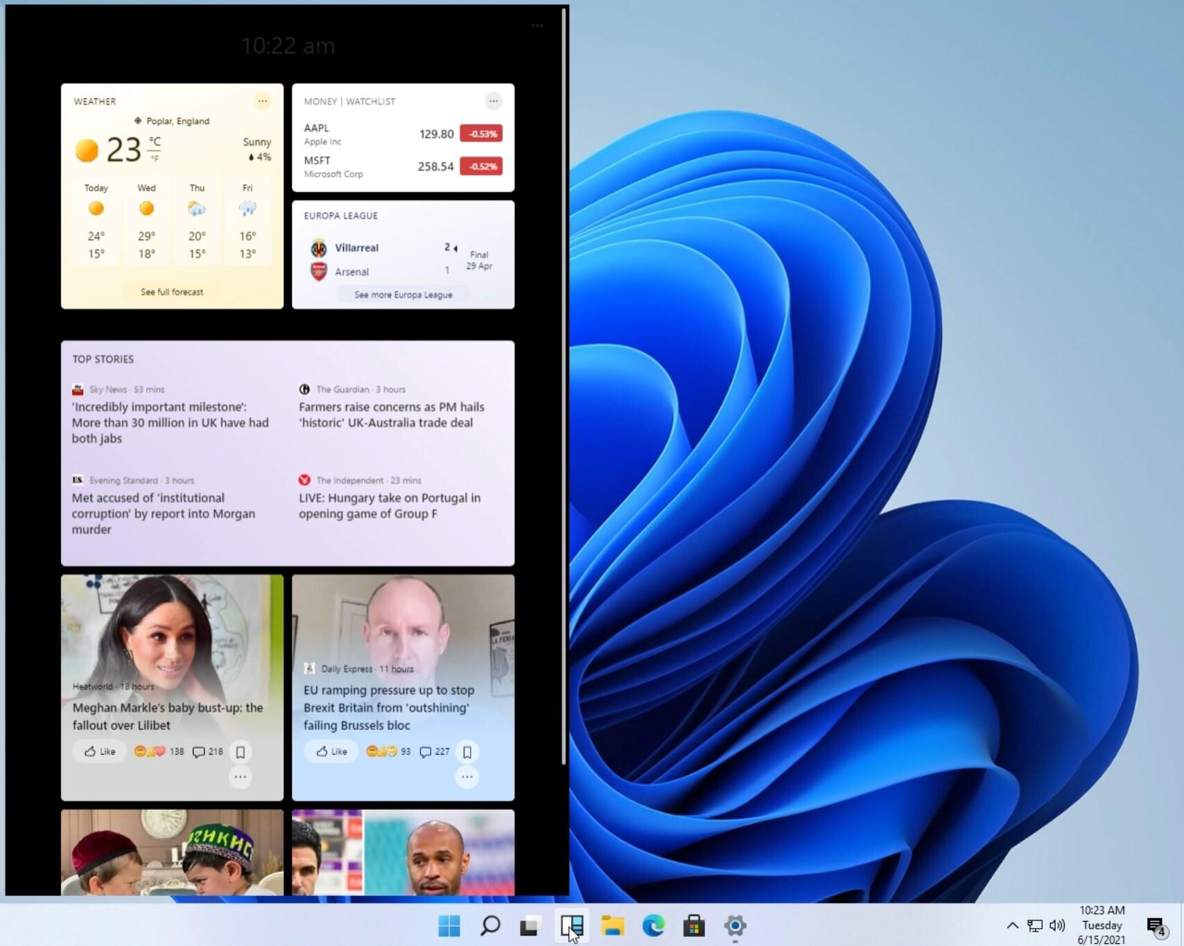
Alleged screenshots of Microsoft's upcoming operating system, the Windows 11, were leaked to the web ahead of its June 24 unveiling. The screenshots reveal a user interface that has several tie-ins with the current Windows 10, although enough is there to set it apart. For starters, the Start "menu" (if you can call it that), looks less like a menu, and more like a pop-out window with icons and actions, much like the macOS Finder. Icons pinned to the taskbar or open, are centered. The clock and system tray is still where it should be.

Windows Explorer features a familiar ribbon-type user interface, although there are changes to the icons. It's laid out exactly like in Windows 10. A thing to notice here is the window theme itself, which is single-tone, and with rounded edges. The "News and Interests" menu that surfaced in the recent Windows 10 update is more full-featured. User interface is only a fraction of what makes up a Windows major version, and Windows 11 is said to feature major under-the-hood changes, such as a new scheduler that's better suited for the upcoming hybrid x86 core processors from Intel and AMD.


View at TechPowerUp Main Site
 
Does it improve FPS that's all we care about.
 
Does it improve FPS that's all we care about.
I dunno... stability, security, usability, flexibility, customization... those are pretty important.
 
Bring back the Windows 7 transparent shiny gloss to the windows/taskbar, looked way better than this current matt flat look we have now days.
 
Classic MS - we don't know what to do so let's move things around and see what happens.
You simply have to use Teams for month to see how chaotic they are in their execution.
 
TBH. This Ui smells like it was a Ui designed for mobile devices.
 
Bring back the Windows 7 transparent shiny gloss to the windows/taskbar, looked way better than this current matt flat look we have now days.

To be honest Vista and 7 were the best looking OSes from Microsoft ever. Since W8 it's been all downhill.

TBH. This Ui smells like it was a Ui designed for mobile devices.

Um, what? Have you been living under the rock? This has been the idea since Windows 8.
 
TBH. This Ui smells like it was a Ui designed for mobile devices.

So. Much. Padding.

Every icon is a million miles apart and you can't tighten the grid. Just wasting screen space for the hell of it.

Screen Shot 2021-06-15 at 12.47.53 PM.png
 
TBH. This Ui smells like it was a Ui designed for mobile devices.

Oh god, Microsoft already destroyed Nokia, are they after another Phone/Mobile company? :pimp:
 
So just Windows 10X.
 
You simply have to use Teams for month to see how chaotic they are in their execution.
Not sure what you mean. Company I work for, switched to Teams a couple of months ago as their main webex service. Have been using it at work every single day since then. Haven't experienced any major issues with it.
 
Not sure what you mean. Company I work for, switched to Teams a couple of months ago as their main webex service. Have been using it at work every single day since then. Haven't experienced any major issues with it.
So you must have been having some meetings right? Participants displayed above, next week on the right, then arranged in a grid. Three people in a call, their icons are displayed in dead center so it looks like Teams' cross-eyed. "Let's add applause action".
And yet they still can't get the stupid screen sharing right. Just today I was able to turn on the camera of person that was sharing the screen by clicking... invisible icon that was in the correct place.
The worse part is that MS has convinced people that they no longer need to provide people RDP access, they simply have a meeting and share their screen to you and grant you control, right?
 
Those new icons look like my first attempts at SVG pictograms in Inkscape... Current set is at least passable, I hope they'll leave the option to switch back.
OSXy taskbar is a good thing. I've been using something like this on Ubuntu and older versions of Windows(since XP), but ended up being too lazy to find a solution to realign my app buttons in W10.
The rest - don't care about and will likely disable. Can't even stand their new weather widget near system tray, which requires you to sign in with MS account in order to change locale and location.
Oh god, Microsoft already destroyed Nokia, are they after another Phone/Mobile company? :pimp:
That's what I thought before, but given their recent history I think Nokia destroyed Nokia. Their refreshed smartphone business was promising, but formally lasted a year with one product lineup cycle. No proper flagships since my Nokia 8, no OLED models, not a hint of "legendary reliability"... everything is sub-mediocre and overpriced, even feature phones.
 
I dunno... stability, security, usability, flexibility, customization... those are pretty important.
I suppose... MS does have a few XBoxes to sell.
 
It looks exactly like windows 10 to me.
 
Um, what? Have you been living under the rock? This has been the idea since Windows 8.

Im just saying. Water is wet.

In terms of 'mobile devices' I mean devices like tablets such as their surface tab. This Ui looks very android or macOS like
 
Does it improve FPS that's all we care about.

It must have something new for DirectX. ..Vulkan 2.0 should be here by the end of the year or first quarter next year. I just know Vulkan 2.0 is is being worked on...
 
Rounded corners you say. Hey MS, my video card and monitor can display more than 8 colours. Just saying ;)

1623790593388.png
 

Attachments

  • 1623790561781.png
    1623790561781.png
    168.1 KB · Views: 189
It just seems somehow right that Microsoft declared Windows 10 would be the last version of Windows then not even change the name for the next version. I just thought they meant they were going to change them name of their operating system to something else.
 
So you must have been having some meetings right? Participants displayed above, next week on the right, then arranged in a grid. Three people in a call, their icons are displayed in dead center so it looks like Teams' cross-eyed. "Let's add applause action".
And yet they still can't get the stupid screen sharing right. Just today I was able to turn on the camera of person that was sharing the screen by clicking... invisible icon that was in the correct place.
The worse part is that MS has convinced people that they no longer need to provide people RDP access, they simply have a meeting and share their screen to you and grant you control, right?

OK, yeah, now that you mention it, I agree. I constantly look for my participant's list when I share my screen. Pretty annoying alright. Ok, you got me on board for your cause :)
 
No thanks.

Got my hands on a Windows 11 .iso, time to test this out.

It's not for everyone I guess.

Cool, if you can be bothered let me/us know how Win11 is, cheers.
 
Back
Top