 4
Gigabyte MO27Q28GR Review - Gloss Without the Glare
Response Time, Input Lag & Motion Blur »Picture Quality
The MO27Q28GR uses LG Display's fourth generation WOLED panel with the Primary RGB Tandem structure. At 2560×1440 across 27 inches the pixel density works out to roughly 109 PPI with a 0.2292 mm dot pitch, which is the standard figure for this class and comfortable enough for desktop work at normal viewing distance.The RGWB subpixel layout still puts a white subpixel alongside the three colored ones, and that still produces some color fringing at the edges of high-contrast text. The reordering in this generation genuinely helps, and it is visibly less distracting than on third generation WOLED panels, but it has not been entirely eliminated. For gaming, video and mixed use it is a non-issue. If you spend your day in a text editor, you will notice it.
Ambient light behavior is the whole reason this model exists, so it deserves a proper answer rather than a hedge. I wrote a substantial portion of this review in a home office on a sunny day, with the blind up on a large double window positioned perpendicular to the desk. That environment defeats most glossy screens. It did not defeat this one. As long as the window itself is not reflected in the panel, the brightness of the room barely registers as an obstacle, for gaming or for anything else. What you must avoid is a direct light source behind you firing into the screen, meaning a lamp or a window at your back rather than beside you. Position the monitor sensibly and the RealBlack Glossy coating delivers what it promises: deep, neutral blacks in a lit room, with the sharpness and depth that only a gloss surface gives you.
The usual OLED fundamentals apply. Every pixel is its own light source, so contrast is effectively infinite, black is genuinely black, and there is no backlight bleed, no clouding and no blooming around bright objects. That combination is still not available from any LCD backlight architecture at any price.
To test picture quality, I used an X-Rite i1Display Pro colorimeter with both Calman Ultimate, the industry-standard suite for display testing and calibration, and DisplayCAL - a free, powerful display calibration and profiling tool.
Picture Quality at Factory Settings
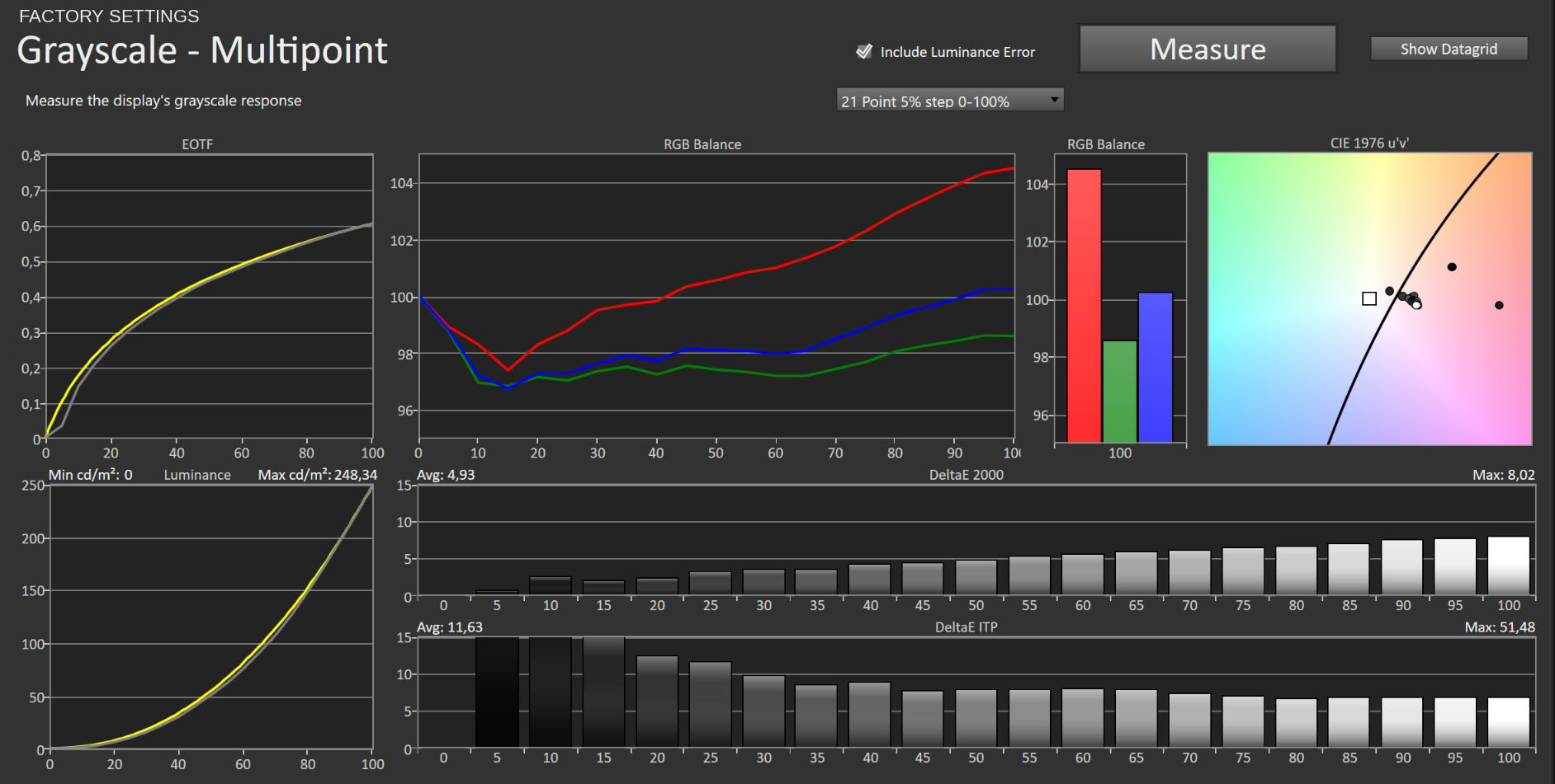
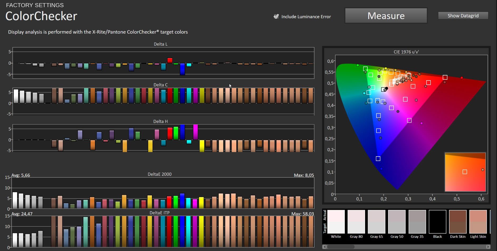
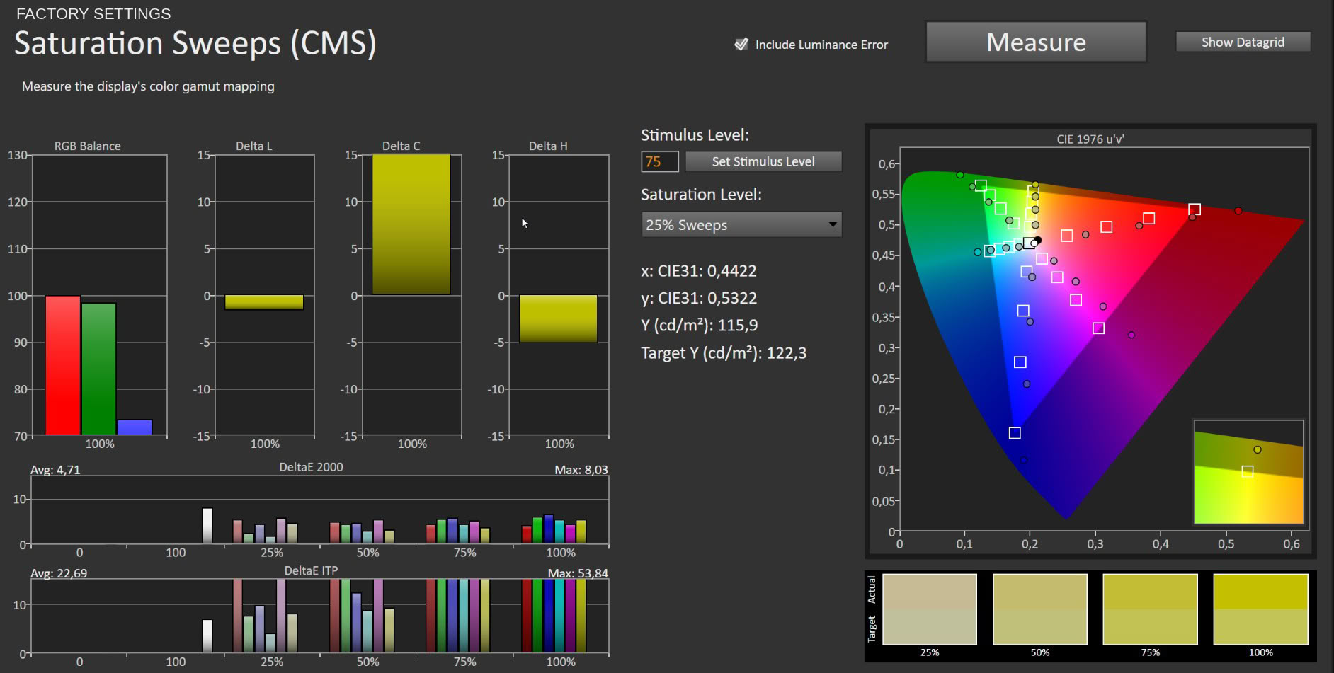
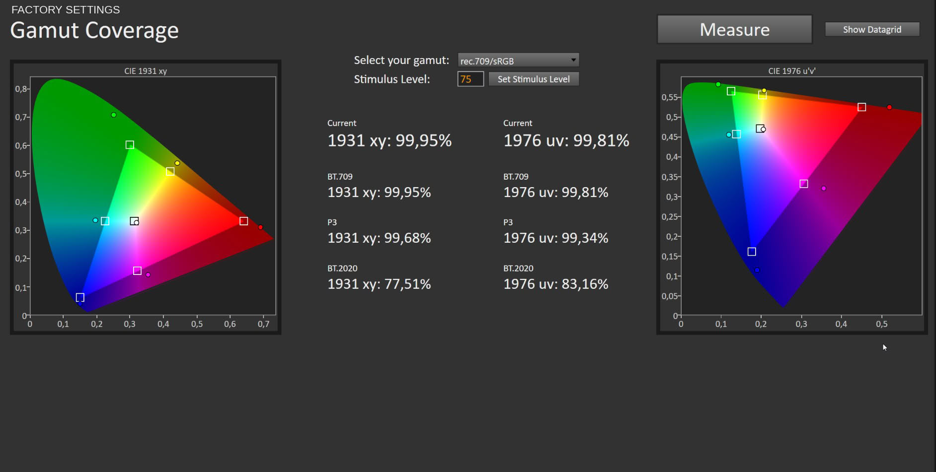
The monitor arrives in the Standard picture profile with the native gamut unrestricted, and the gamut measurement is the good news. Coverage reaches 99.95% of sRGB, 99.68% of DCI-P3 and 77.51% of BT.2020. Gigabyte's 99.5% DCI-P3 claim is not marketing rounding; the panel actually gets there. Grayscale is the weak point. Average ΔE measures 4.93 with a maximum of 8.02, and the RGB balance graph shows exactly why: red climbs steadily from about 20% stimulus upward and keeps climbing to white, while green and blue sit below it. The result is a warm cast that intensifies with brightness.
There is an interesting wrinkle here for anyone cross-referencing reviews. I tested the matte MO27Q28G on the same equipment, and its factory imbalance ran the other way: green underrepresented against red and blue, with an average grayscale ΔE of 4.1. Same panel generation, same chassis, same firmware family, opposite error. That tells you the factory calibration on these units is loose enough that the direction of the error is essentially a lottery, which in turn means the correction values I give below are a starting point rather than a guarantee for your specific unit.
Color accuracy in Standard returns 5.66 average ΔE with a maximum of 8.05, and saturation sweeps land at 4.71 average and 8.03 maximum. Reading the component breakdown, the dominant term is Delta C rather than Delta H, so the panel is oversaturating rather than misreading hues. That is native gamut behavior measured against an sRGB target, and it is expected. For games and video the result is vivid and appealing. For sRGB work it is wrong, and the grayscale error compounds it.
Picture Quality with sRGB Profile
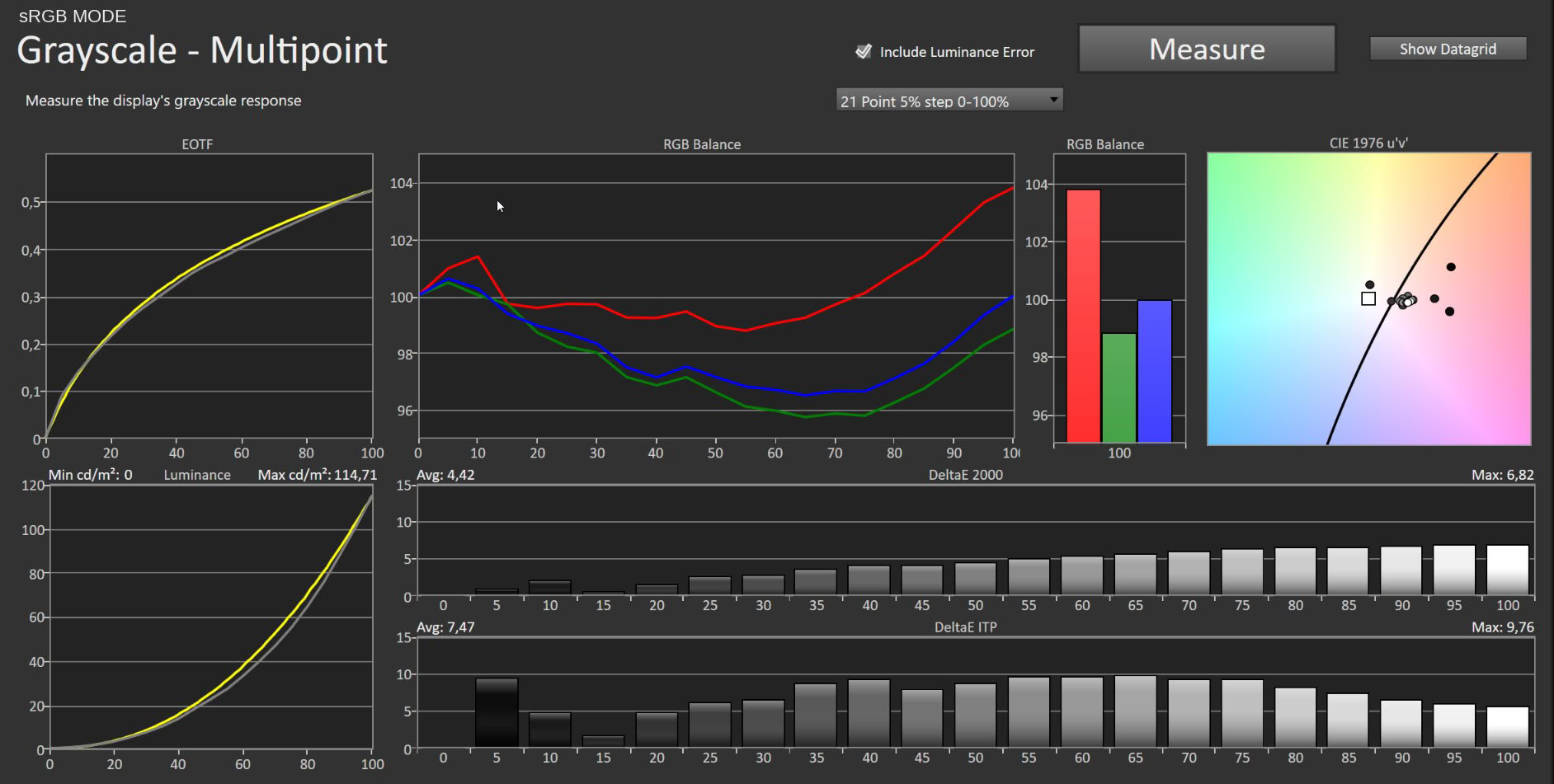
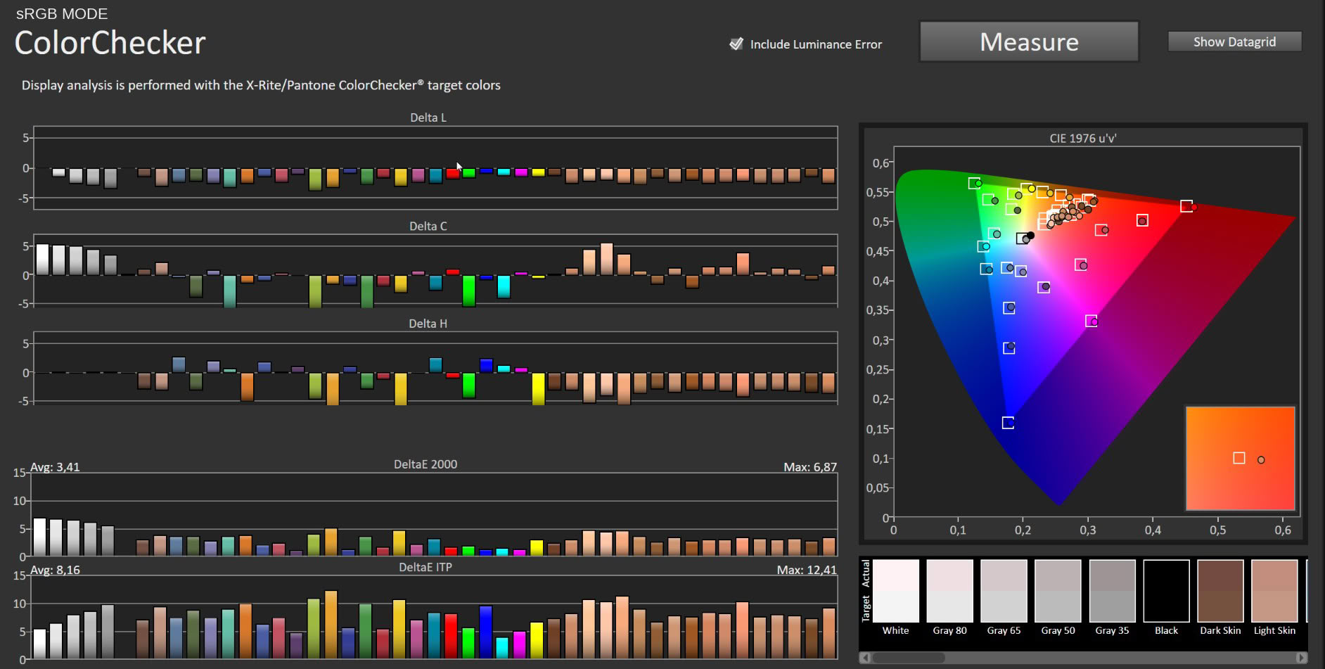
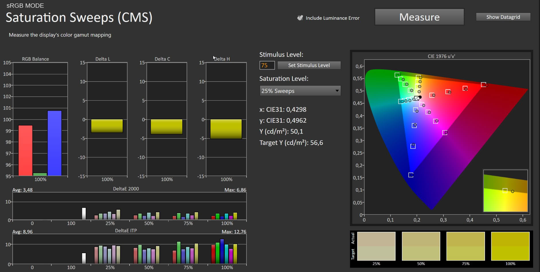
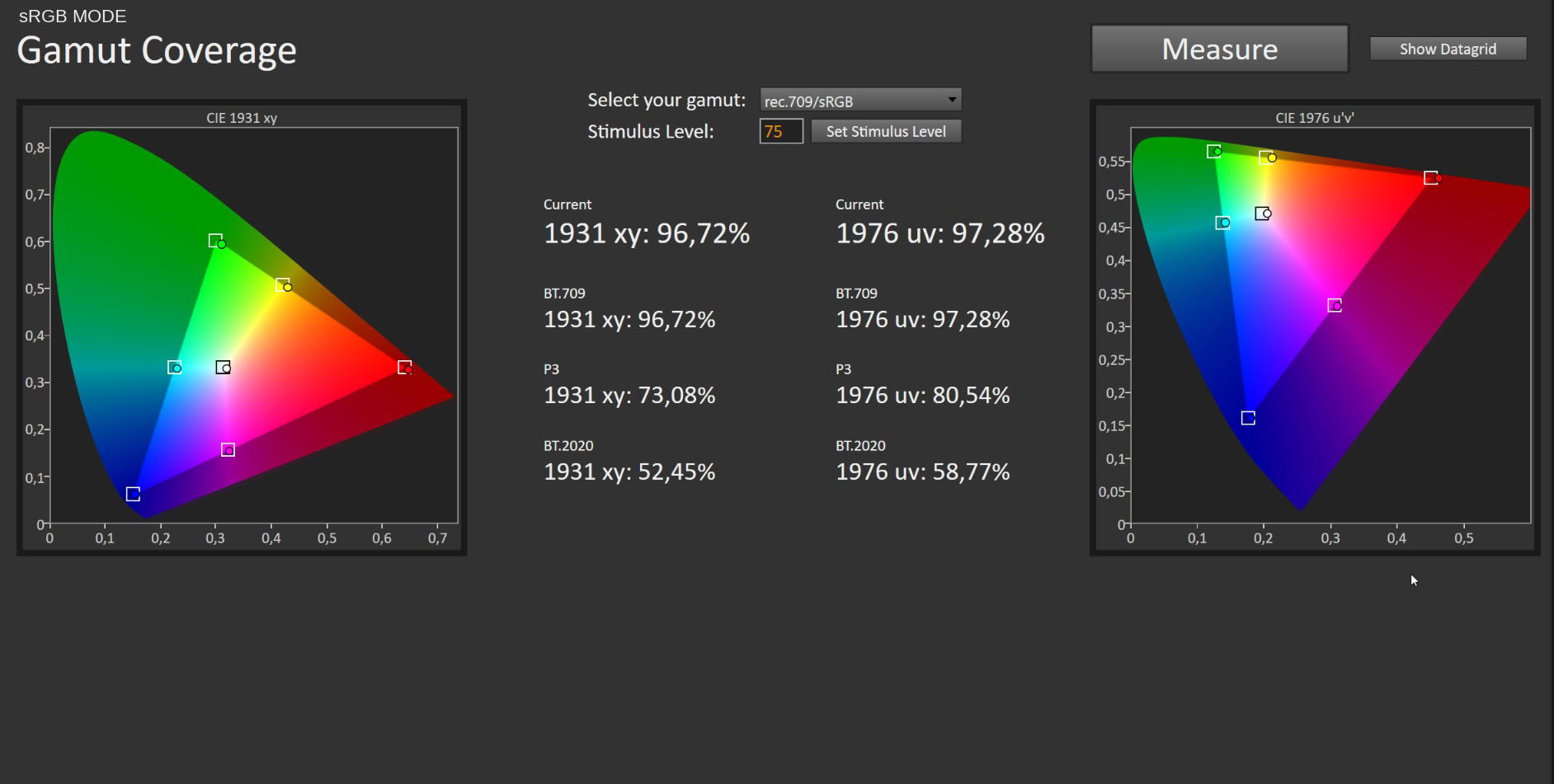
The sRGB profile clamps the gamut properly. Coverage falls to 96.72% of sRGB, 73.08% of DCI-P3 and 52.45% of BT.2020. The oversaturation disappears and color accuracy improves accordingly, to 3.41 average ΔE with a 6.87 maximum, and 3.48 average with 6.86 maximum on saturation sweeps. What the profile does not do is touch the white point. Grayscale stays at 4.42 average ΔE with a 6.82 maximum, essentially unchanged from Standard, and the red surplus is still sitting there in the RGB balance graph. As a gamut reference for a specific job the sRGB profile is fine. As a daily driver it is not, and for anyone who needs genuine colorimetric accuracy, hardware calibration remains the only real answer.
Picture Quality with Modified Settings
Everyone else will get more out of this panel by correcting it manually, which takes two adjustments:Picture > Custom > Color Temperature > User Define > R 97/G 100/B 99
Picture > Custom > Brightness > 66
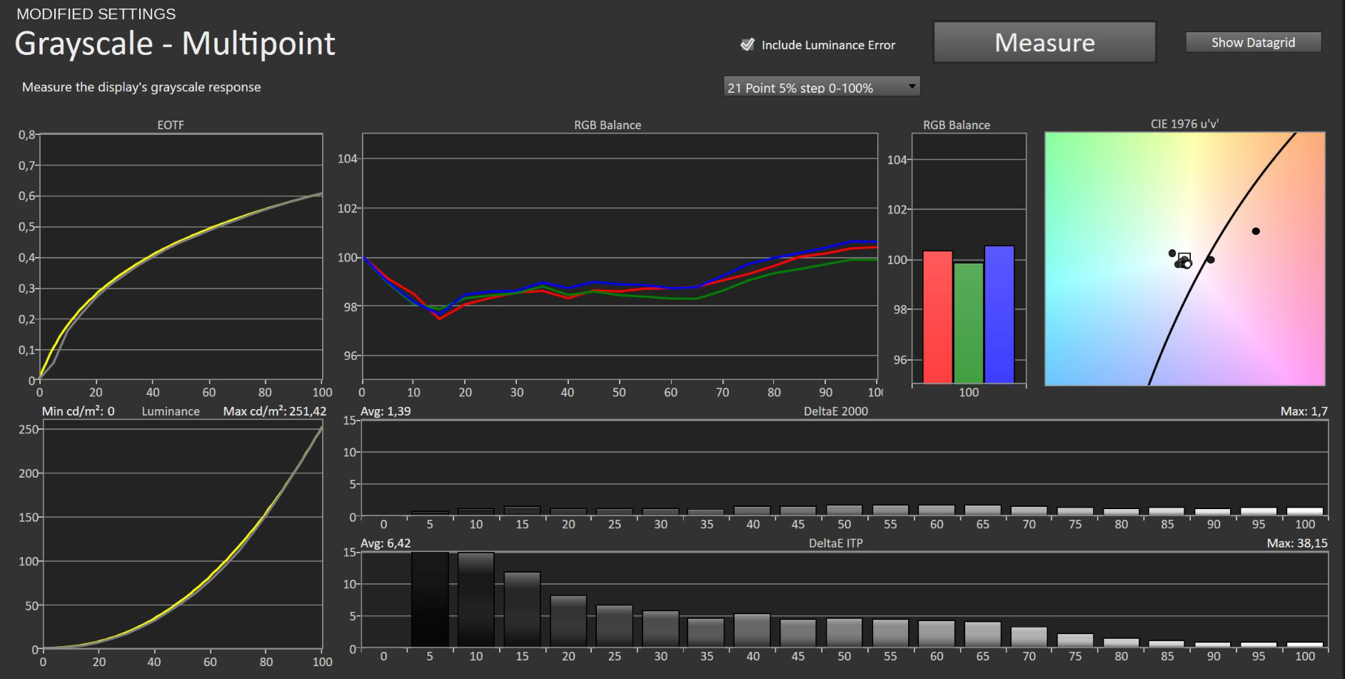
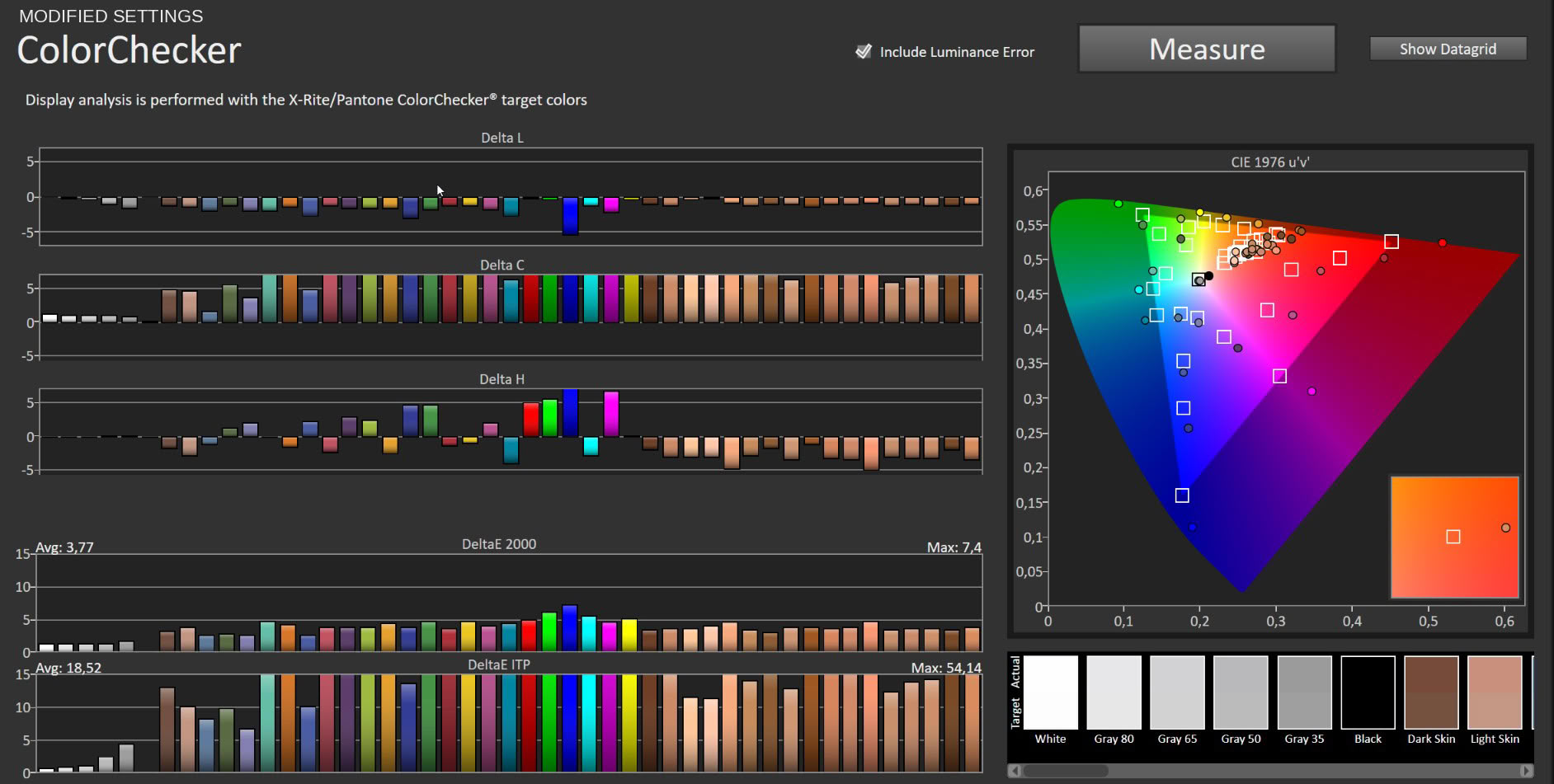
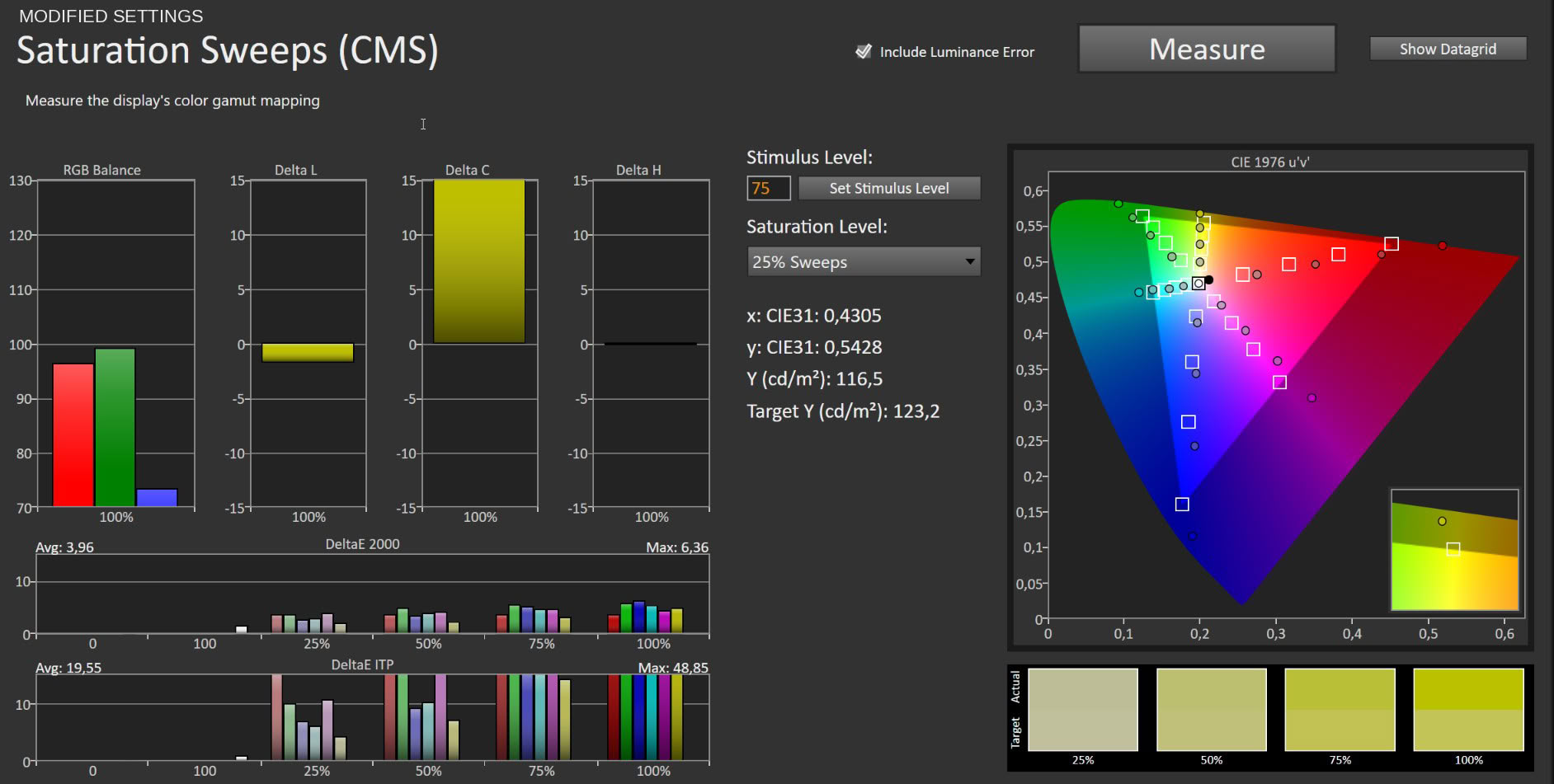
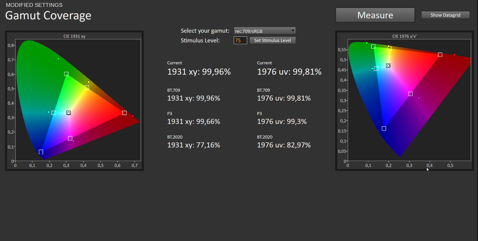
After these simple changes, the average grayscale ΔE drops from 4.93 to 1.39, with a maximum of 1.7. Both figures sit under the threshold where errors become visible, and the low maximum is as important as the average because it means the improvement is uniform rather than an average hiding a bad region. The three channels now track together across the range, the white point lands close to the 6,500 K reference, and the EOTF curve follows 2.2 without the shadow compression that factory settings introduce. Brightness 66 produced 251.42 cd/m², which is where I prefer to sit for mixed day and night use.
None of this costs you the wide gamut. Custom mode leaves the panel unclamped and measured coverage is unchanged. Color accuracy against sRGB targets comes in at 3.77 average ΔE with a 7.4 maximum in the color accuracy test and 3.96 average with 6.36 maximum on saturation sweeps, and as before those errors are chroma rather than hue, driven by the panel reaching past the sRGB boundary rather than by anything being wrong.
Two OSD values, no calibration hardware, and the panel goes from mediocre to genuinely good. Do it before you do anything else with this monitor.
Luminance, Contrast and Color Uniformity
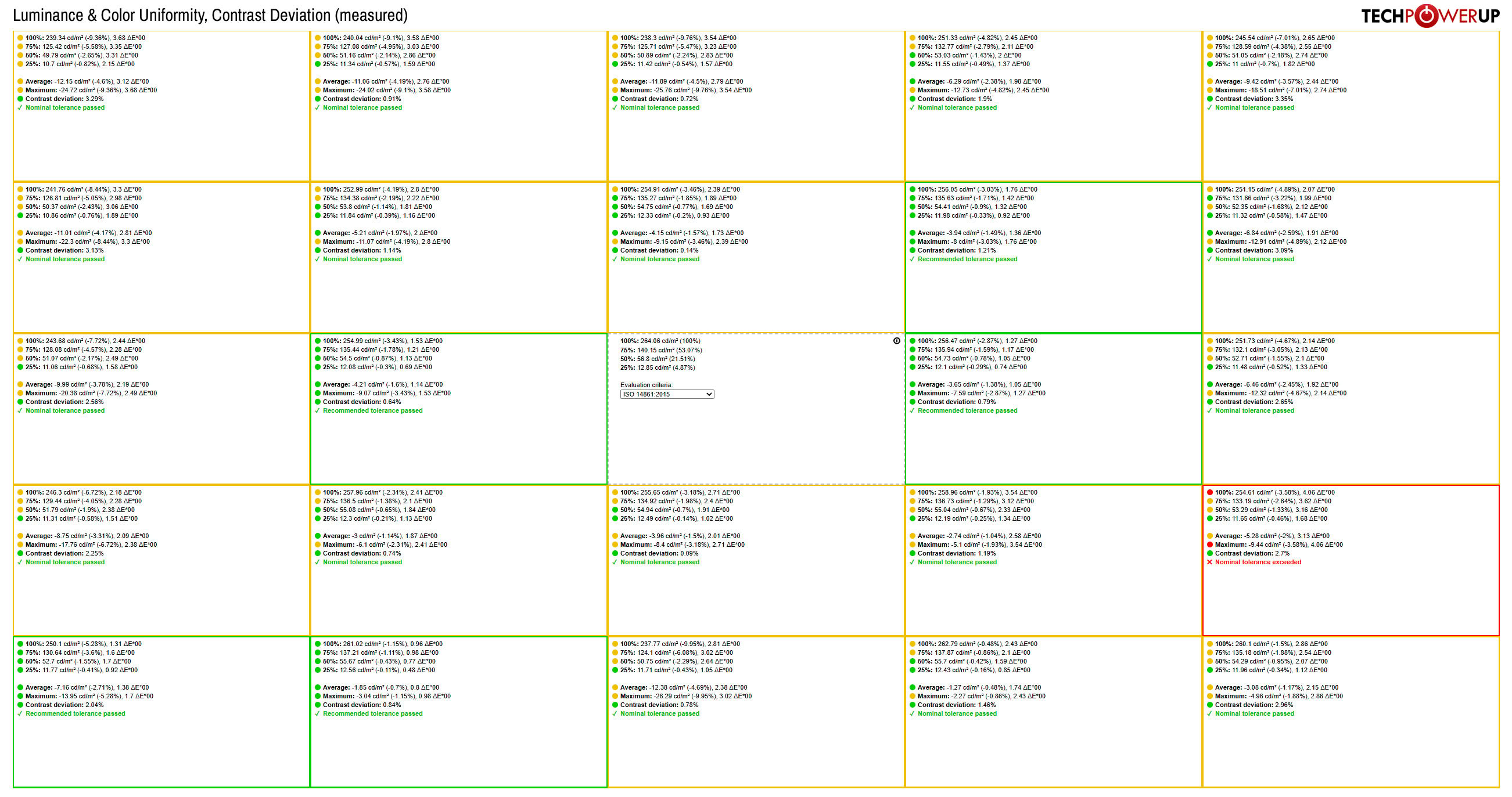
Uniformity is the weakest result in this review. Against a 264.06 cd/m² center reference, most zones pass nominal ISO 14861:2015 tolerance and five of them clear the tighter recommended tolerance, but one zone toward the lower right fails nominal tolerance outright, with 4.06 ΔE and 2.7% contrast deviation. Luminance deviations elsewhere reach roughly 10% in the upper left and along the bottom edge.
For context, the matte MO27Q28G I tested previously held most of its measurement grid within recommended tolerance with luminance deviations largely under 3%, so this is not a characteristic of the panel generation. It is unit variance, and this particular unit drew a worse hand. In practice none of it is visible in games, video or normal desktop content. Put a flat mid-gray field on the screen and you will find it.
HDR Performance
The Gigabyte MO27Q28GR supports HDR10 and carries VESA DisplayHDR True Black 500 certification, and the monitor switches between SDR and HDR automatically as soon as you toggle HDR in Windows.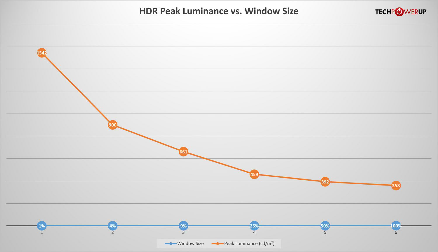
In the HDR Peak 1500 profile the panel measured 1,542 cd/m² on a 1% window, 900 cd/m² at 4%, 661 cd/m² at 9%, 459 cd/m² at 25%, 392 cd/m² at 50% and 358 cd/m² across a full white field. The 1% figure exceeds the rated 1,500 cd/m², which almost never happens, and it is worth noting that Gigabyte ties its specification to 1.5% APL while my measurement is taken at 1% of screen area. These are the highest peak luminance figures I have recorded from an OLED monitor.
They come with a caveat that the numbers themselves make plain. Dropping from 1,542 to 661 cd/m² between the 1% and 9% windows is a very steep ramp, and a profile that adjusts luminance that aggressively will show it. In content where the average picture level swings quickly, HDR Peak 1500 visibly rides the brightness up and down, and it also applies looser tone mapping than the standard profile does. For most HDR gaming and video I would use the plain HDR profile instead. It gives up a great deal of peak output, but it holds a steadier image and tracks color more accurately, and the difference in how the two look across an actual film or game session favors the conservative option more often than the spec sheet suggests.
Gigabyte offers HyperNits on top, available only under HDR Peak 1500 and in High and Medium settings. The name oversells it slightly, because HyperNits does not raise the panel's physical ceiling at all: peak luminance across window sizes measures the same with it on and off. What it changes is the shape of the EOTF curve, the mapping that turns a digital signal into actual light. Instead of lifting the peak target, it raises mid-tones while protecting highlight detail from clipping, so the image reads as brighter and fuller while the panel emits exactly as much light as before. Gigabyte quotes up to 30% for High and around 20% for Medium, the latter aimed at darker rooms. It is smarter use of existing capability rather than new capability, and it addresses the real complaint about peak-oriented HDR profiles, which is that the average scene ends up looking darker than it should.
Viewing Angles
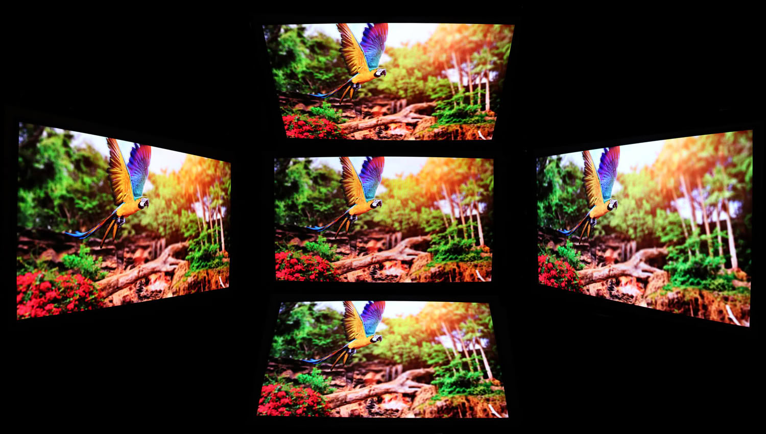
Viewing angles are excellent, as they are on every OLED panel. Color and contrast hold steady from any seated position with no shift off axis.
OLED Burn-in Prevention
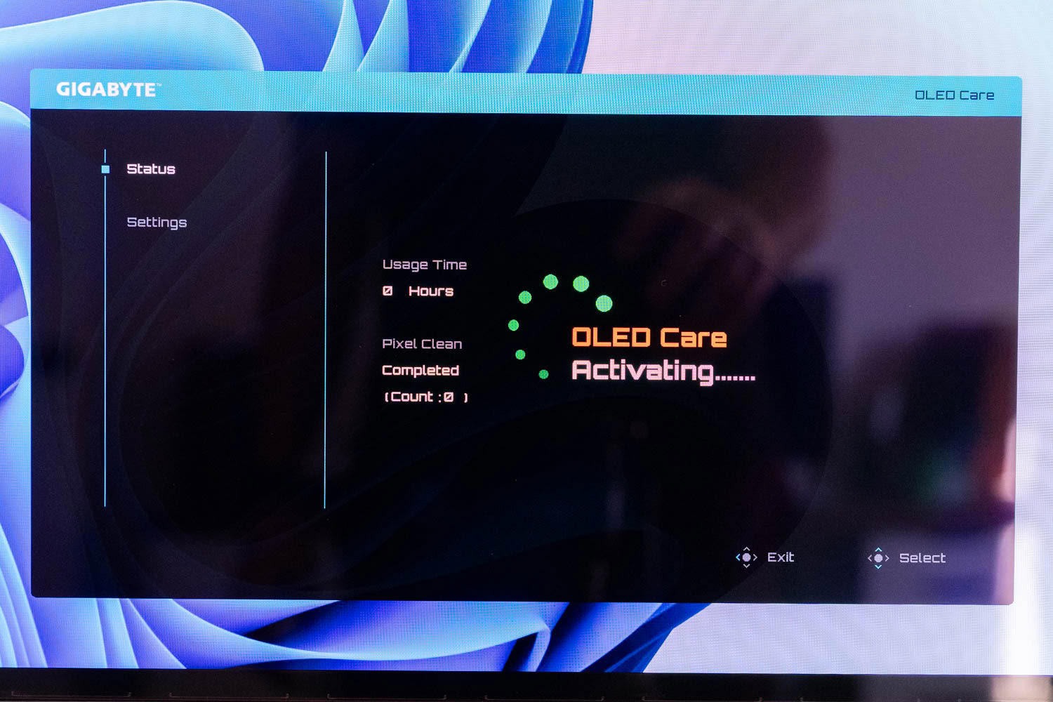
Burn-in mitigation runs under AI OLED Care, reached from the quick menu, and it opens on a Status page rather than a settings list. That page shows accumulated panel usage time and the state of the last Pixel Clean cycle along with how many have run, which is more transparency than most manufacturers offer. Knowing how many hours are on the panel and when it last compensated turns burn-in from something you worry about abstractly into something you can actually check.
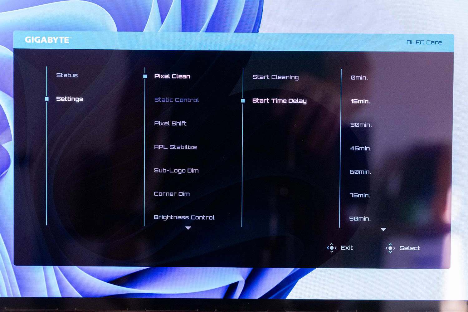
Settings holds the working set. Pixel Clean can be triggered immediately with Start Cleaning or deferred through Start Time Delay, which offers intervals from zero to 90 minutes and beyond, so the compensation routine waits until you have stepped away rather than interrupting whatever you were doing. Below it sit Static Control, Pixel Shift, APL Stabilize, Sub-Logo Dim, Corner Dim and Brightness Control, which between them cover static content detection, subtle image movement, average picture level management, and targeted dimming of persistent logos, HUD elements and screen corners.
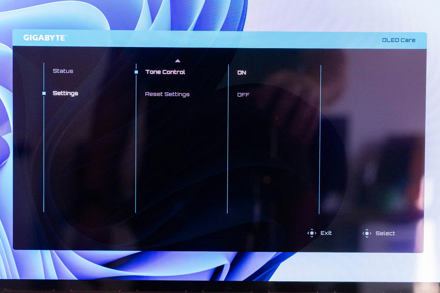
The last entry is the one worth singling out. Tone Control does not prevent wear at all; it compensates for wear that has already happened. Organic emissive materials do not degrade at the same rate across red, green and blue, so an aging OLED panel drifts in color temperature as one channel fades faster than the others. Tone Control adjusts the balance over time to counteract that drift and hold the white point where it should be. It is the only item in this menu addressing the panel's long-term condition rather than its daily use, and its presence says something about how seriously Gigabyte is treating longevity here.
The point of the whole system is that the burden is not on you. The monitor watches for the patterns that actually cause wear, meaning static HUD elements, the Windows taskbar, application chrome and anything else that sits in one place for hours, and dims those regions specifically rather than the whole image. Nobody buying an OLED in 2026 should be policing their own desktop for static content, and with this running you do not have to.
Gigabyte covers the panel with a three-year warranty that explicitly includes burn-in, which remains the most concrete protection available regardless of what the software does.
Nov 19th, 2026 22:34 PST
change timezone
Latest GPU Drivers
New Forum Posts
- Honestly, do you care about GTA VI? (178)
- Anthrophics IPO (10)
- WarpCoreBench scores! (78)
- How to prevent OLED burn damage due to PC freezes or power outtages? (39)
- TPU's Nostalgic Hardware Club (22172)
- RX 7600 + Ryzen 5 5600GT getting the same FPS as my old RX 6500 XT – What am I missing? (5)
- GTA VI (11)
- GPU Temperatures Rise Very Quickly in FurMark – Is This Normal? (18)
- Time to upgrade CPU and MOBO (72)
- Dual B70 or Dual R9700 Pro on Linux (13)
Popular Reviews
- AMD Zen 6 Technical Deep Dive
- Ugreen NASync DXP4800 GT Review
- Acemagic Retro X3 Review
- Upcoming Hardware Launches 2027 (Updated Nov 2026)
- Corsair RM1200e (Second Generation) Review
- Pulsar Office Tour & First Look at P1 Dual-Sensor Mouse
- Biwin Black Opal NV7400 2 TB Review
- Chieftec Iceberg PRO 360 DARK Review
- AMD Ryzen 7 9800X3D Memory Performance Scaling
- AMD Ryzen 7 9800X3D Review - The Best Gaming Processor
TPU on YouTube
Controversial News Posts
- NVIDIA Co-Founder and CEO Jensen Huang Officially Resigns (490)
- Report: Jensen Huang Eyes NVIDIA Comeback (224)
- Open Letter Asking NVIDIA to Reinstate Jensen Huang Passes 115,000 Signatures (184)
- OpenAI CEO Argues Home PCs Waste the World's Limited DRAM Supply (152)
- NVIDIA Launches Investigation Into Jensen Huang's Relationship With Suspected Chinese Spy (136)
- Intel "Raptor Lake Next" 16-Core and 20-Core CPUs Surface (130)
- Legendary Game Studio BioWare Shuts Down Following EA Layoffs (104)
- Dell CEO Says the Memory Shortage Will Get Worse in 2027 (95)