 12
Gigabyte MO32U24 Review - Penta Tandem Hits Its Stride
Response Time, Input Lag & Motion Blur »Picture Quality
The Gigabyte MO32U24 uses Samsung Display's fourth generation QD-OLED panel with the five-layer Penta Tandem structure. At 3840×2160 across 31.5 inches, the pixel density is approximately 140 PPI with a 0.1814 mm dot pitch, which is comfortably into the range where Windows text renders cleanly.The subpixel layout remains triangular rather than a vertical RGB stripe, which on paper is the arrangement responsible for the color fringing that has followed QD-OLED around since the first generation. In practice, at this pixel density, it is a non-issue. I spent weeks on text-heavy work, spreadsheets, code and general desktop use without fringing ever pulling my attention, and I ran the display at 125% scaling rather than the 150% Windows suggests, which is the more demanding case. Anyone specifically hunting for it with a magnifier will find it. Nobody using the monitor normally will.
Ambient light behavior is the more interesting question with any QD-OLED, because the technology omits the circular polarizer that WOLED panels use to suppress reflected light. The ObsidianShield film is Gigabyte's mitigation, and it works better than I expected from a glossy surface. This is a gloss panel, but I used it without any difficulty in a room lit by daylight, and the purple cast that used to appear on earlier QD-OLED panels under those conditions is effectively gone. The one thing to avoid is a light source firing directly into the screen, meaning a lamp or a large window behind you rather than beside or ahead of you. Get the positioning right and perceived contrast stays high all day, which is not something I could have written about a glossy QD-OLED two generations ago.
The rest of the OLED fundamentals apply as always. Every pixel generates its own light, so contrast is effectively infinite, black is genuinely black, and there is no backlight bleed, no clouding and no halo around bright objects against dark backgrounds. No LCD backlight architecture matches this, regardless of how many dimming zones it has.
To test picture quality, I used an X-Rite i1Display Pro colorimeter with both Calman Ultimate, the industry-standard suite for display testing and calibration, and DisplayCAL - a free, powerful display calibration and profiling tool.
Picture Quality at Factory Settings
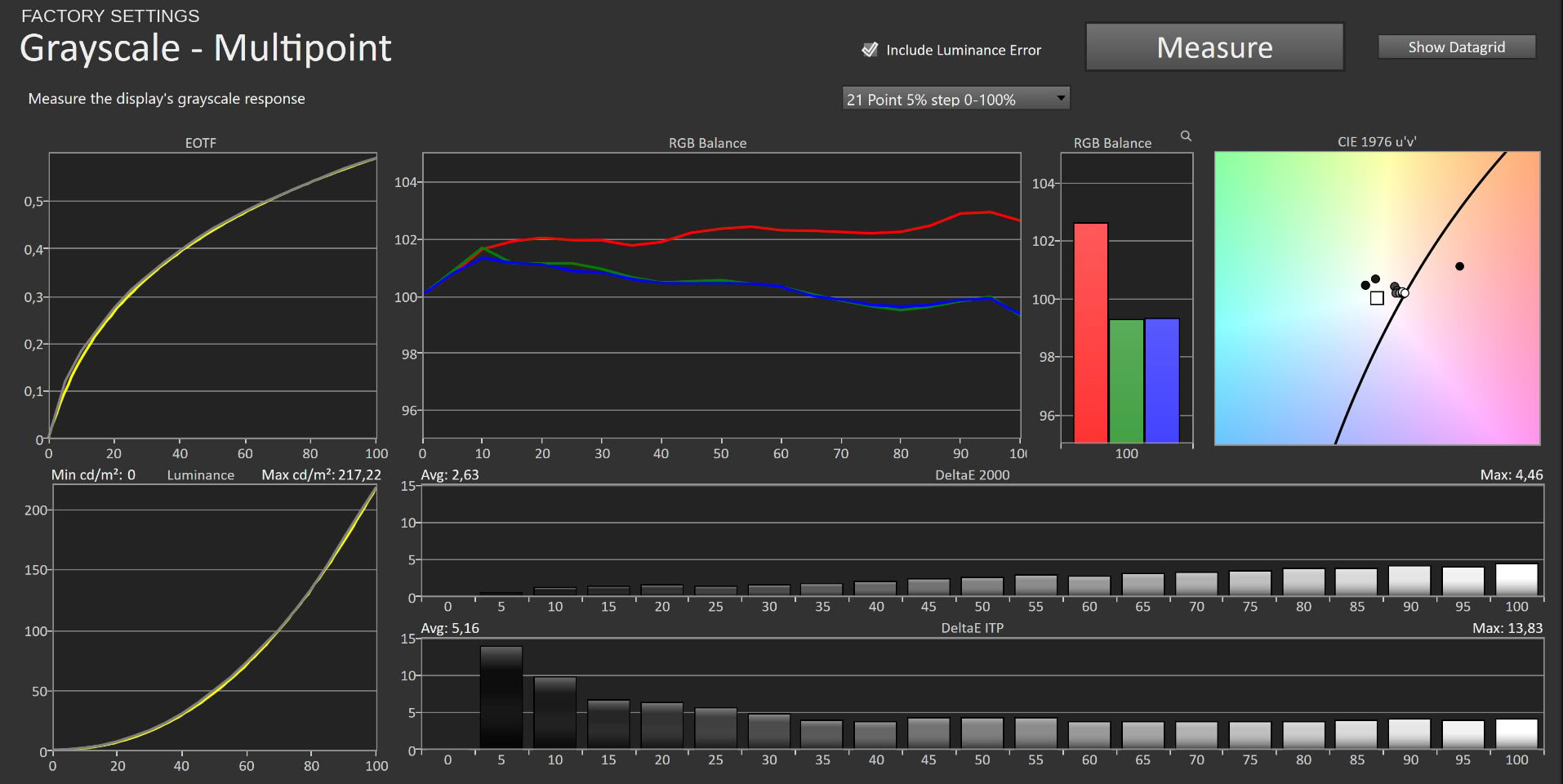
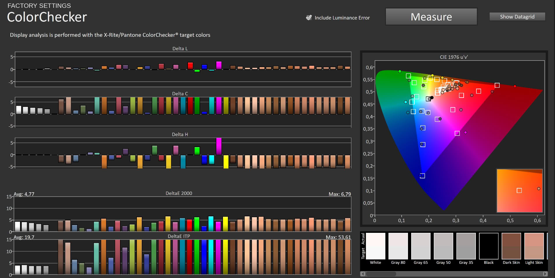
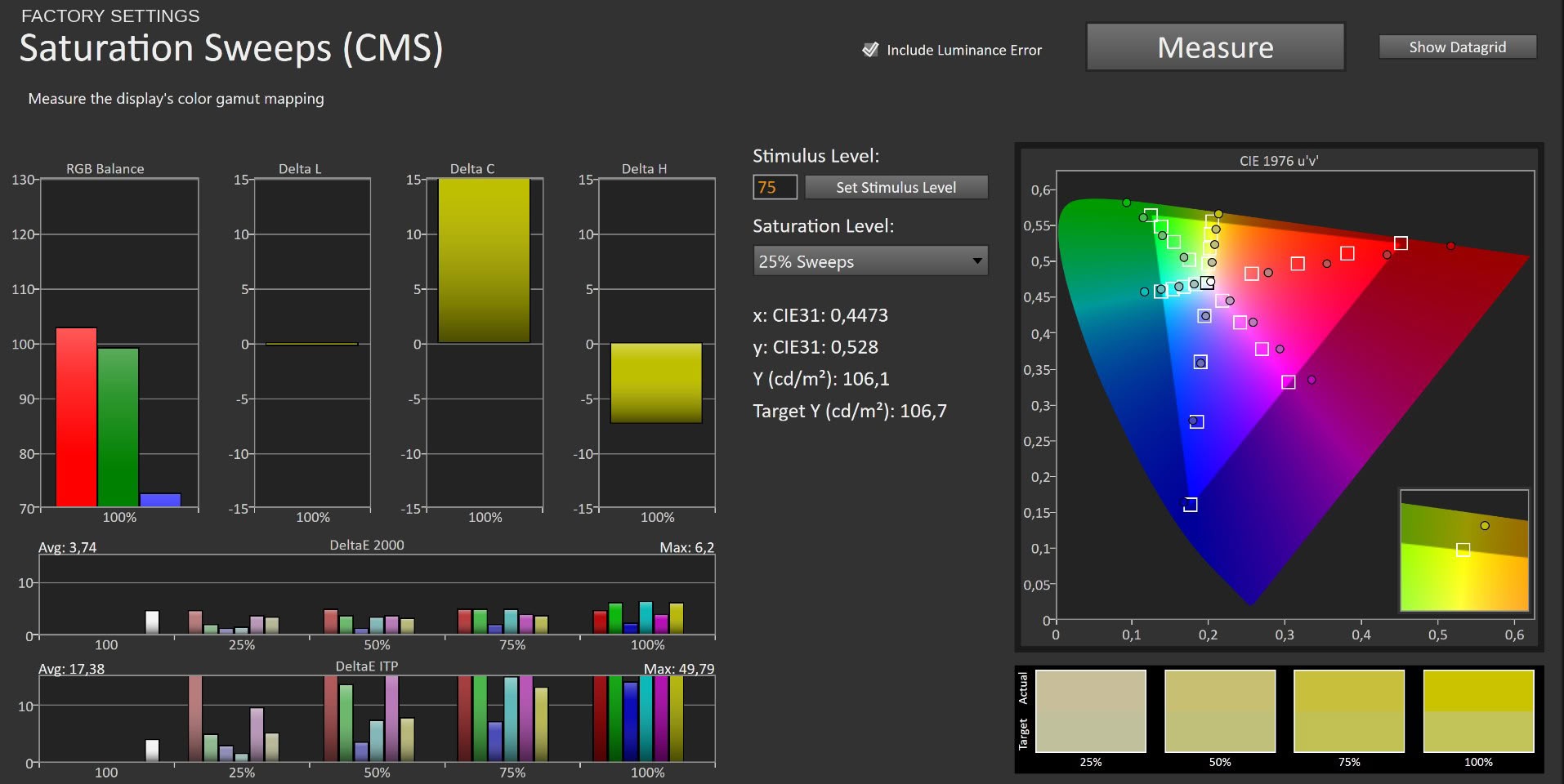
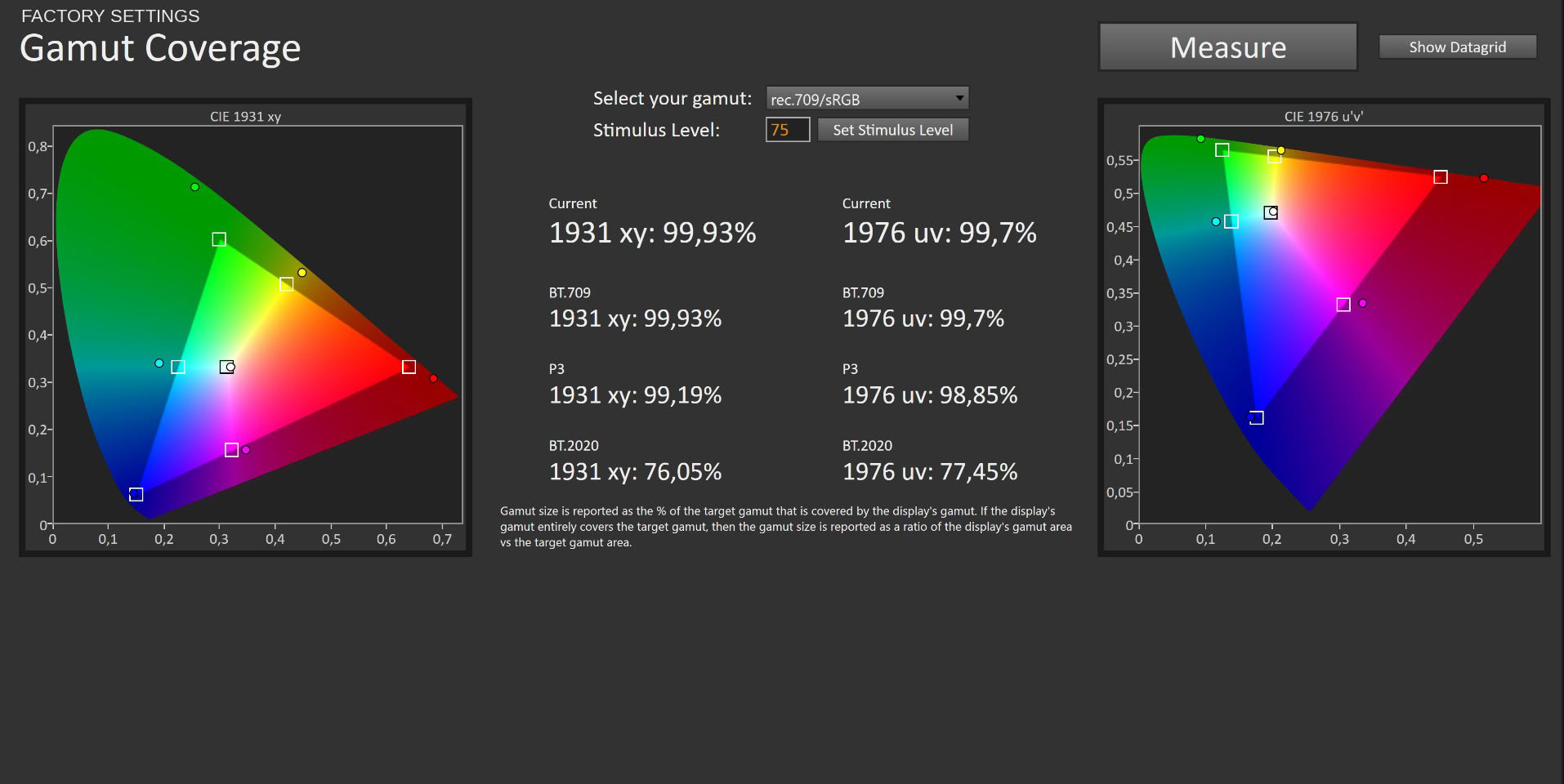
Out of the box the MO32U24 arrives in the ECO picture profile, with the panel running its full native gamut. Coverage is comprehensive: 99.93% of sRGB, 99.19% of DCI-P3 and 76.05% of BT.2020 in CIE 1931 xy, and 99.7%, 98.85% and 77.45% respectively in CIE 1976 uv. Hitting 99% of P3 is exactly what Gigabyte advertises, and the measurement backs it up without qualification.
Grayscale in ECO is respectable rather than exceptional, averaging 2.63 ΔE with a maximum of 4.46. The RGB balance graph explains where the error comes from: red sits roughly 2 to 2.5% above green and blue from about 15% stimulus upward, and the gap widens toward the top of the range. The result is a mild but consistent warm tint. EOTF tracking is clean throughout, with the measured curve sitting almost on top of the reference across the full luminance sweep. Maximum luminance in ECO measures 217.22 cd/m², which is on the conservative side for a power-saving preset but perfectly usable.
Color accuracy reflects the wide gamut running unclamped against sRGB targets. ColorChecker returns an average of 4.77 ΔE with a maximum of 6.79, and saturation sweeps come in at 3.74 average and 6.2 maximum. Looking at the component breakdown, almost all of the error is Delta C rather than Delta H, meaning the monitor is oversaturating rather than shifting hues. That is native gamut behavior working as designed, and for games and video it produces the punchy, saturated look people buy QD-OLED for. For sRGB-critical work it is the wrong starting point.
Picture Quality with sRGB Profile
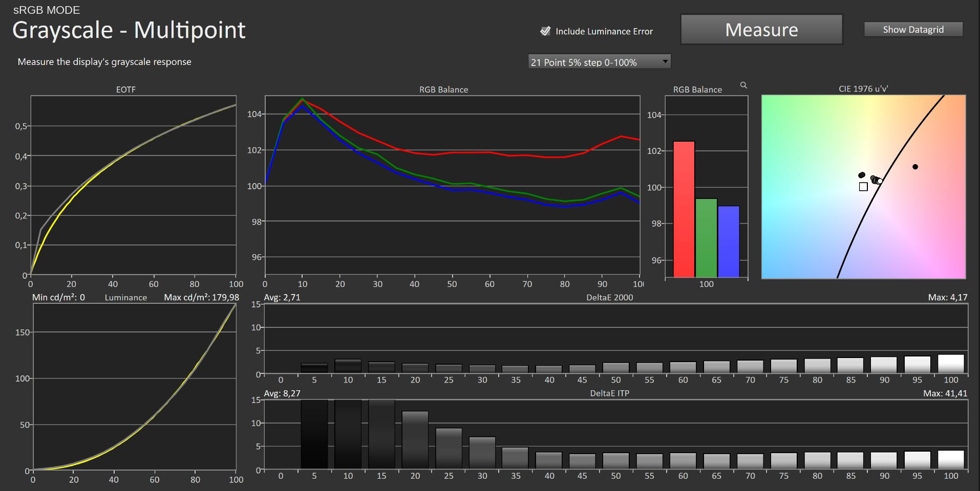
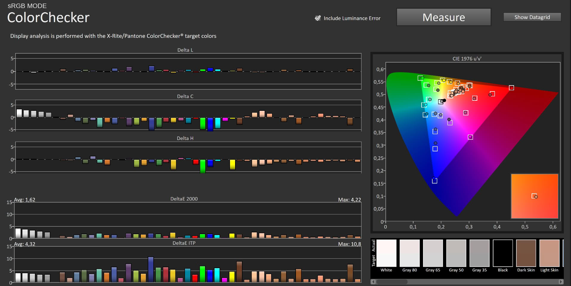
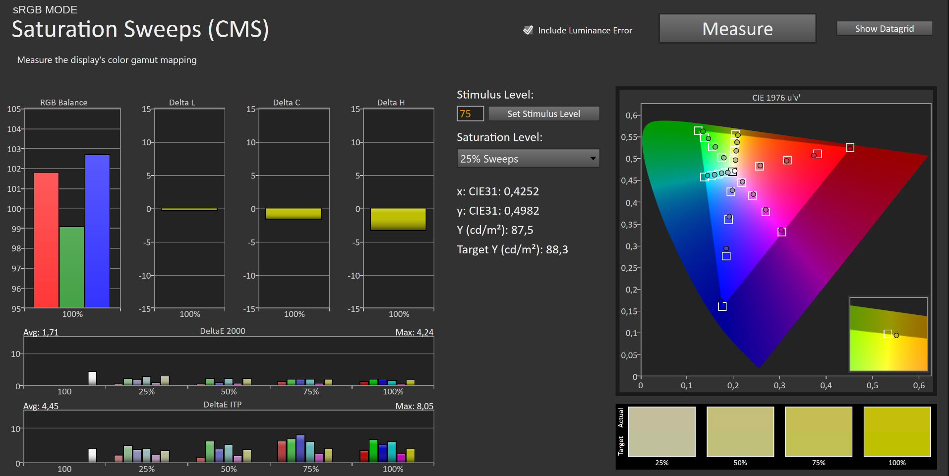
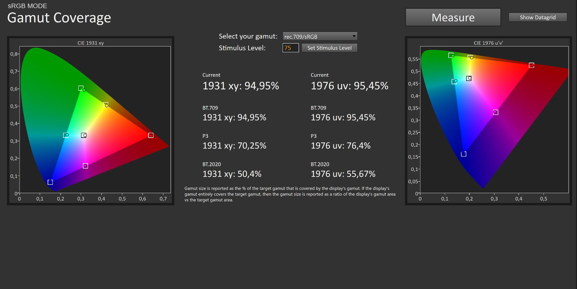
Switching to the sRGB picture mode applies a real clamp, and the measurements confirm it. Gamut coverage drops to 94.95% of sRGB, 70.25% of DCI-P3 and 50.4% of BT.2020 in CIE 1931 xy, with 95.45%, 76.4% and 55.67% in CIE 1976 uv. The P3 and BT.2020 figures falling by roughly 30% and 25% is what a functioning restriction looks like.
The payoff is immediate on color accuracy. ColorChecker improves to 1.62 average ΔE with a 4.22 maximum, and saturation sweeps tighten to 1.71 average and 4.24 maximum. Those are figures where errors stop being visible without a reference alongside. Grayscale, however, barely moves: 2.71 average ΔE with a 4.17 maximum, essentially unchanged from ECO, and the RGB balance graph shows the same red surplus with an additional spike near the bottom of the range where all three channels overshoot before settling. Luminance is also locked at 179.98 cd/m², dimmer than the default and not adjustable upward in any meaningful way.
The pattern here is familiar from Gigabyte's other OLED monitors. The sRGB mode clamps the gamut competently but leaves the white point alone, which limits how useful it is as a daily driver. If you need sRGB for a specific job, it does the job. If you want an accurate everyday desktop, keep reading.
Picture Quality with Modified Settings
To get the best out of the panel I made two adjustments in the OSD:Picture > Custom > Brightness > 83
Picture > Custom > Color Temperature > User Define > R 95/G 97/B 100
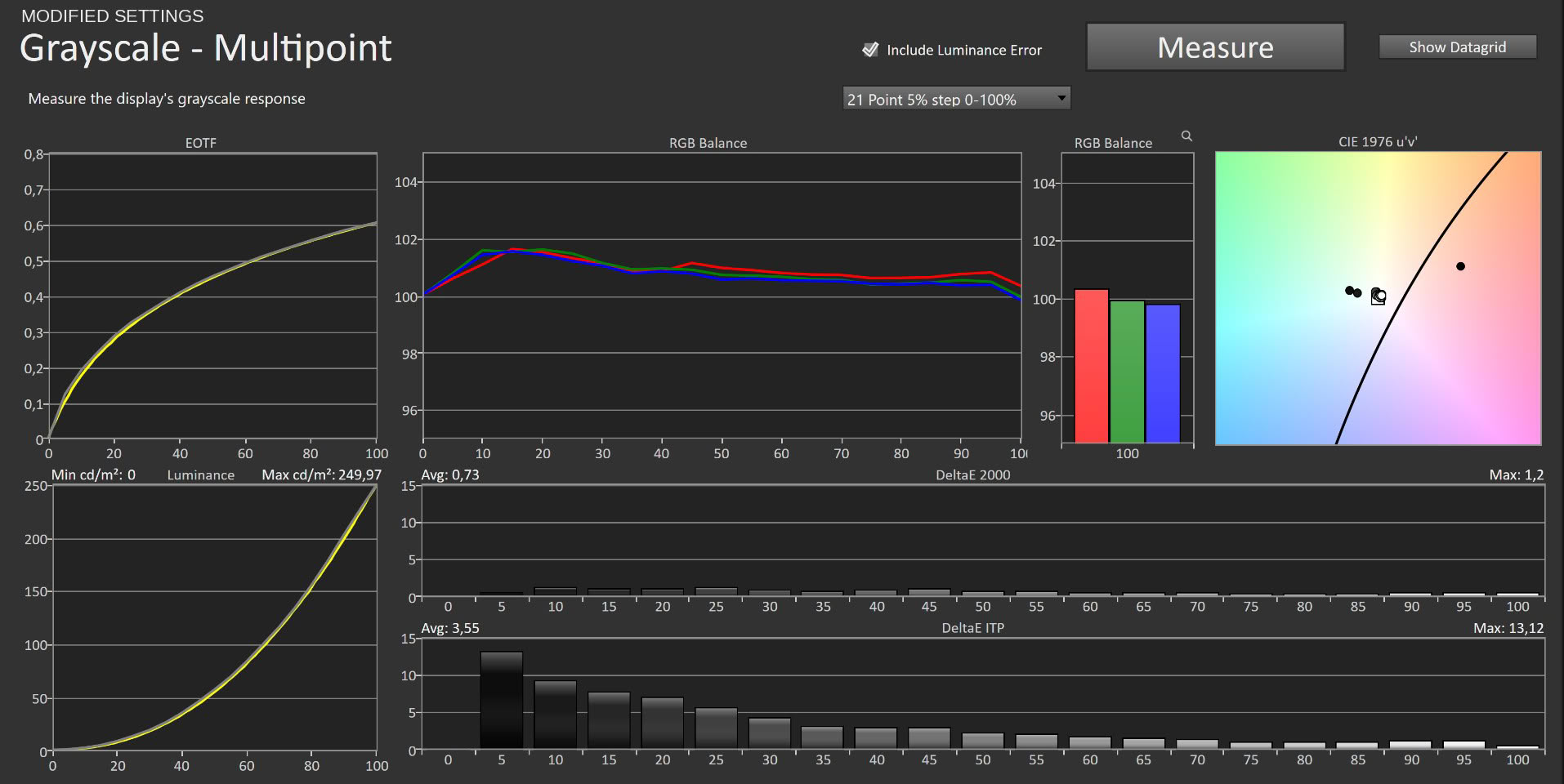
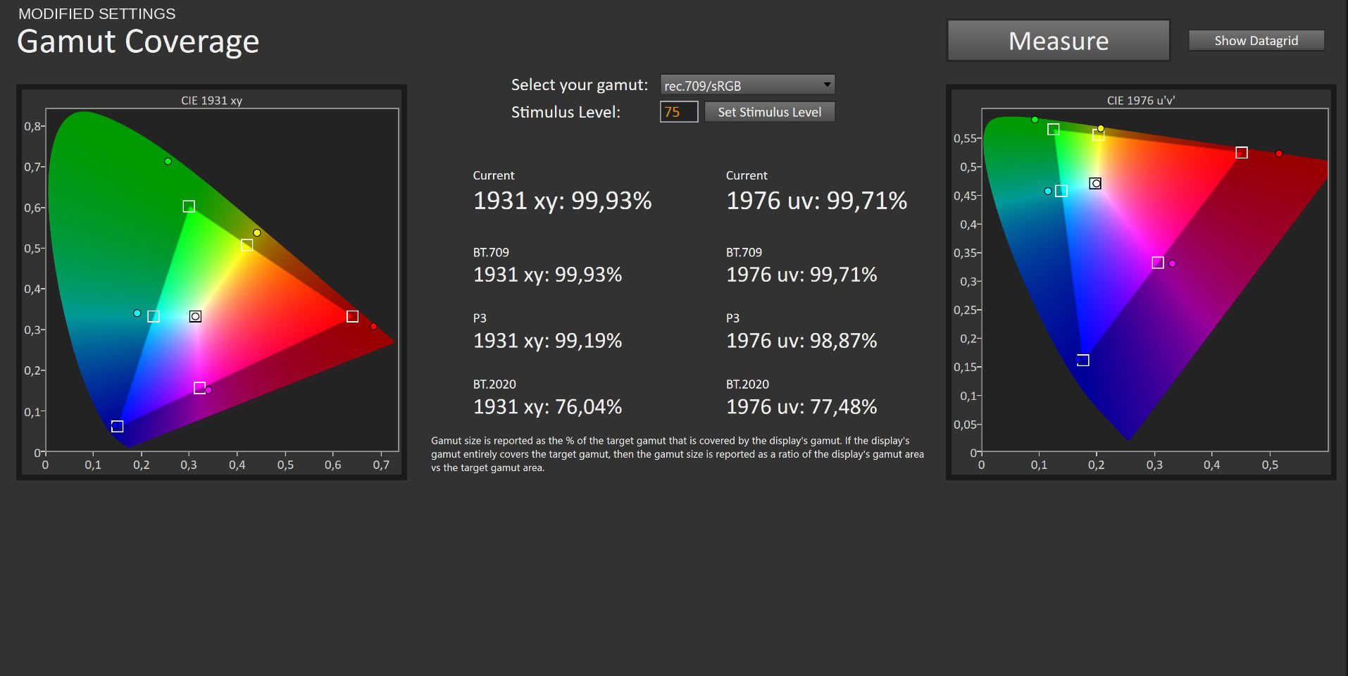
Two settings, and the transformation is dramatic. Average grayscale ΔE collapses from 2.63 to 0.73, with a maximum of just 1.2. Both numbers sit below the threshold where anyone can see an error at all, and the maximum being that low matters as much as the average, because it means there is no single problem region hiding inside a good mean. The RGB balance graph now shows all three channels tracking within about 1.5% of each other from 10% stimulus to white, with the red surplus corrected and the white point landing on the 6,500 K reference. EOTF tracking remains clean. Maximum luminance at brightness 83 measures 249.97 cd/m², which was my target and which suits a normally lit room without needing to run the panel flat out.
Critically, none of this costs you the wide gamut. Custom mode keeps the panel unclamped, and measured coverage is identical to the factory default: 99.93% of sRGB, 99.19% of DCI-P3 and 76.04% of BT.2020 in CIE 1931 xy, with 99.71%, 98.87% and 77.48% in CIE 1976 uv. You get reference-grade grayscale and the full color volume of the panel simultaneously, which is the combination most people actually want.
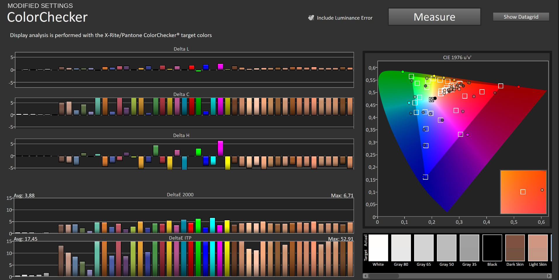
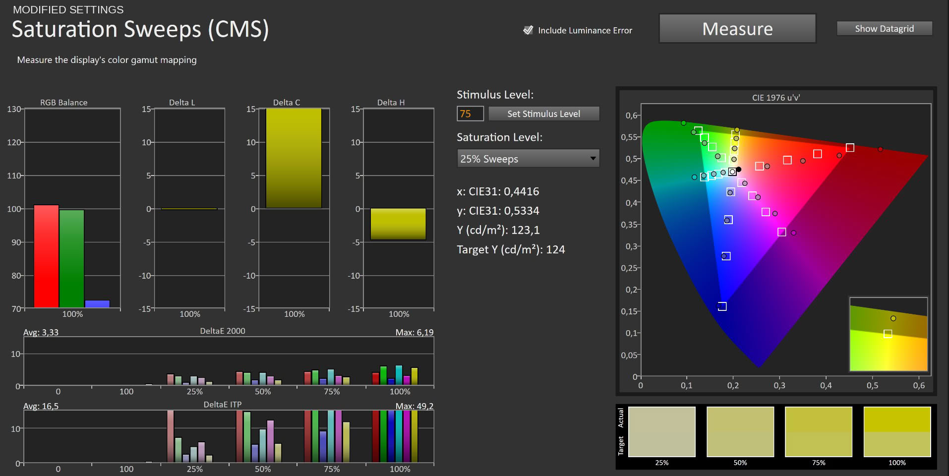
Color accuracy against sRGB targets naturally stays higher in this configuration, at 3.88 average ΔE with a 6.71 maximum on ColorChecker and 3.33 average with a 6.19 maximum on saturation sweeps. Those numbers are not a fault. They are the arithmetic consequence of measuring a P3-wide display against a smaller target space, and the Delta C bars confirm the error is chroma rather than hue. Patches that fall inside sRGB track well.
Subjectively the difference between ECO and this configuration is obvious the moment you switch. Whites go from faintly warm to neutral, skin tones stop looking slightly ruddy, and the overall image reads clean rather than tinted. Two OSD values, no calibration hardware, thirty seconds of work. There is no reason to run this monitor any other way.
Luminance, Contrast and Color Uniformity
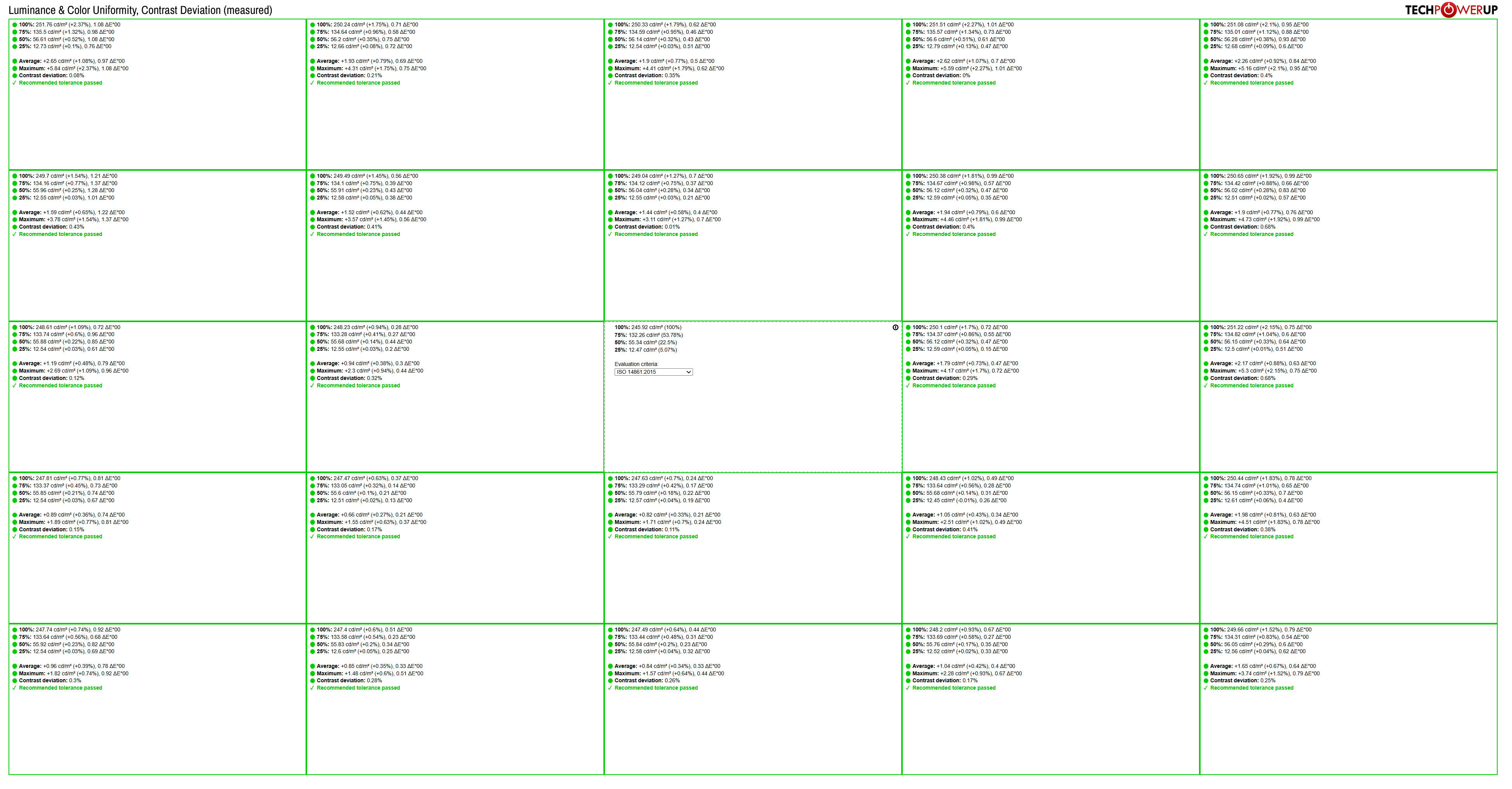
Uniformity is the standout result of this review and the one place where the MO32U24 comfortably outperforms every recent OLED I have measured. All twenty-five zones pass ISO 14861:2015 recommended tolerance, with no exceptions and no marginal cases. Against a 245.92 cd/m² center reference, the worst luminance deviation anywhere on the panel is +2.37%, and most zones land inside 1%. Color uniformity is equally tight, with the highest zone error measuring 1.37 ΔE and the majority sitting below 0.8. Contrast deviation peaks at 0.68%.
To put that in perspective, the GO27Q24G showed corner deviations approaching 20% and corner ΔE values of 4 to 5 on a screen with a fraction of the area. Getting a 32-inch panel this consistent from edge to edge is genuinely difficult, and the result is that flat color test patterns, gradients and large uniform backgrounds show nothing at all. No banding, no dirty screen effect, no visible corner falloff. This is as good as panel uniformity gets.
HDR Performance
The MO32U24 supports HDR10 and carries VESA DisplayHDR True Black 500 certification. The OSD offers five HDR profiles: the standard HDR mode plus HDR Game, HDR Movie, HDR Vivid and HDR Peak 1000. I measured peak luminance against window size in the two that matter, the standard HDR profile and HDR Peak 1000.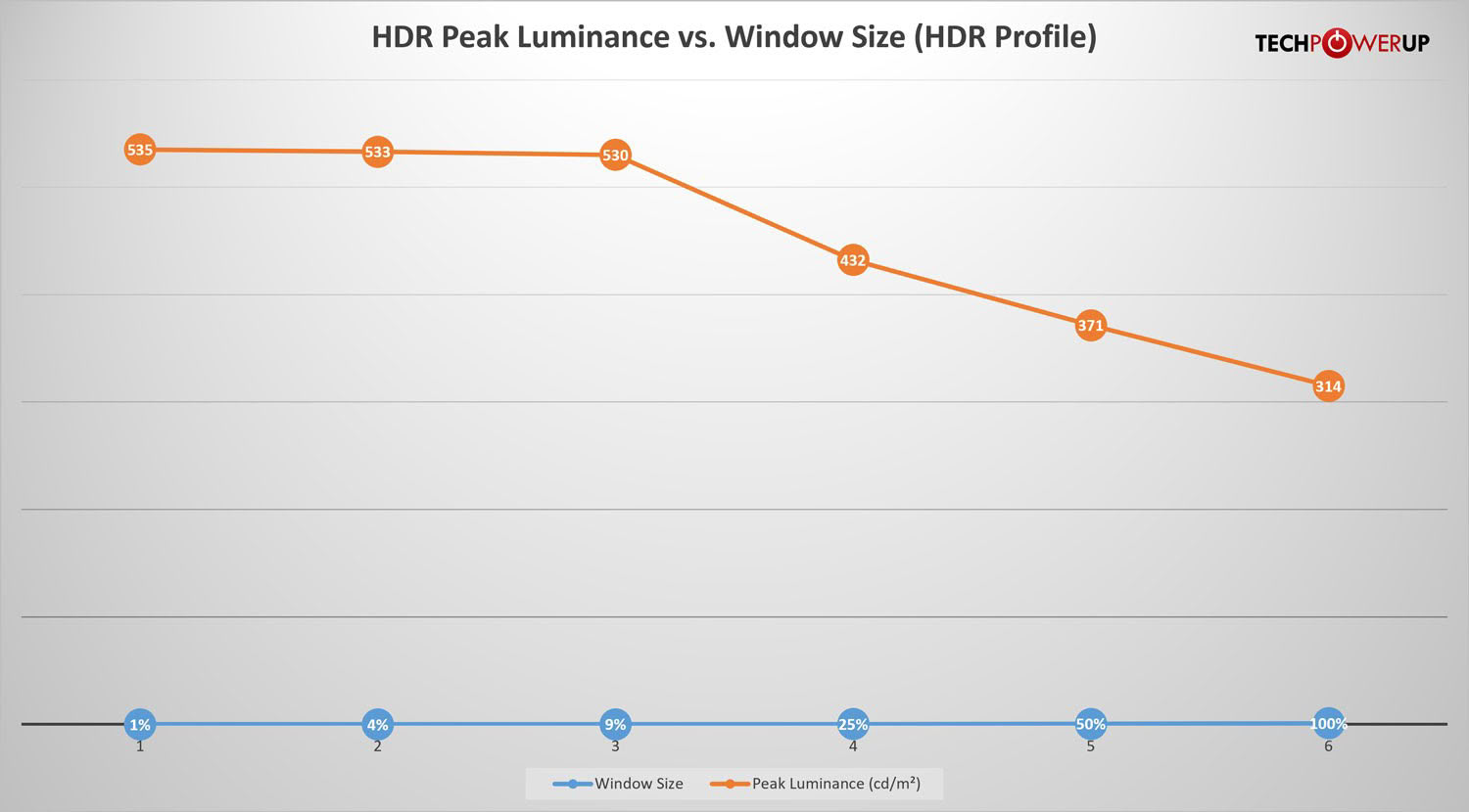
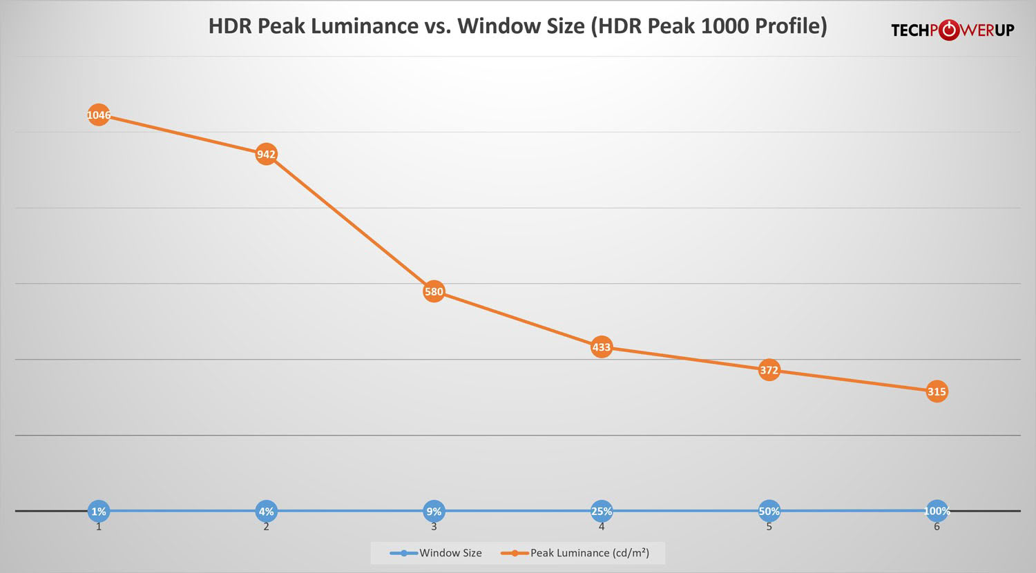
The comparison is more revealing than I expected. The standard HDR profile holds a nearly flat 535, 533 and 530 cd/m² at 1%, 4% and 9% window sizes before rolling off to 432 cd/m² at 25%, 371 cd/m² at 50% and 314 cd/m² full screen. HDR Peak 1000 starts far higher at 1,046 cd/m² on a 1% window and 942 cd/m² at 4%, but falls away much faster, reaching 580 cd/m² at 9%.
From 25% upward the two profiles converge to within a single cd/m² of each other: 433 against 432, then 372 against 371, then 315 against 314. That tells you precisely what HDR Peak 1000 does and does not do. It roughly doubles output on small specular highlights, the sun glinting off a car, a muzzle flash, a light source in an otherwise dark frame, and it does nothing whatsoever once a meaningful portion of the screen is lit. The ABL behavior at large window sizes is identical because it is a thermal and power constraint rather than a tuning choice.
That extra reach comes at a cost, though, and it is not one I would wave through. Falling from 1,046 to 580 cd/m² between the 1% and 9% windows is a far steeper slope than the essentially flat line the standard profile holds across the same range, which is another way of saying HDR Peak 1000 runs noticeably more aggressive automatic brightness limiting. When on-screen content changes quickly, stepping out of a dark corridor into a sunlit street being the obvious example, the profile adjusts luminance visibly enough that some people will notice it as brightness pumping. I would not recommend it universally for that reason. If the behavior bothers you, the standard HDR profile gives a steadier and more predictable image, and what you give up is peak output on small highlights rather than anything else. The measured 1,046 cd/m² does clear the rated 1,000 cd/m², which is always nice to see.
Gigabyte layers HyperNits on top, available only when HDR Peak 1000 is active, in High and Medium settings. The name is slightly misleading, because HyperNits does not raise the panel's physical ceiling at all: measured peak luminance across window sizes is identical with it on and off. What it changes is the shape of the EOTF curve, the mapping that determines how a digital signal becomes actual light on screen. Rather than lifting the peak target, it raises mid-tones while taking care not to clip highlight detail, so the image reads as meaningfully brighter and fuller even though the panel is emitting exactly as much light as before. Gigabyte quotes up to 30% for High and roughly 20% for Medium, the latter aimed at darker rooms. It is smarter use of existing capability rather than new capability, and it targets the real complaint about peak-oriented HDR profiles, which is that the average image looks too dark. I did not measure each setting individually, so treat the improvement itself as a subjective assessment.
Viewing Angles
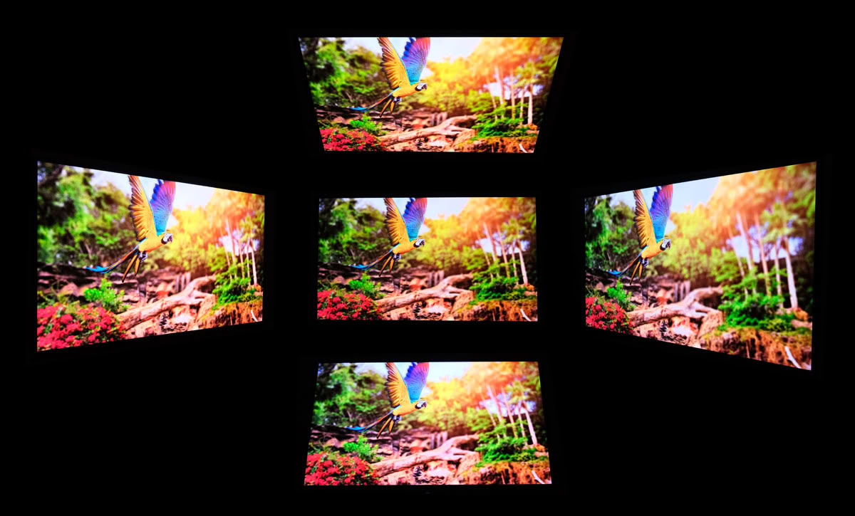
Viewing angles are excellent, as they are on every OLED. Color and contrast stay consistent from any seated position, with no shift when moving off axis. Samsung certifies this module under its QuantumView program, which guarantees at least 60% of front-facing luminance and a color shift below 0.012 Δu'v' at 60° off axis, and nothing in normal use contradicts that.
OLED Burn-in Prevention
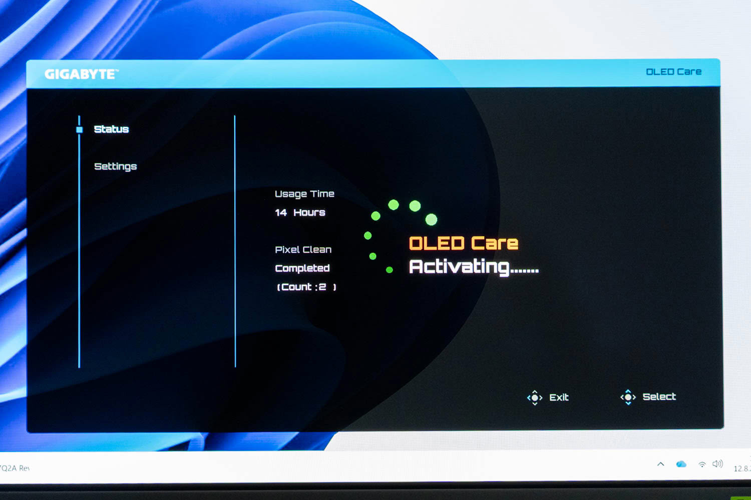
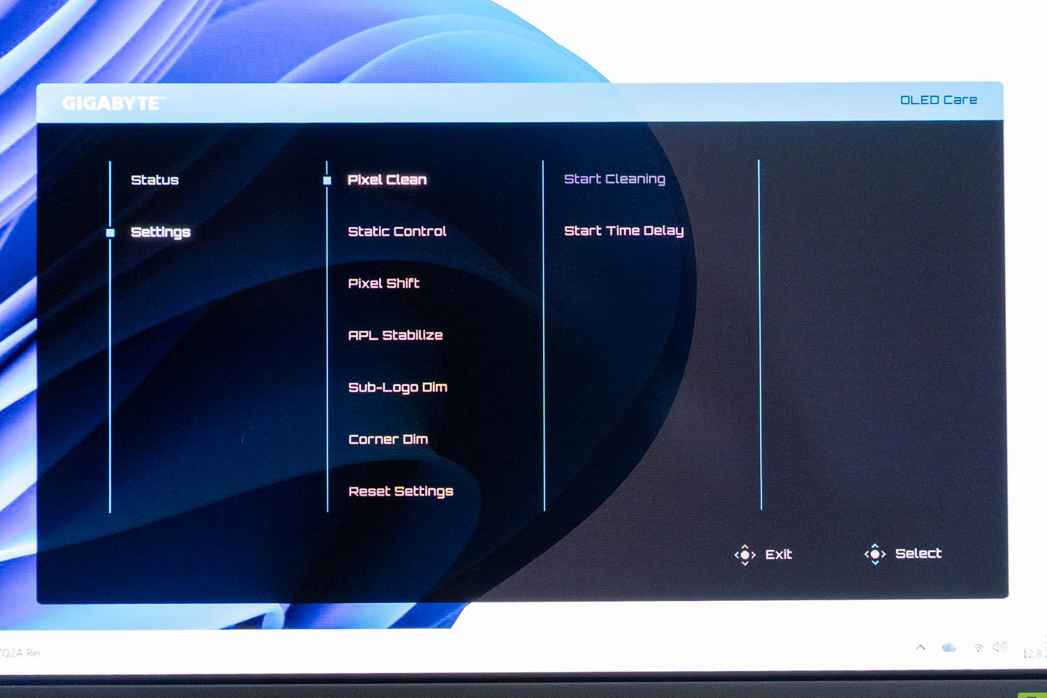
Burn-in mitigation runs under AI OLED Care, which Gigabyte simply labels OLED Care in the interface, and it opens on a Status page rather than a settings list. That page reports accumulated panel usage time and the state of the last Pixel Clean cycle along with a running count of how many have completed, which is more transparency than most manufacturers offer. Knowing how many hours are on the panel and when it last compensated turns burn-in from something you worry about abstractly into something you can actually check.
Settings holds the working set:
Pixel Clean - The compensation routine that equalizes pixel wear. Start Cleaning runs it immediately, while Start Time Delay defers it so it waits until you have stepped away rather than interrupting whatever you were doing.
Static Control - Watches for regions of the image that have not changed for an extended period and reduces brightness in those areas specifically rather than across the whole panel.
Pixel Shift - Moves the entire image by a small amount at intervals, so no pixel holds identical content indefinitely, spreading wear across a slightly larger area.
APL Stabilize - Manages how the panel responds to changes in average picture level, smoothing the luminance swings that occur when content moves between predominantly dark and predominantly bright frames.
Sub-Logo Dim - Identifies persistent logos, HUD elements and interface graphics and selectively lowers their luminance while leaving the rest of the frame alone.
Corner Dim - Applies targeted brightness reduction to the panel corners, where static desktop elements tend to accumulate and wear develops unevenly.
The point of the whole system is that the burden is not on you. The monitor looks for the patterns that actually cause wear, meaning static HUD elements, application chrome and anything else parked in one place for hours, and dims those regions rather than the entire image. Nobody buying an OLED in 2026 should be policing their own desktop for static content, and with this running you do not have to.
Gigabyte covers the panel with a three-year warranty that explicitly includes burn-in, which remains the most concrete protection available regardless of what the software does.
Nov 18th, 2026 12:20 CST
change timezone
Latest GPU Drivers
New Forum Posts
- Honestly, do you care about GTA VI? (141)
- Wireless Internet sharing between PC and router both-ways, is it possible? (17)
- My Final Barrier to Exclusively Using Linux has Fallen (Azure Virtual Desktops) (9)
- Ghetto Mods (4883)
- Very unusual two gaming-pc scenarios. (3)
- [Intel AX1xx/AX2xx/AX4xx/AX16xx/BE2xx/BE17xx] Intel Modded Wi-Fi Driver with Intel® Killer™ Features (633)
- RX 580 2048SP 8GB Samsung – Black Screens in Games, Looking for a Compatible BIOS (2)
- DTS DCH Driver for Realtek HDA [DTS:X APO4 + DTS Interactive] (2812)
- Time to upgrade CPU and MOBO (31)
- Primary DisplayPort Monitor Not Waking After Driver Updates 621.01 and 621.14 (9)
Popular Reviews
- Acemagic Retro X3 Review
- Upcoming Hardware Launches 2027 (Updated Nov 2026)
- AMD Zen 6 Technical Deep Dive
- ASUS ROG Strix B850-I Gaming Wi-Fi7 W Review
- Corsair HX1000i Shift Crystal Review
- Biwin Black Opal NV7400 2 TB Review
- Chieftec Iceberg PRO 360 DARK Review
- AMD Ryzen 7 9800X3D Review - The Best Gaming Processor
- Phantom Blade Zero Performance Benchmark Review - 35 GPUs Tested
- Montech King 95 3D PRO Review
TPU on YouTube
Controversial News Posts
- NVIDIA Co-Founder and CEO Jensen Huang Officially Resigns (477)
- Open Letter Asking NVIDIA to Reinstate Jensen Huang Passes 115,000 Signatures (184)
- Report: Jensen Huang Eyes NVIDIA Comeback (184)
- OpenAI CEO Argues Home PCs Waste the World's Limited DRAM Supply (152)
- NVIDIA Launches Investigation Into Jensen Huang's Relationship With Suspected Chinese Spy (136)
- Intel "Raptor Lake Next" 16-Core and 20-Core CPUs Surface (130)
- Legendary Game Studio BioWare Shuts Down Following EA Layoffs (104)
- Dell CEO Says the Memory Shortage Will Get Worse in 2027 (95)