 4
UPERFECT BE173BU Review - Sharp Picture, Blurred Gaming Ambitions
Response Time, Input Lag & Motion Blur »Picture Quality
The BE173BU is built around a 17.3-inch IPS panel at 3840×2160, which works out to roughly 255 PPI. That is an exceptionally dense screen, and it makes for beautifully crisp text and images, but it also makes Windows impractical for most users at 100% scaling, since interface elements become extremely small. Set display scaling to 150% and the monitor becomes genuinely comfortable; treat that as a requirement rather than an option. It is worth understanding what that trade-off does to your usable space, though. At 150% scaling the desktop no longer behaves like a native 4K screen but reports an effective 2560×1440 workspace, so you are not actually gaining more room for windows than a QHD panel would give you; what the 4K resolution buys you here is density and sharpness, not extra real estate. In other words, text and images look markedly cleaner than on a 1440p portable of the same size, but you fit the same amount of content on screen, which is the sensible outcome on a 17.3-inch display anyway. Being an IPS panel with a conventional backlight, blacks are gray rather than truly black, with the attached Calman runs indicating a contrast ratio of roughly 600 to 700:1 in the factory and manually adjusted modes, but for productivity, media, and general use it still looks clean and punchy.The matte anti-glare coating is a real advantage over glossy portable monitors, due to their very nature, where you're using them in varying conditions. Reflections are diffused rather than mirrored, so the monitor stays usable next to a window or under bright lighting, which suits a portable that will be used in varied environments.
To test picture quality, I used an X-Rite i1Display Pro colorimeter with both Calman Ultimate, the industry-standard suite for display testing and calibration, and DisplayCAL - a free, powerful display calibration and profiling tool. The BE173BU exposes no user-facing firmware version, and all measurements were taken at the native 3840×2160 120 Hz.
UPERFECT's published gamut information is internally inconsistent. The specification table claims 100% Adobe RGB and 100% DCI-P3, while a support response describes the 120 Hz version only as an "85% gamut" panel without identifying the reference color space. Our sample fully covers sRGB and measures approximately 97.4% DCI-P3 and 71.2% BT.2020, making the 100% DCI-P3 claim slightly optimistic. The monitor also lacks an effective and accurate sRGB mode, so saturated sRGB content appears too vivid in applications without color management.
Picture Quality at Factory Settings

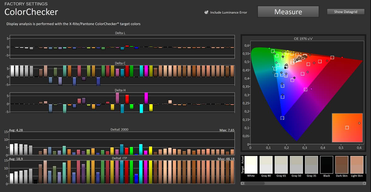
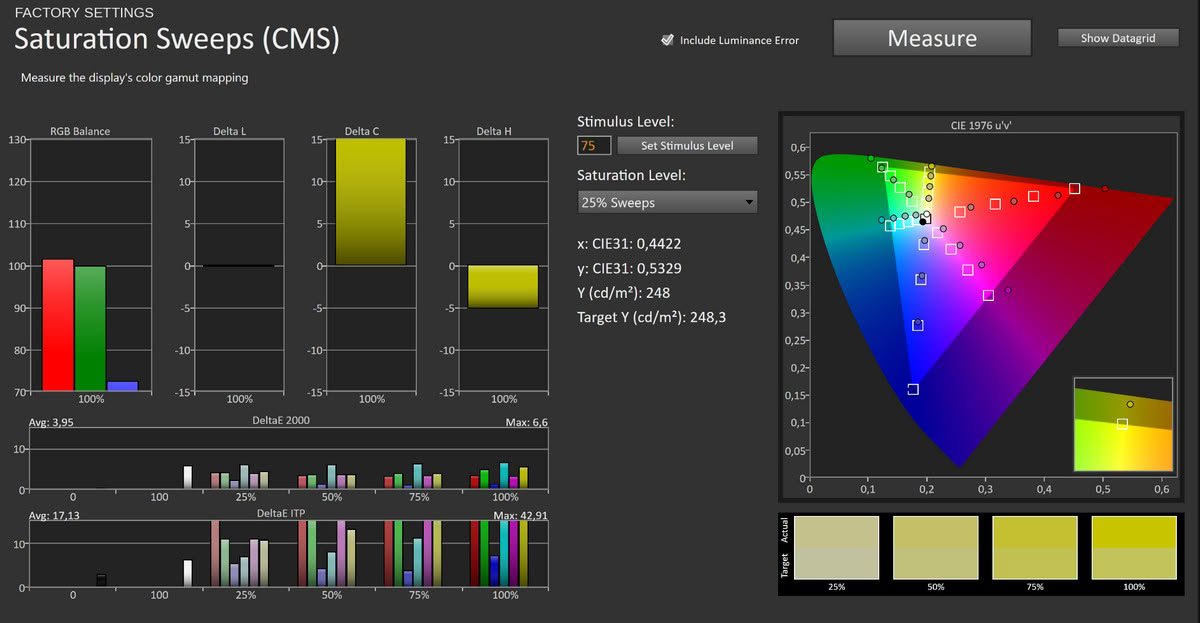
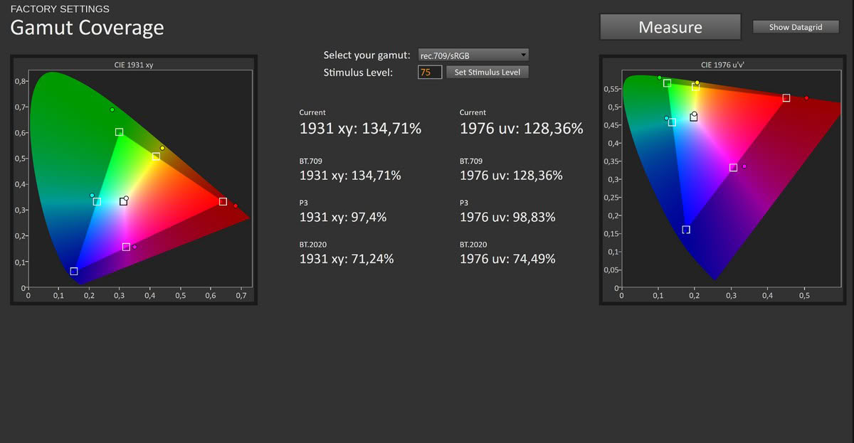
Out of the box the UPERFECT BE173BU is, pleasantly, much closer to accurate than some other UPERFECT monitors I've recently reviewed. There is a mild warm cast, with red running slightly high and blue tapering off toward the top of the range, but nothing like the earlier model's heavy blue tint. Grayscale tracking averages a ΔE of 4.34 with a maximum of 6.24, color accuracy averages 4.28 with a maximum of 7.65, and the saturation sweeps come in at 3.95 average and 6.6 maximum. Peak luminance reaches an eye-catching 503 cd/m². This is perfectly usable as shipped for general work and media, with only the slight warmth and the untamed wide gamut keeping it from being accurate enough for color-critical tasks.
Picture Quality with sRGB Setting
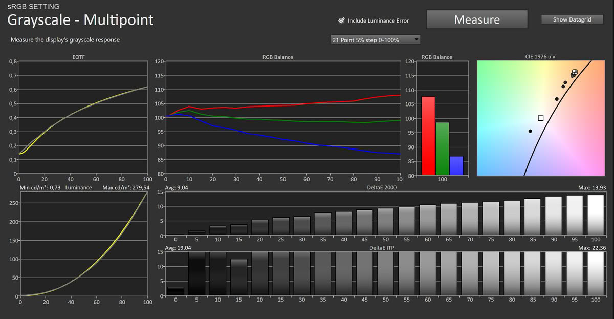
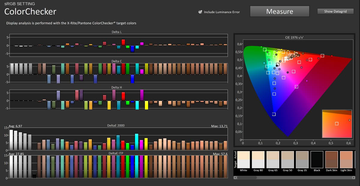
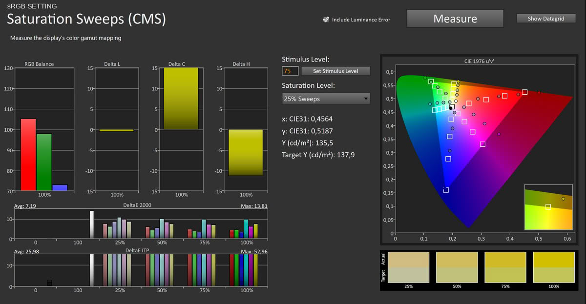
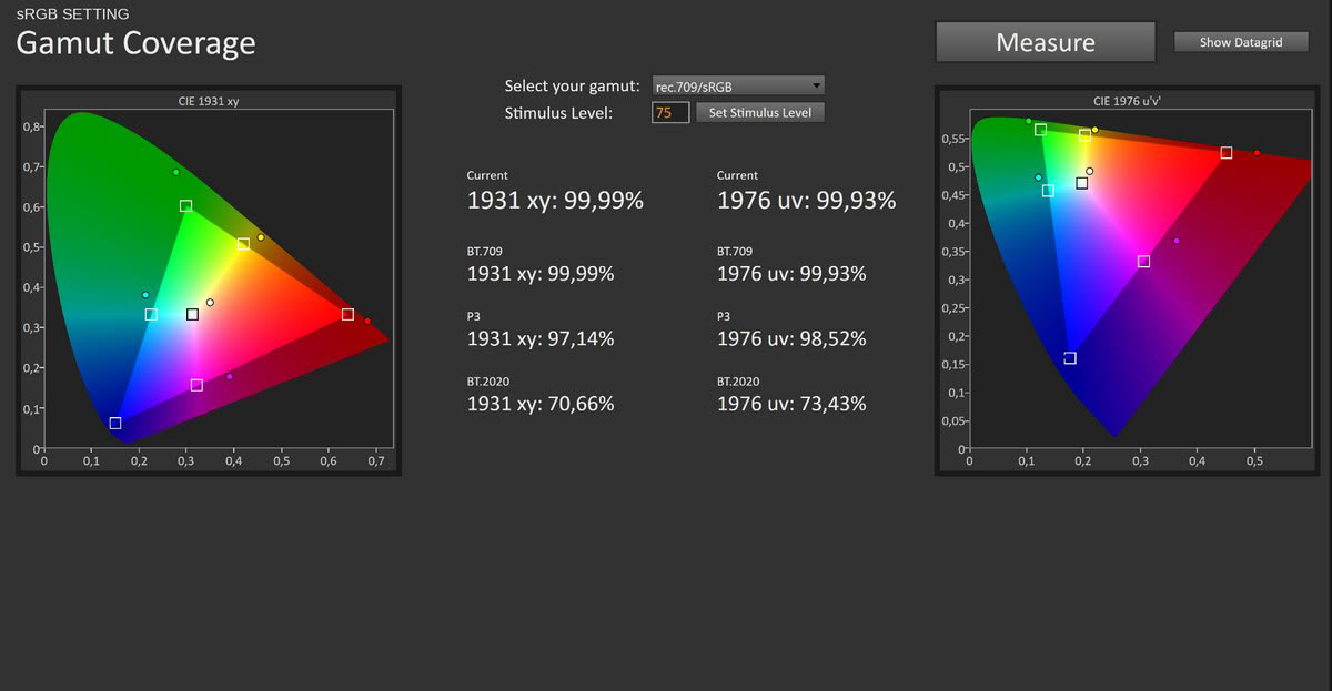
The OSD's sRGB entry is actively counterproductive and does not deliver an accurate sRGB presentation. Calman still reports approximately 97% DCI-P3 coverage in this mode, while the white point moves substantially further from the target. Grayscale accuracy actually gets worse than the default, averaging a ΔE of 9.04 as red climbs and blue drops away, and color accuracy and saturation rise to 6.97 and 7.19 respectively. Peak luminance also falls to about 279 cd/m². There is no reason to use this mode; the factory default is more accurate and brighter.
Picture Quality with Modified Settings
Since the sRGB option is a dead end, I dialed the panel in manually, though the exact RGB values may vary slightly between units. Two changes did the job:Picture > Brightness > 36 (targeting roughly 250 cd/m²)
Temperature > User > R 46/G 48/B 50
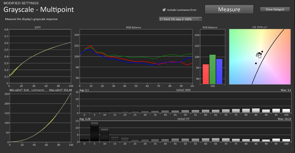
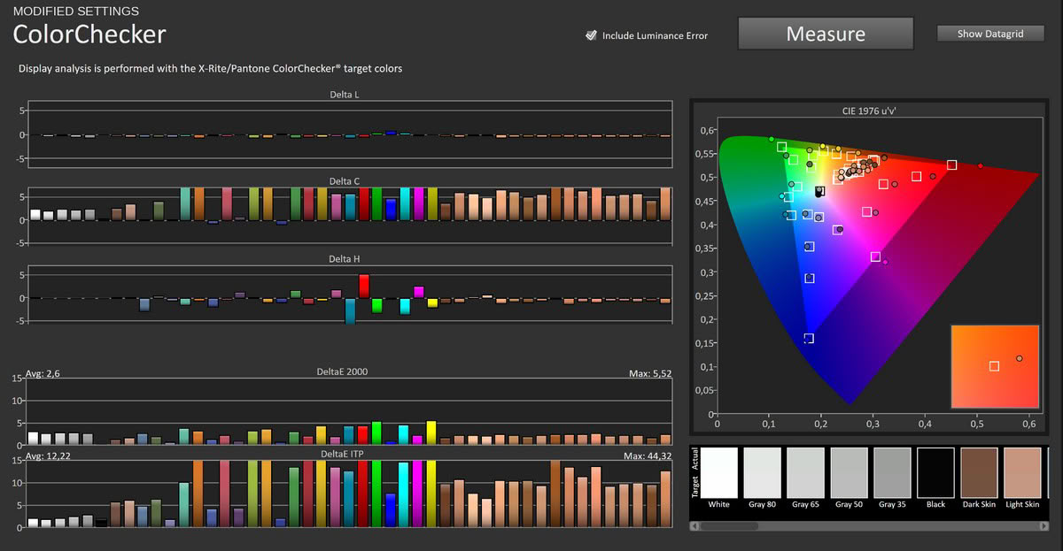
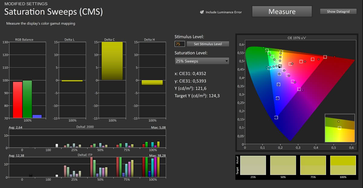
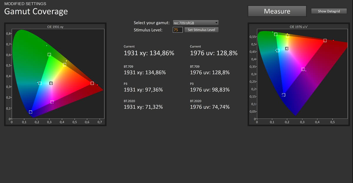
The tuned result is very good for a portable monitor in this class. Trimming red slightly and rebalancing the channels neutralizes the warm cast, and grayscale accuracy drops to an average ΔE of 2.1 with a maximum of 3.2. Color accuracy improves to ΔE 2.6 average and 5.52 maximum, and the saturation sweeps to 2.64 average and 5.08 maximum. The white point lands neutral, the RGB channels track together, and brightness at 36 gives around 250 cd/m², comfortable for most rooms, with a ton of headroom for when you need it. The wide gamut stays fully intact at roughly 97% DCI-P3, so you keep the panel's color range while gaining clean, neutral grayscale. The remaining errors are largely caused by the panel's unclamped wide gamut. Grayscale is neutral after adjustment, but saturated sRGB content still appears too vivid in applications without color management, which remains a real limitation for color-sensitive work.
Luminance, Contrast and Color Uniformity
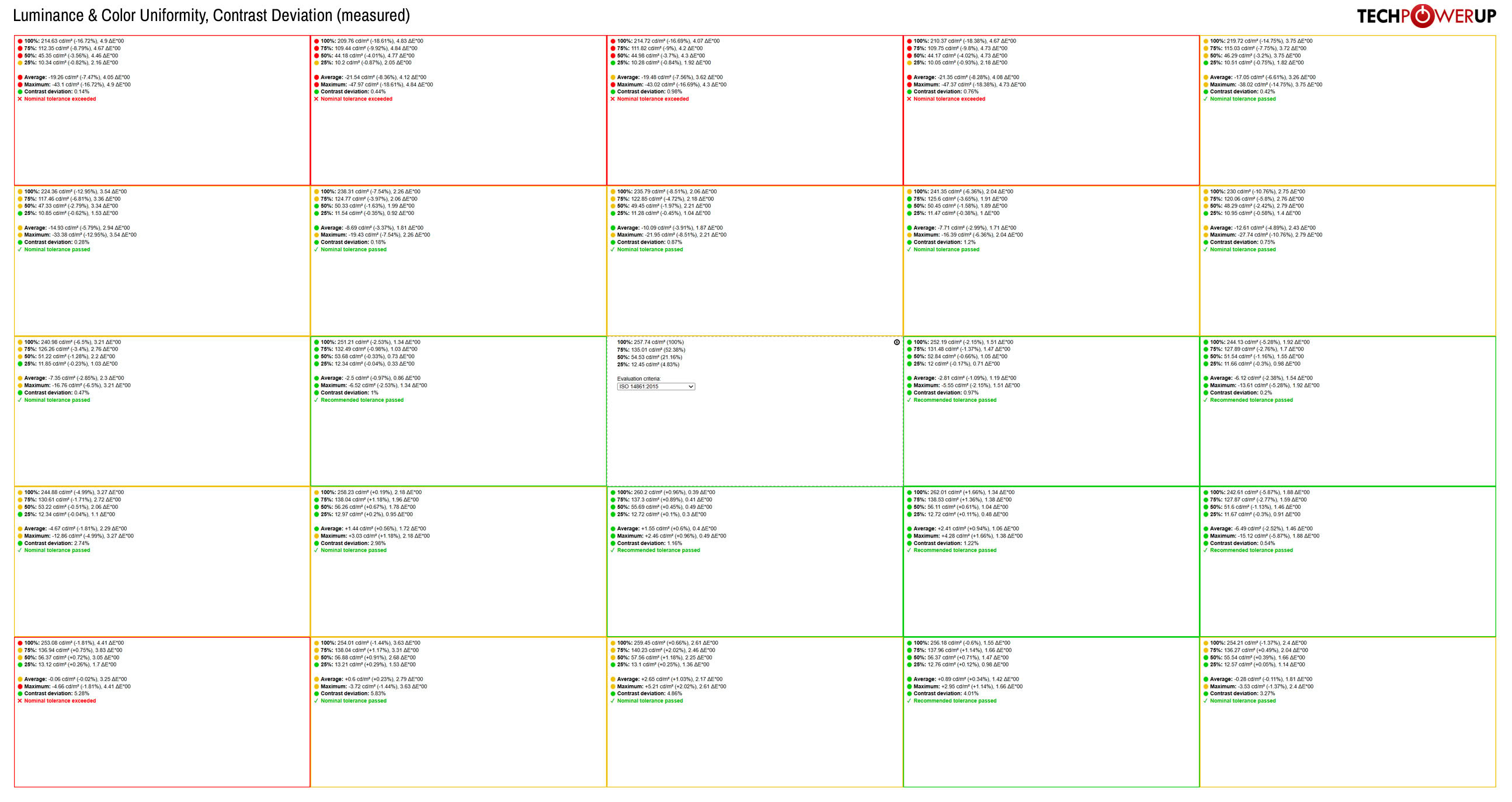
Uniformity is a mixed bag, which is typical for an inexpensive portable IPS. The center measures approximately 258 cd/m², while the central and lower portions of the panel generally remain relatively close to that reference. The upper half is noticeably weaker: the second row is roughly 6 to 13% darker than the center, while the top row falls about 15 to 19% behind. Color error reaches approximately ΔE 5 in the weakest areas, while contrast deviation remains below about 6%. The differences are generally unobtrusive in mixed content, but the upper portion appears visibly darker on large uniform gray or white backgrounds.
HDR Performance
The BE173BU carries an UltraHDR toggle in the OSD and accepts an HDR10 signal, so Windows will switch it into HDR mode. That is where it ends. This panel is genuinely bright, at over 500 cd/m², but with a 1,000:1 contrast ratio, 8-bit color, and no local dimming, it has none of the contrast machinery real HDR requires. Enabling HDR just changes how the signal is tone-mapped rather than delivering any real HDR impact, so treat it as a compatibility checkbox and leave it off for the best-looking image.Viewing Angles
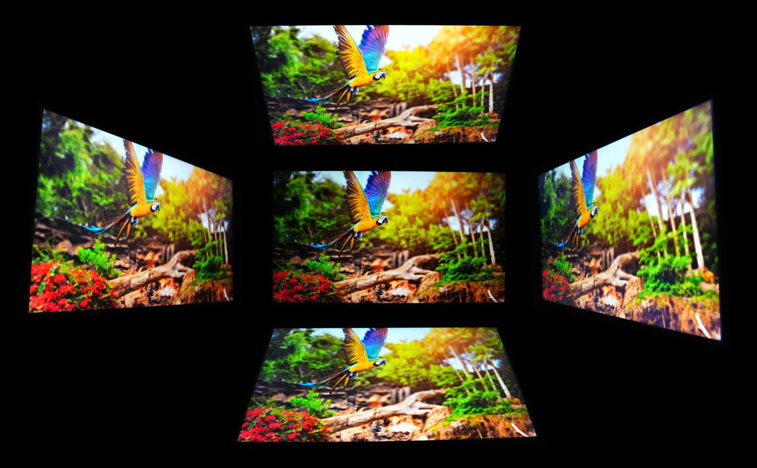
Viewing angles are good, as expected from IPS, with only the mild luminance falloff and slight shift you get from any IPS panel and no dramatic color inversion.
Nov 19th, 2026 16:14 CST
change timezone
Latest GPU Drivers
New Forum Posts
- Honestly, do you care about GTA VI? (164)
- Windows 11 General Discussion (7736)
- Current Sales, Bundles, Giveaways (10448)
- Last game you purchased? (1409)
- WarpCoreBench scores! (76)
- Got the EOL 32GB TridentZ 6000 CL26 1.4V (12)
- Dell Workstation Owners Club (3516)
- Making a game in Godot engine (4)
- DTS DCH Driver for Realtek HDA [DTS:X APO4 + DTS Interactive] (2815)
- Security Apps (2)
Popular Reviews
- Acemagic Retro X3 Review
- Ugreen NASync DXP4800 GT Review
- Upcoming Hardware Launches 2027 (Updated Nov 2026)
- Pulsar Office Tour & First Look at P1 Dual-Sensor Mouse
- AMD Zen 6 Technical Deep Dive
- Biwin Black Opal NV7400 2 TB Review
- Sapphire Radeon RX 7700 XT Pure Review
- Sapphire Radeon RX 7700 XT Pulse Review
- AMD Ryzen 7 9800X3D Review - The Best Gaming Processor
- Chieftec Iceberg PRO 360 DARK Review
TPU on YouTube
Controversial News Posts
- NVIDIA Co-Founder and CEO Jensen Huang Officially Resigns (489)
- Report: Jensen Huang Eyes NVIDIA Comeback (223)
- Open Letter Asking NVIDIA to Reinstate Jensen Huang Passes 115,000 Signatures (184)
- OpenAI CEO Argues Home PCs Waste the World's Limited DRAM Supply (152)
- NVIDIA Launches Investigation Into Jensen Huang's Relationship With Suspected Chinese Spy (136)
- Intel "Raptor Lake Next" 16-Core and 20-Core CPUs Surface (130)
- Legendary Game Studio BioWare Shuts Down Following EA Layoffs (104)
- Dell CEO Says the Memory Shortage Will Get Worse in 2027 (95)