Friday, February 21st 2020

Microsoft Redesigns Windows 10 Icons

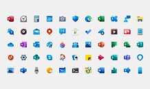
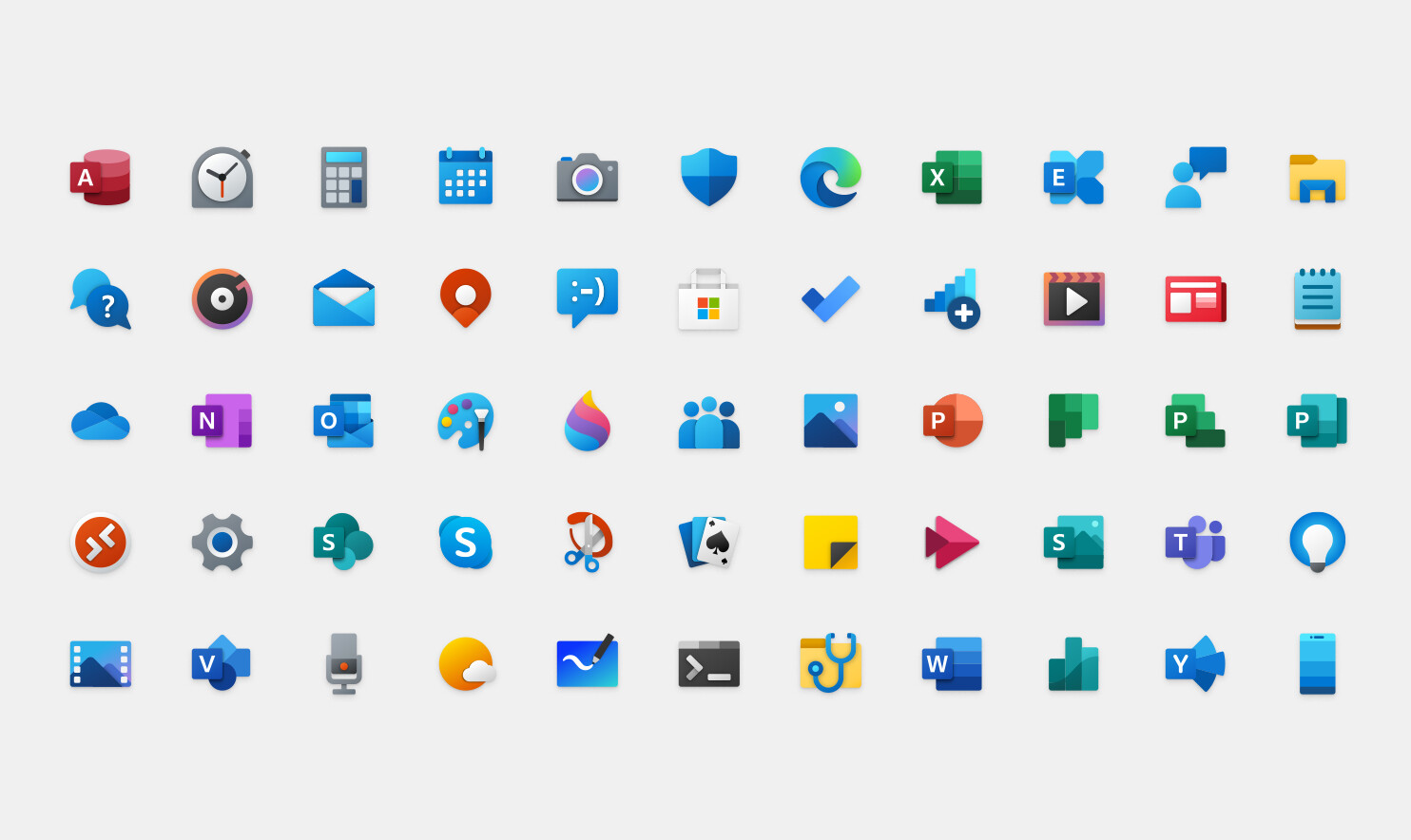
Microsoft's Windows 10 operating system has been a mix of old and new designs since its launch, however, Microsoft decided to modernize its UI look by providing a fresh set of icons. If you are a user of Microsoft Office suite, then you already know how the new icons look for Office applications like Excel and Word. The material design present on those apps is now transferring to the rest of Windows 10 stock applications like Calendar and Calculator. In the effort to modernize the look of Windows 10 and end the Windows 7 inspired UI, Microsoft will be pushing the updated icon set over few following months. The updates icons are already available for Windows 10 Insiders, and specifically for Preview Build 19569. Regular users can expect to get the update in the coming months.
Add your own comment

68 Comments on Microsoft Redesigns Windows 10 Icons

#26
Sybaris_Caesar
Lol. I'd want this icon-pack in my phone. In my PC not so much.

But man, nothing ever came close to Windows 7 UI. If they hadn't killed W7 and W10 didn't have so good of a yask manager I'd still be sporting W7. The rounded corners and transparent aero theme was sublime.
Posted on Reply
#27
Dammeron
lexluthermiesterOh goodness no. They were good for their time, but it's 2020, let's have something commiserate for todays computing.
They were never good, not even in the '90s. It was just a clusterf*ck of pixelart, that tried to be more than it should.
Posted on Reply
#28
btarunr
Editor & Senior Moderator
lexluthermiesterVery true!
Also, simple graphics under lossy RD compression (such as Citrix's crappy compression) end up looking a lot better than complex true-color icons with too many shapes, colors, or gradients.
Posted on Reply
#29
lexluthermiester
DammeronThey were never good, not even in the '90s. It was just a clusterf*ck of pixelart, that tried to be more than it should.
It was good for it's time, back then it was the best the technology it was running on could do. Nowaday's, with the ultra powerful hardware available? There is simly no excuse not to use UI elements that look wonderful, eye-catching and appealing.
KhonjelBut man, nothing ever came close to Windows 7 UI.
I fully agree with this. The Windows 7 UI is easily Microsofts best effort of all the UI's they've come up with.
Posted on Reply
#30
ARF
Yes, W7's icons are more corresponding to the reality, more physical.

The best icon is simply a photo of the thing that you want to link to.

Posted on Reply
#31
[XC] Oj101
ARFYes, W7's icons are more corresponding to the reality, more physical.

The best icon is simply a photo of the thing that you want to link to.

That's way too busy, it makes my eyes bleed.
Posted on Reply
#32
aktpu
These look good. Thank satan we finally get rid of all flat everything
Posted on Reply
#33
Rahnak
I like these new icons. I just hope it doesn't take another 10 years to apply them everywhere. The "new" Settings app, for example, will look way out of place with this new iconography. That makes Windows 10 an even bigger mishmash of design languages, which personally, I find very aggravating.
Posted on Reply
#35
Sybaris_Caesar
DammeronThey were never good, not even in the '90s. It was just a clusterf*ck of pixelart, that tried to be more than it should.
Now that you mention it when I had Windows 8.1, I briefly used used the 2000 style or older themepack that came as options in the personalization control panel.
Since I got my first PC in early 2010s I kinda liked feeling like I owned a modern retro machine. I even had the drab one tone blue wallpaper.
Since Personalization moved to Settings App in W10, you can't do that anymore right?
If not I'd like to try it again.

Btw is MS gonna remove control panel in the future? I know they're already stripping it piece by piece by will they outright remove it in a future build?
I really hate the settings app. Most of the time the settings I want are in related settings or additional settings tab, not the main one. mouse settings panel and the sounds panel come to mind.

I really wish they didn't touch control panel.
Posted on Reply
#36
Vario
KhonjelNow that you mention it when I had Windows 8.1, I briefly used used the 2000 style or older themepack that came as options in the personalization control panel.
Since I got my first PC in early 2010s I kinda liked feeling like I owned a modern retro machine. I even had the drab one tone blue wallpaper.
Since Personalization moved to Settings App in W10, you can't do that anymore right?
If not I'd like to try it again.

Btw is MS gonna remove control panel in the future? I know they're already stripping it piece by piece by will they outright remove it in a future build?
I really hate the settings app. Most of the time the settings I want are in related settings or additional settings tab, not the main one. mouse settings panel and the sounds panel come to mind.

I really wish they didn't touch control panel.
I kind of remanufactured my control panel by finding the links to the individual elements of it that I was using often, and putting shortcuts down on my desktop to get to the parts I access often such as sound options, display, device manager, bluetooth, network connections, etc. Its strange to see the old valuable windows control elements buried behind a veneer of slick, worthless toggles. Once you make a few shortcuts and place them somewhere, you can find them easy with start -> type the thing you want, whereas on a new system install its harder to locate at first.
Posted on Reply
#37
cucker tarlson
TheLostSwedeLooks very Google-esque.
imo it looks very smartphone-like
Posted on Reply
#38
ARF
ThrashZoneHi,
Cell phone os.
Hi,
Watch OS, modern phones are more powerful and can render more graphics heavy icons.
cucker tarlsonimo it looks very smartphone-like
Posted on Reply
#39
Sybaris_Caesar
VarioI kind of remanufactured my control panel by finding the links to the individual elements of it that I was using often, and putting shortcuts down on my desktop to get to the parts I access often such as sound options, display, device manager, bluetooth, network connections, etc. Its strange to see the old valuable windows control elements buried behind a veneer of slick, worthless toggles. Once you make a few shortcuts and place them somewhere, you can find them easy with start -> type the thing you want, whereas on a new system install its harder to locate at first.
Hmmm I might do that too. I do have Control Panel as start menu shortcut in my old laptop but in main PC, SSD is do fast that there's almost no downtime between typing to search and it showing up.

I distinctly remember there's a folder with shortcuts of all the important tools. I think it's call administrative tools. Might look for that later.
Posted on Reply
#40
Space Lynx
Astronaut
I think they are just running out of ideas for updates. Nothing to see here. lol
Posted on Reply
#41
iui4
No love for Windows Vista? :roll:
Posted on Reply
#42
Dammeron
I just looked closer into those new icons, analyzed them and... yeah, don't like them that much. Old Office icons at least had something more linking them to their respective programs, like a written page for Word, or calc sheet for Excel, instead of just a first letter - that was way easier to read for me. On the new chart eg. I see 3 new icons with "P" and if I didn't know the colour theme of Powerpoint, I wouldn't know which one represents it.

Besides, as someone mentioned earlier, there's too much blue goin' on.
Posted on Reply
#43
Chrispy_
I wish they'd finish porting all the legacy UI to the modern UI first. The mishmash of different styles is getting worse, not better. We were promised a unified design language 8 years ago and they've catastrophically failed to complete that task.

Refreshing the icons is like putting lipstick on a pig when there is still a whole bunch of missing functionality that requires you to open legacy console windows or bring up legacy control panel items. That stuff is Windows NT era and pretty icons are so far away from the list of priorities that that Microsoft's efforts with refreshed icons demonstrate laughable awareness of what's actually important.
Posted on Reply
#45
Upgrayedd
These icons look really bad. Just putting a square with a letter in it seems really generic and rather hard to differentiate.

I just want an OLED friendly them in the hopes more monitors come out.
Posted on Reply
#46
TheGuruStud
lynx29I think they are just running out of ideas for updates. Nothing to see here. lol
No need for bug fixing and perf increases. Just give the dolts new icons and they'll be satisfied.

BTW, I'm STILL waiting on all of the features that were axed from Vista, b/c the morons couldn't create a new kernel for it to run on.
Posted on Reply
#47
Octopuss
I'd have to see side by side comparison to form an opinion.

I want Windows 7 official style for everything. I'm sick of flat design and washed out colours.
Posted on Reply
#48
holyprof
ARFI don't like these new icons. Look too childish, like made by or for children in the kindergarten.
Agreed 100%.
I teach 7 to 15 year olds how to use a computer and know their taste. These new icons scream "millennials".
I like the new designs, but nothing beats windows 7 style icons - those hit the sweet spot looking attractive and serious at the same time. Windows 8 style looks too simplified (too professional) and the new ones look too childish.
Posted on Reply
#49
Assimilator
Because the most important issues with Windows 10 are the icons...

Come on, Microsoft.
Posted on Reply
#50
Hardware Geek
VulkanBrosLet´s have the good old Win 3.0 icons back :roll:


That would actually be a fun option for old timers like me who grew up with Windows 3 to ME (THAT was an awful OS).
btarunrMicrosoft switched to simpler graphics for icons and buttons (across Windows and Office), due to the emergence of remote desktops, DaaS, VDIs, etc. It's easier on the network bandwidth.
You're the editor? Cool. Can we send corrections to you? I find so many grammar and spelling errors in posts on techpowerup.
lynx29I think they are just running out of ideas for updates. Nothing to see here. lol
Hopefully that means they're going to finally start fixing the bugs. Wishful thinking I realize.
Posted on Reply
Add your own comment
Nov 21st, 2026 04:19 PST change timezone

New Forum Posts

Popular Reviews

TPU on YouTube

Controversial News Posts