Friday, February 21st 2020

Microsoft Redesigns Windows 10 Icons

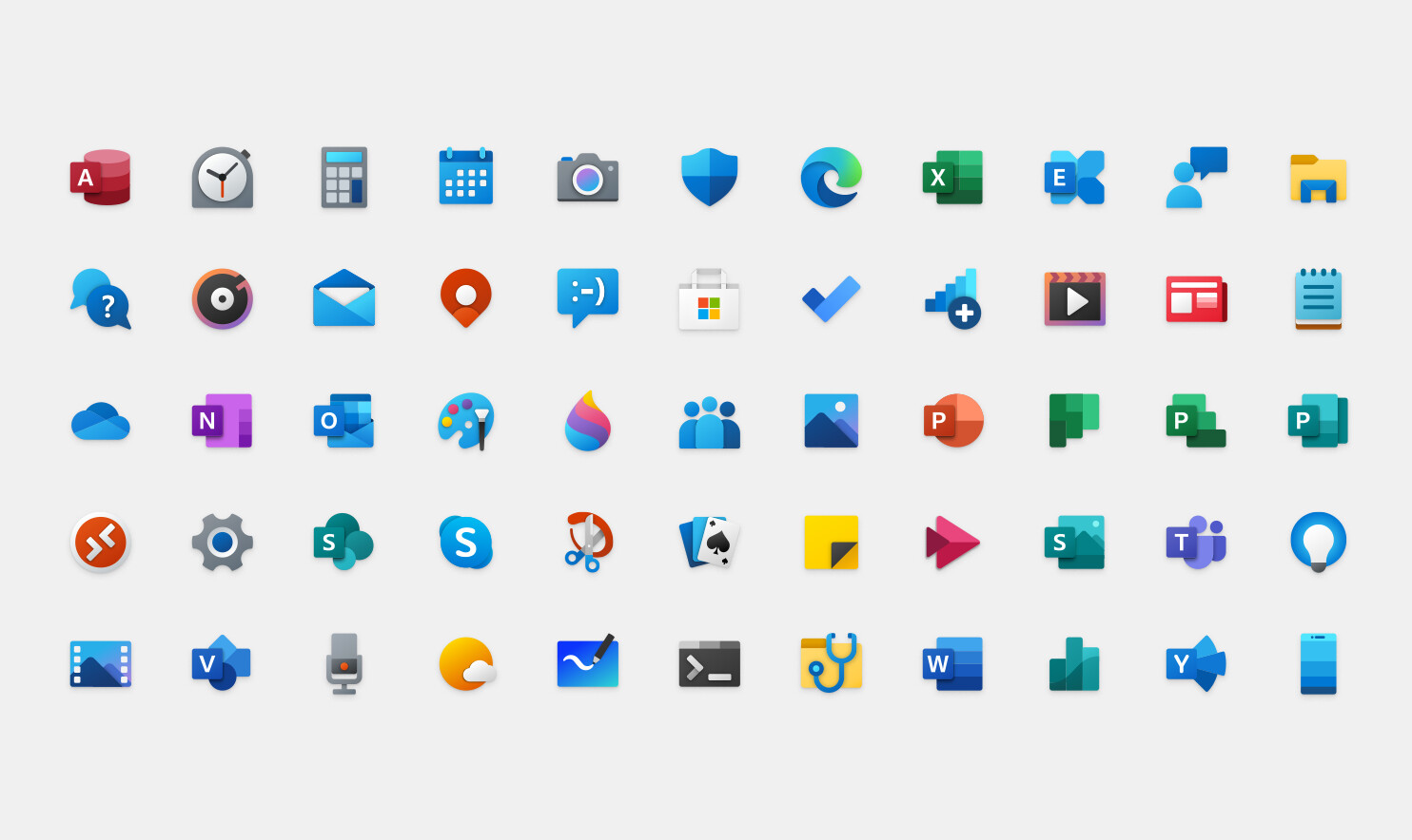
Microsoft's Windows 10 operating system has been a mix of old and new designs since its launch, however, Microsoft decided to modernize its UI look by providing a fresh set of icons. If you are a user of Microsoft Office suite, then you already know how the new icons look for Office applications like Excel and Word. The material design present on those apps is now transferring to the rest of Windows 10 stock applications like Calendar and Calculator. In the effort to modernize the look of Windows 10 and end the Windows 7 inspired UI, Microsoft will be pushing the updated icon set over few following months. The updates icons are already available for Windows 10 Insiders, and specifically for Preview Build 19569. Regular users can expect to get the update in the coming months.
Add your own comment

68 Comments on Microsoft Redesigns Windows 10 Icons

#51
ARF
[XC] Oj101That's way too busy, it makes my eyes bleed.
What do you mean by busy? What happens every time you open YouTube or a folder containing photos or videos?


This new style is just extreme minimalist, for babies.
It's just not appropriate for a serious, professional, academic OS.

It's for Baby TV.
It's so bad, that they can hardly fall any lower than that ^^^^.
Posted on Reply
#52
Solaris17
Super Dainty Moderator
RahnakI like these new icons. I just hope it doesn't take another 10 years to apply them everywhere.
Same, I like the new icons but office has had them for a long time. I really wish they would fix their timing issue when it comes to UI releases.
Posted on Reply
#53
gamefoo21
Solaris17Same, I like the new icons but office has had them for a long time. I really wish they would fix their timing issue when it comes to UI releases.
Office seems to get the UI updates before they roll it out to Windows proper. I suspect it's a way to gauge corporate acceptance.
Posted on Reply
#54
Solaris17
Super Dainty Moderator
gamefoo21Office seems to get the UI updates before they roll it out to Windows proper. I suspect it's a way to gauge corporate acceptance.
that’s probably pretty accurate
Posted on Reply
#55
ARF
I bet MS will cancel these new icons given the negative feedback.

They are champions of trying to sabotage its users, anyone does remember the Start button removal?!

:laugh:
Posted on Reply
#56
lexluthermiester
ARFI bet MS will cancel these new icons given the negative feedback.
Doubtful.
Posted on Reply
#57
ARF
lexluthermiesterDoubtful.
Then, I will have to use special Skins and Themes in order to force them to be gone ;)
Posted on Reply
#58
lexluthermiester
ARFThen, I will have to use special Skins and Themes in order to force them to be gone ;)
Ok, you do that.
Posted on Reply
#59
Paganstomp
How come they didn't change on my.... Oh Wait, I'm running Windows 8.1. :D
Posted on Reply
#60
Space Lynx
Astronaut
PaganstompHow come they didn't change on my.... Oh Wait, I'm running Windows 8.1. :D
Win 8.1 on my end too, Win 8.1 is the best OS ever made imo, it's rock solid, shame AMD does not support it with drivers though :(
Posted on Reply
#61
Melvis
lexluthermiesterNow if they can apply this to the rest of the OS..
Yeah Windows 10 looks like it was designed in the 80's....Its hip to be square!
Posted on Reply
#62
Octopuss
AssimilatorBecause the most important issues with Windows 10 are the icons...

Come on, Microsoft.
You are aware that icons are not created by programmers, aren't you?
Posted on Reply
#63
lexluthermiester
MelvisYeah Windows 10 looks like it was designed in the 80's
Yeah, that more or less how I felt when I first saw the RTM of Win8.
MelvisIts hip to be square!
Nice Huey Lewis reference!
Posted on Reply
#64
RoutedScripter
I was just gearing up to do my DLL hacks to get all Win10 system icons replaced with Win7 icons, unless a Win10 icon looks better or the equivalent Win7 icon doesn't exist.
Posted on Reply
#65
Arctucas
lexluthermiesterNot really. They don't need to admit what everyone already knows. All they need to do is introduce a new style and call it progress.


I do. Windows 8/8.1/10 UI has always looked like something for 5 year olds. It is unappealing. Windows XP, Vista and especially 7 all looked much better.
That was my immediate impression.

Bright colors, simplistic shapes that undeveloped minds can easily comprehend.
Posted on Reply
#66
TheOne
AleksandarKRegular users can expect to get the update in the coming months.
And I'm already seeing them on my desktop, they don't look as bad as they do in the picture, but they don't seem suited for blue tiles.
Posted on Reply
#67
Prima.Vera
Is it me, or the icons look pretty shitfull (understatement) ???
Posted on Reply
#68
lexluthermiester
Prima.VeraIs it me, or the icons look pretty shitfull (understatement) ???
It's you....:laugh:
Posted on Reply
Add your own comment
Nov 21st, 2026 04:19 PST change timezone

New Forum Posts

Popular Reviews

TPU on YouTube

Controversial News Posts