Thursday, March 25th 2021

Microsoft Tests Colorful New System Icons for Windows 10
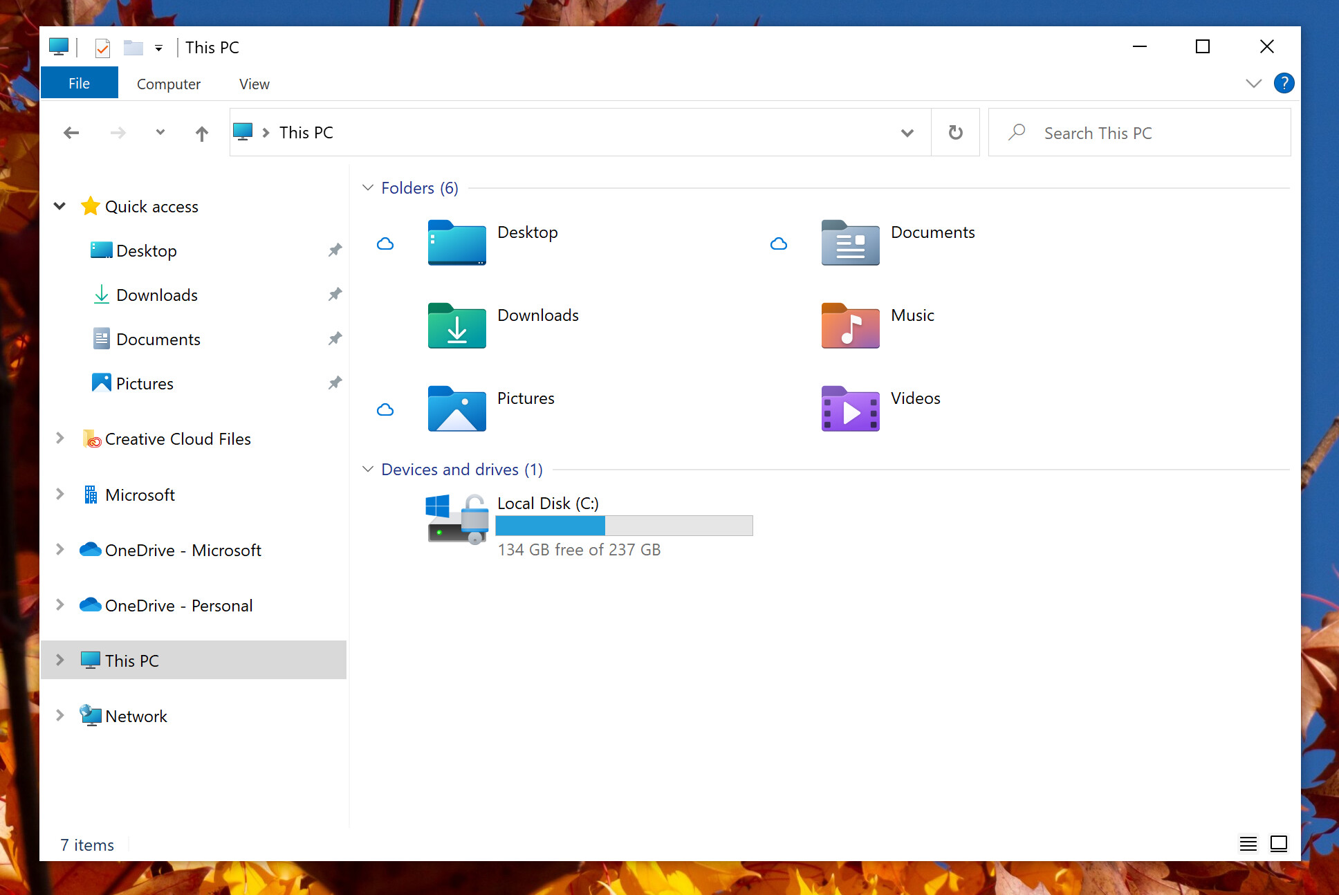
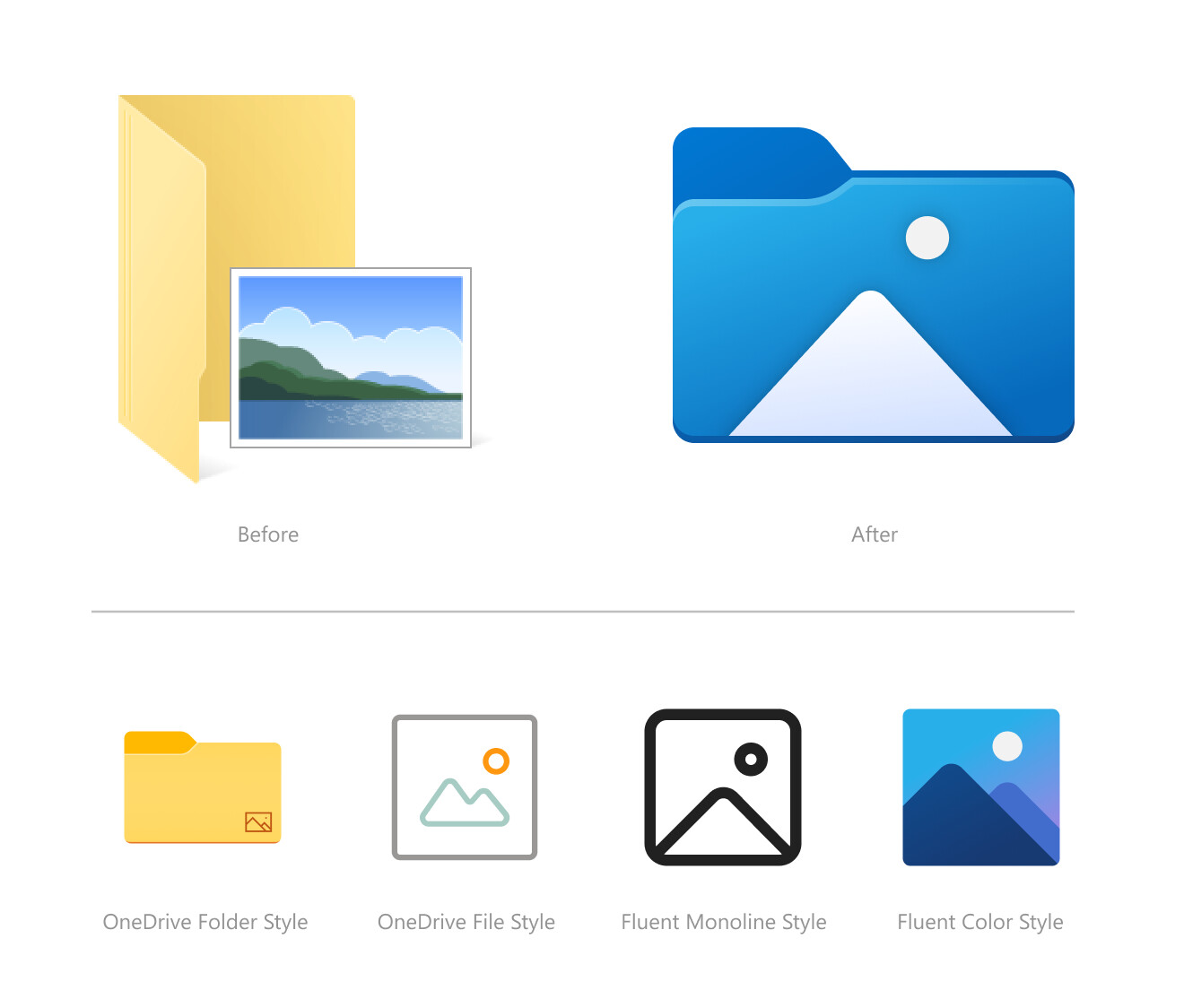
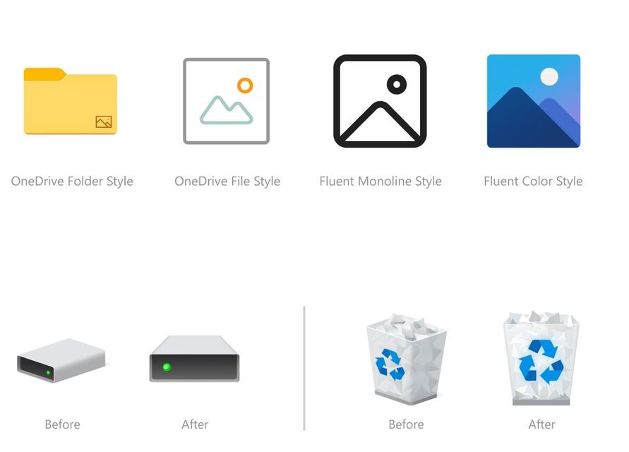
Microsoft is testing a user-interface refresh with an upcoming update to Windows 10. Released for testing with Insider Preview Build 21343, the refresh includes new system icons that are of a significantly different design scheme from the ones you have now. System folders (Desktop, Documents, Downloads, Pictures, Music, etc.,) now come with color-coded icons resembling something from a Windows-knockoff Linux desktop environment. The graphics of the icons appear simpler, and this simplicity probably has something to do with the emergence of remote-desktop/virtual-desktop, where simpler graphics are easier on the network bandwidth, particularly on the side of the VDI server. The current system icons of Windows 10 are evolved from those of previous Windows versions.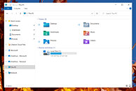


Source:
Windows Insider Blog
83 Comments on Microsoft Tests Colorful New System Icons for Windows 10
Just to be clear, the file thumbnails are working fine. The problem happens with the thumbnail that used to show up for the folder itself. For example, for "Images" you had that icon of the folder half-open and it showed you two random pictures you had inside that folder. Now, it's just the folder icon.
Expected behavior:
What actually happens:
Got a new 1TB Samsung 860 EVO laying around, where I plan a dual boot with Win10 & Manjaro KDE, so I can take a break from sickening Windows. For the time. Eyeballing with the MacMini as a daily driver, but going to wait for v2 when all the minor bugs are fixed. Such a sexy little thing. Windows only on the gaming rig, at least in full screen gaming mode you can't see Microsoft's mess. :D
Just more MS BS.