Thursday, March 25th 2021

Microsoft Tests Colorful New System Icons for Windows 10

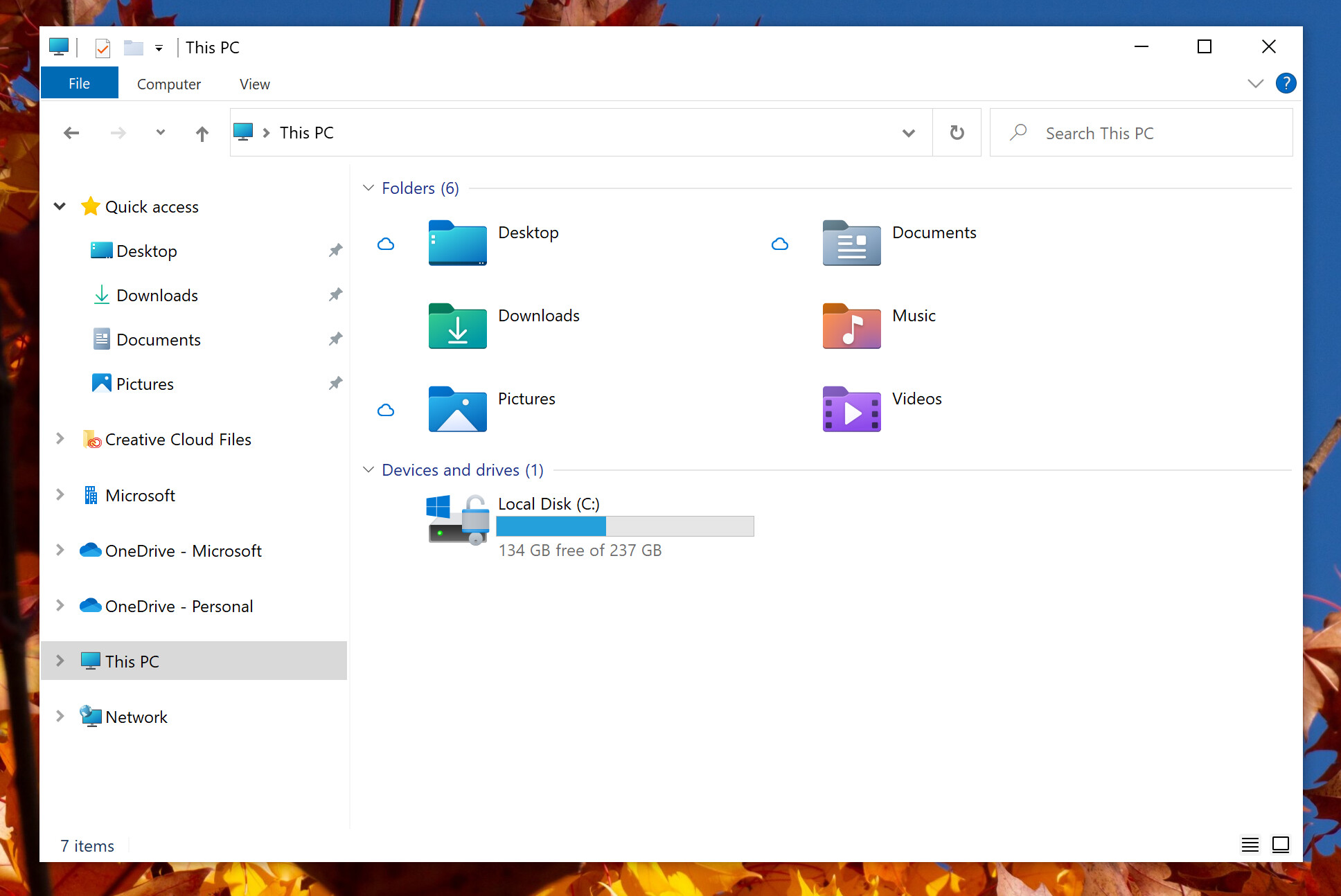
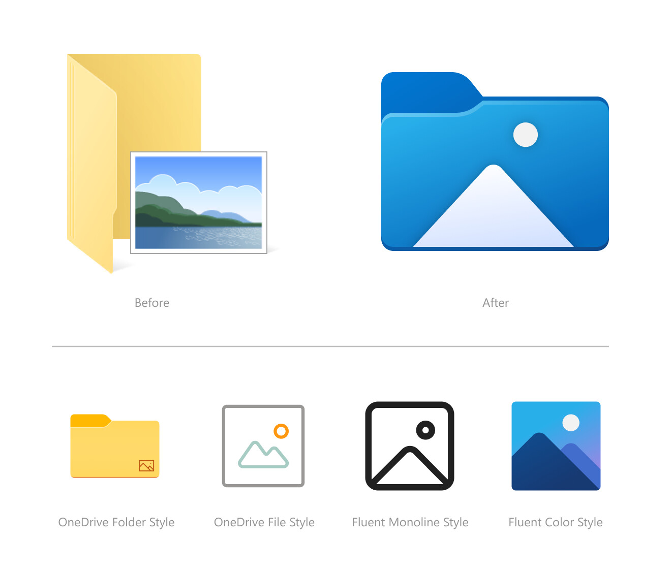
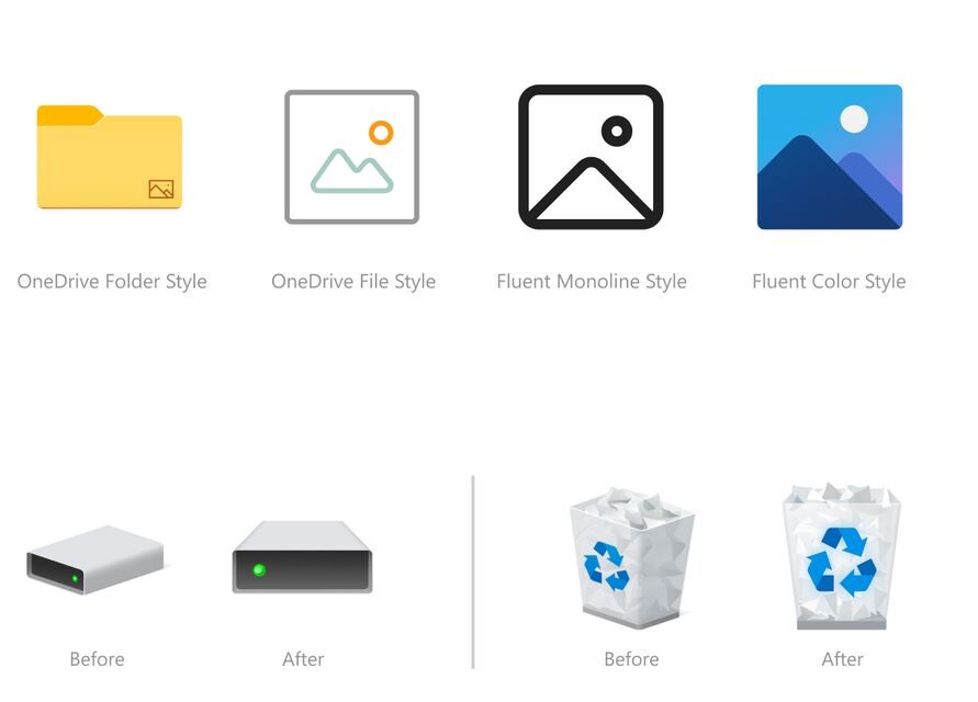
Microsoft is testing a user-interface refresh with an upcoming update to Windows 10. Released for testing with Insider Preview Build 21343, the refresh includes new system icons that are of a significantly different design scheme from the ones you have now. System folders (Desktop, Documents, Downloads, Pictures, Music, etc.,) now come with color-coded icons resembling something from a Windows-knockoff Linux desktop environment. The graphics of the icons appear simpler, and this simplicity probably has something to do with the emergence of remote-desktop/virtual-desktop, where simpler graphics are easier on the network bandwidth, particularly on the side of the VDI server. The current system icons of Windows 10 are evolved from those of previous Windows versions.
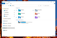
Source: Windows Insider Blog
Add your own comment

83 Comments on Microsoft Tests Colorful New System Icons for Windows 10

#1
gt362gamer
I'd prefer to keep the current Windows 10 icons...
Posted on Reply
#2
bonehead123
gt362gamerI'd prefer to keep the current Windows 10 icons...
Me too, however I do like the new-ish asthetics overall :)
Posted on Reply
#3
Searing
Personally I don't like 3d skewed icons, the newest ones shown here are much better. Flat and straight facing.
Posted on Reply
#4
Mysteoa
I have no qualm with the new icons, as long as they are consistent across the board.
Posted on Reply
#5
Chrispy_
Hey Microsoft, how about not making pointless little changes to artwork that nobody cares about, and you first of all finish the underlying OS?

The Windows 95-style Control Panel, which was supposed to be replaced by the Windows 8 settings app nine years ago is still required because you haven't bothered actually making some of the core OS functionality ready for this millennium yet. Multiple times over the last 9 years I have kept reading how the next update/version will finally complete the interface and retire the old Control Panel to stop this schizophrenic dual-interface duplicate/conflicting madness that started with Windows 8 and you keep letting me (and everyone else) down. What's the point of moving features to the settings app, only to have them as a link back to the Windows 9x interface? That's not a re-code, that's just adding another layer of shit on top of something that is already shit.

LIPSTICK.

ON.

A.

PIG.


So yeah, finish making the W10 OS first, and then worry about pointless fettling with icon art. The Feature Creep is getting ridiculous when parts of the OS are still clearly the same tired code that I was using in the WindowsNT days.
Posted on Reply
#6
qubit
Overclocked quantum bit
They're purdy, I like 'em.
Posted on Reply
#7
Darmok N Jalad
They look fine to me, though I wish they would offer a thinner UI as an option for non-touch users. The thickness is just a lot of wasted space to accommodate using your finger for some actions, and touch-centric apps have never really taken off on Windows. Considering all the 16:9 displays out there, that thickness takes away from the content for what you're actually trying to get done.
Posted on Reply
#8
dyonoctis
Chrispy_Hey Microsoft, how about not making pointless little changes to artwork that nobody cares about, and you first of all finish the underlying OS?

The Windows 95-style Control Panel, which was supposed to be replaced by the Windows 8 settings app nine years ago is still required because you haven't bothered actually making some of the core OS functionality ready for this millennium yet. Multiple times over the last 9 years I have kept reading how the next update/version will finally complete the interface and retire the old Control Panel to stop this schizophrenic dual-interface duplicate/conflicting madness that started with Windows 8 and you keep letting me (and everyone else) down. What's the point of moving features to the settings app, only to have them as a link back to the Windows 9x interface? That's not a re-code, that's just adding another layer of shit on top of something that is already shit.

LIPSTICK.

ON.

A.

PIG.


So yeah, finish making the W10 OS first, and then worry about pointless fettling with icon art. The Feature Creep is getting ridiculous when parts of the OS are still clearly the same tired code that I was using in the WindowsNT days.
It's not the same team handling those task. Just because a team is slacking off doesn't mean that the other teams should stop working ;)
Posted on Reply
#9
Hossein Almet
I was thinking to myself a days ago, how comes Microsoft keeps persisting with the boring yellow folders' icons. Painted the folders in different colors in the first steps in the right direction. They should ultimately create a new kind folders, which look modern.
Posted on Reply
#10
voltage
Its about time! much welcomed. I am so tired of seeing the decades old Manila Folder.
Posted on Reply
#11
windwhirl
Chrispy_Hey Microsoft, how about not making pointless little changes to artwork that nobody cares about, and you first of all finish the underlying OS?
Multiple teams, buddy. Design doesn't handle code.
Chrispy_Multiple times over the last 9 years I have kept reading how the next update/version will finally complete the interface and retire the old Control Panel to stop this schizophrenic dual-interface duplicate/conflicting madness that started with Windows 8 and you keep letting me (and everyone else) down.
I wonder where you read that, because it was never announced in Insider comm channels. At best, they've been slowly moving things, but nowhere did they say "We're moving everything next milestone". And I've been running Insider builds for years.

And besides, if they move everything people are gonna complain that the change was too sudden. No one is ever happy.
Chrispy_The Feature Creep is getting ridiculous when parts of the OS are still clearly the same tired code that I was using in the WindowsNT days.
I can agree with that, though. Then again, multiple teams handling different aspects of the OS.
Posted on Reply
#12
Wilson
Chrispy_Hey Microsoft, how about not making pointless little changes to artwork that nobody cares about, and you first of all finish the underlying OS?

The Windows 95-style Control Panel, which was supposed to be replaced by the Windows 8 settings app nine years ago is still required because you haven't bothered actually making some of the core OS functionality ready for this millennium yet. Multiple times over the last 9 years I have kept reading how the next update/version will finally complete the interface and retire the old Control Panel to stop this schizophrenic dual-interface duplicate/conflicting madness that started with Windows 8 and you keep letting me (and everyone else) down. What's the point of moving features to the settings app, only to have them as a link back to the Windows 9x interface? That's not a re-code, that's just adding another layer of shit on top of something that is already shit.

LIPSTICK.

ON.

A.

PIG.


So yeah, finish making the W10 OS first, and then worry about pointless fettling with icon art. The Feature Creep is getting ridiculous when parts of the OS are still clearly the same tired code that I was using in the WindowsNT days.
You understand that designers don't code, right?
Posted on Reply
#14
Chomiq
Classic MS, focused on introducing new icons.
Posted on Reply
#15
Just Some Noise
I like these new Icons. They look really much better than the old ones.
Posted on Reply
#16
ymbaja
voltageIts about time! much welcomed. I am so tired of seeing the decades old Manila Folder.
Agreed. And why make them look like folders at all. They should just change them to random shapes and colors.. maybe even symbols. The more haphazard and inconsistent the design the better.

Ohh... had another great idea. Remove the folder names too while they are at it (those look ugly).
Posted on Reply
#17
Unregistered
Meh, no thanks. Those icons look absolutely trash juxtaposed with that primitive explorer.
Posted on Edit | Reply
#18
Wirko
WilsonYou understand that designers don't code, right?
I also understand that end users aren't beta testers. But no matter how well I understand that, it still doesn't make it true.
Posted on Reply
#19
windwhirl
WirkoI also understand that end users aren't beta testers. But no matter how well I understand that, it still doesn't make it true.
No software is bug-free. Specially not when said piece of software is literally millions of lines of code big.

And people with issues will always be way louder than the rest that runs Windows (or whatever other software you can think of) just fine.

Myself, I've been running insider builds since basically the Windows 10 launch and so far I can say that I've encountered issues rarely enough that I could count them with the fingers of one hand.

On top of that, Windows isn't Mac, where there are just a handful of different hardware configurations. There are literally millions of different configurations. And then you have to start considering whether the driver for each hardware piece is written correctly or if it's fully compatible with whatever you're running, plus whatever else may be running in kernel-mode not fucking something up, and user-installed crap.

EDIT: You could remove a lot of legacy code and clean up a bit, I suppose, but we should start thinking of getting rid of all the purely 32-bit stuff for that matter. And discarding nearly half the devices around the world that require some sort of legacy support.
Posted on Reply
#20
mechtech
MS did you add true 10-bit color support to windows/2D desktop yet?
Posted on Reply
#21
noel_fs
BIG NO

this kind of thing makes me mad, there is several things to improve but they decide to keep adding stuff instead of fixing and tweaking whats already there


those icons are ugly
Posted on Reply
#22
windwhirl
mechtechMS did you add true 10-bit color support to windows/2D desktop yet?
I think that's supported but it's kinda a mess? Or at least, the interface itself isn't meant to be used in 10-bit color modes (I have read complaints of everything looking washed out, that sort of stuff). Kinda makes sense, since 90% of the world uses 8-bit panels at best (or worse, like 6-bit+FRC), but it's annoying if you have the hardware for it.

Other people also have thrown around the idea that the code that handles color management (WDDM, DWM and/or whatever else) would need a rewrite or something (which might affect drivers too), but that's just an idea some have had. Can't say if it holds or not.

Also, the two main GPU vendors used to limit high-color modes to professional models, I think? (Nvidia with Quadros, AMD with FirePro/Radeon Pro/whatever)
EDIT: AMD doesn't support it unless you're using Dual-Link DVI or DisplayPort, they don't mention HDMI :confused:
www.amd.com/en/support/kb/faq/dh2-008
Posted on Reply
#23
TechLurker
I get the need to modernize the icons to be more "app-icon" like, but I do hope they keep an option for the old ones, somewhat like how one is still able to pick different icon pack defaults. There's a few new ones I like, but a old ones I'd rather keep. I also hope the new folder icons for pictures/movies can still display a small preview image of what's in the folder.
Posted on Reply
#25
windwhirl
1d10tIs it free?
No. It's chained to Insider builds for now :P
Posted on Reply
Add your own comment
Apr 27th, 2024 13:53 EDT change timezone

New Forum Posts

Popular Reviews

Controversial News Posts