Thursday, March 25th 2021

Microsoft Tests Colorful New System Icons for Windows 10
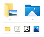
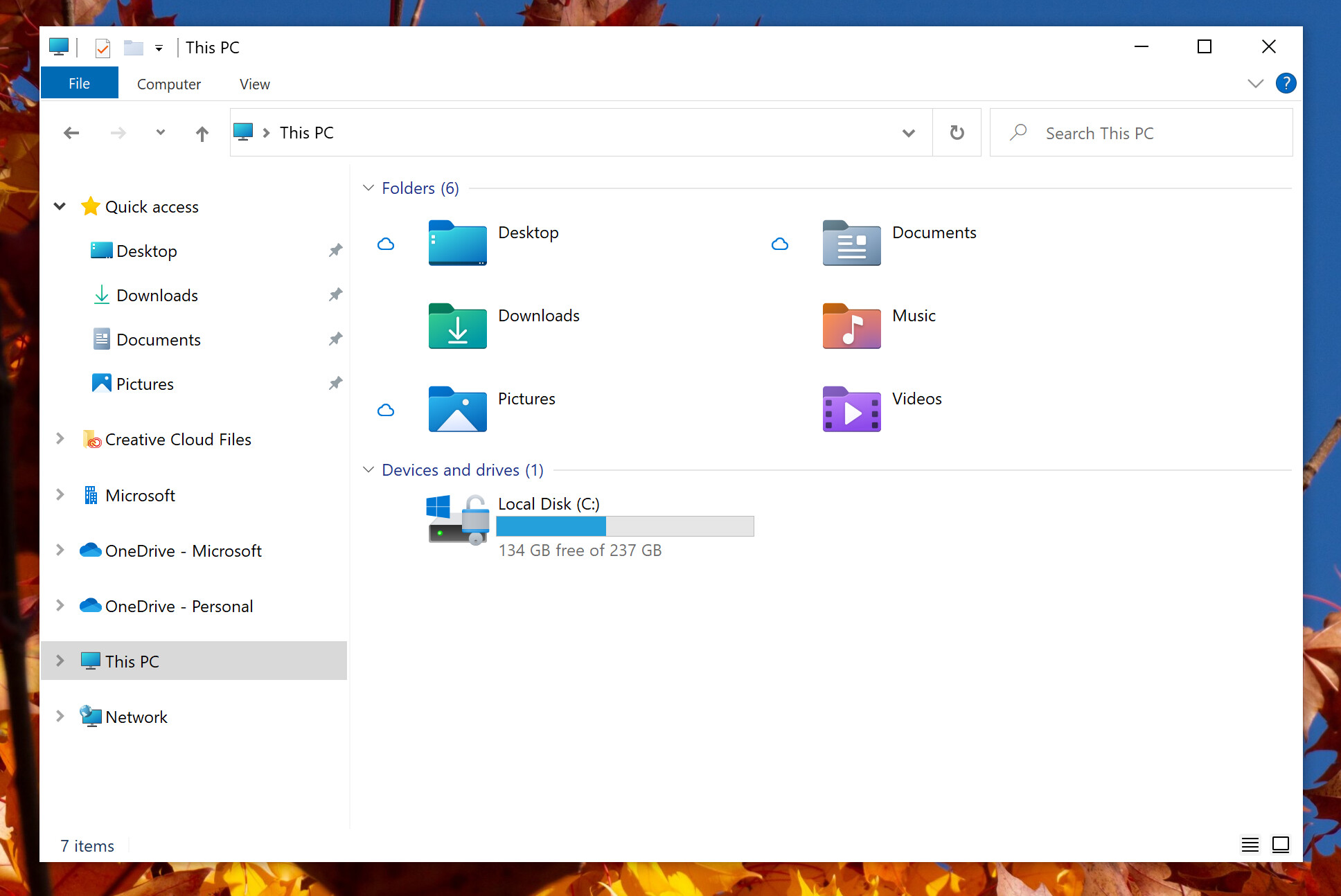
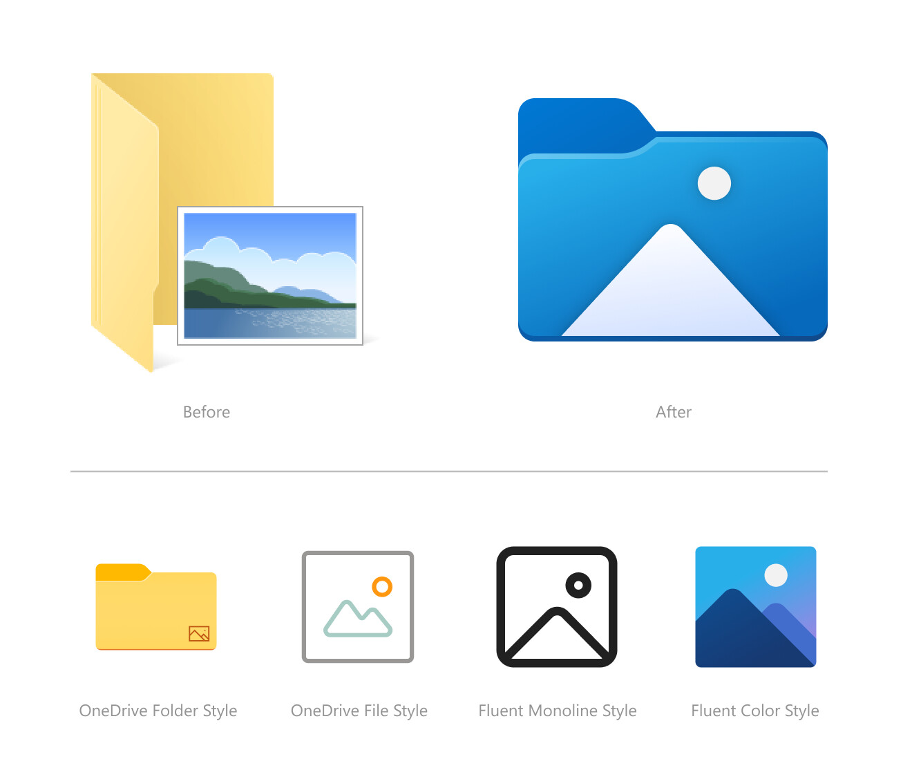
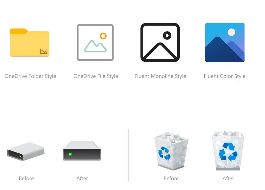
Microsoft is testing a user-interface refresh with an upcoming update to Windows 10. Released for testing with Insider Preview Build 21343, the refresh includes new system icons that are of a significantly different design scheme from the ones you have now. System folders (Desktop, Documents, Downloads, Pictures, Music, etc.,) now come with color-coded icons resembling something from a Windows-knockoff Linux desktop environment. The graphics of the icons appear simpler, and this simplicity probably has something to do with the emergence of remote-desktop/virtual-desktop, where simpler graphics are easier on the network bandwidth, particularly on the side of the VDI server. The current system icons of Windows 10 are evolved from those of previous Windows versions.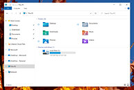

Source:
Windows Insider Blog
83 Comments on Microsoft Tests Colorful New System Icons for Windows 10
Microsoft is following the trend?
bumptop.github.io/
Some days I feel like the win95 team is secretly sabotaging their source code with arbitrary limitations drawn from the 90s. Whats next, unlimited file size, in 8bit color?
Its either go back to dos or use more colour
How very linux of them.
www.techradar.com/news/windows-10-printer-chaos-has-been-resolved-heres-how-to-get-the-fix
A hotfix came after many days, with many warnings that it could break other things (like wifi).
The reality is that most users will probably use all of the Control Panel (well, Control Panel and Settings app) once, maybe. After that, very sporadically they will circle back to touch this or that.
Think about it: most items in it are at best used once when the user is setting things up for the first time (accessibility options, Bitlocker, mouse and keyboard, sound...), some aren't even used (myself I never use the Work folders thing, Storage Spaces, Color Management or Windows Firewall). And then you have the big loads of enterprise users that rarely touch anything there because the IT staff disabled almost everything company-wide, while doing a lot if not all of the configuration through Group Policy and Active Directory or whatever they call it these days.
So, yeah, a bit of a pain in the neck for those that actually do use it relatively frequently (whether that's just for the shits and giggles or because something is/got broken, it's another matter entirely). But most users will just go "oh, so this is now in the Settings app? ok, cool" and forget about the thing entirely once they're done.
On how do I know about it? It's a guess, but it's based on the following:
The Settings app launched with Windows 10.
Since then, aside from what was available in the Settings app that got removed from Control Panel during launch, very few things have been moved.
Every single time something got moved, I saw it announced months before it reached the mass userbase because the thing that got moved was detailed in the Insider build release notes.
Finally, there are still a lot of settings inside the classic Control Panel. Some of them have been duplicated in Settings for a long time already and yet they are still there. So, I don't think Microsoft is willing or caring to move everything in one go. It will be a slow process.
And it's taken almost 6 years to get to where we are now. I'd say it will take at least a few more years, if only because they're focused on other stuff. Again, Microsoft doesn't expect users to tinker all the time with the settings, beyond the usual wallpaper change, and they do have the telemetry to know it, after all, so it's very likely that moving things from CP to Settings is low priority or not even registered as a goal for anytime soon.
21H2 vs 21H1 seems like it's basically a whole new OS, or at least deserving of a new number.
In any case, the bug has been reported multiple times in Feedback hub, so Microsoft is probably aware of this already.I'm betting on MS pulling an Apple and calling it Windows 10 for at least 5 more years :laugh: