Thursday, March 25th 2021

Microsoft Tests Colorful New System Icons for Windows 10

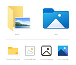
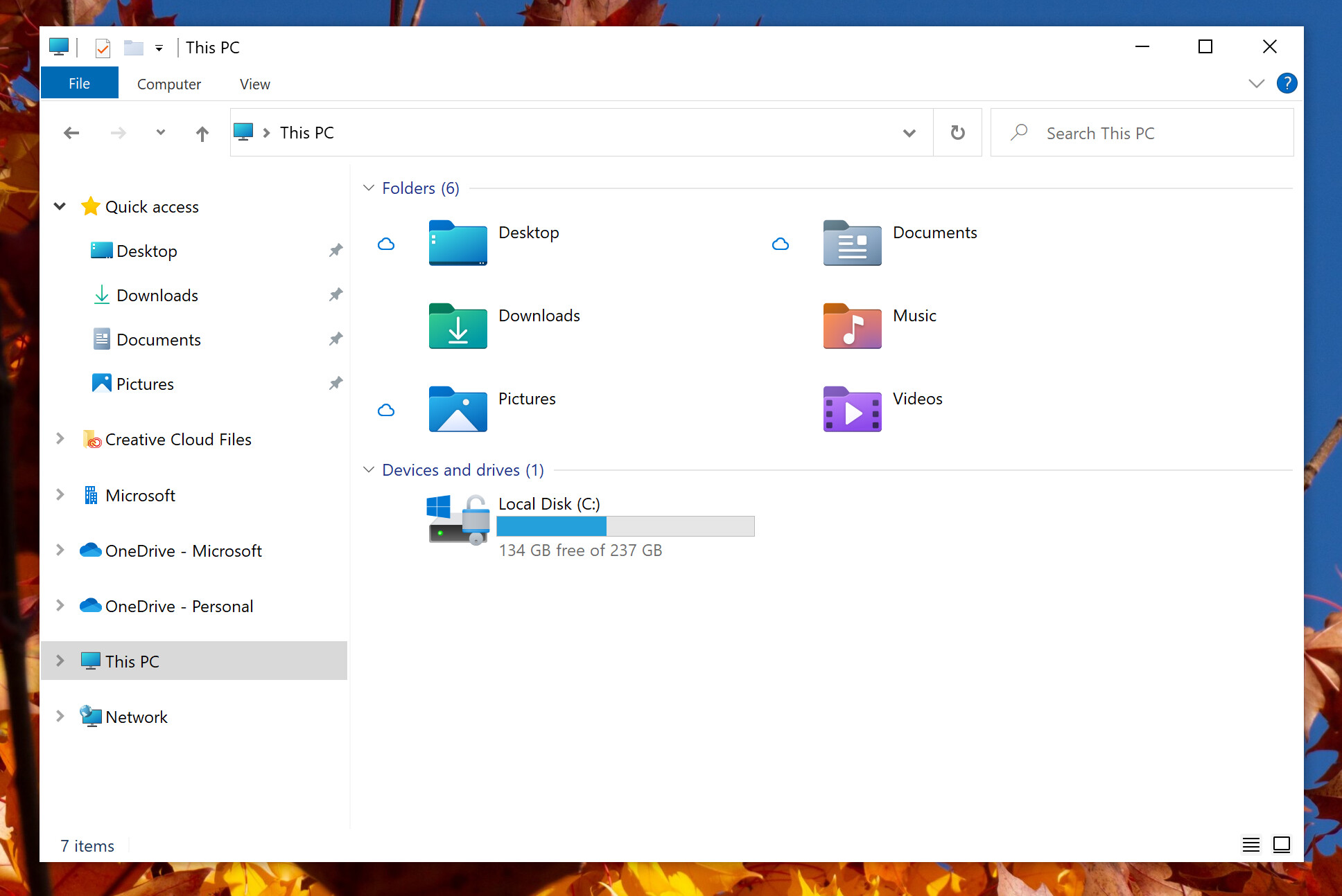
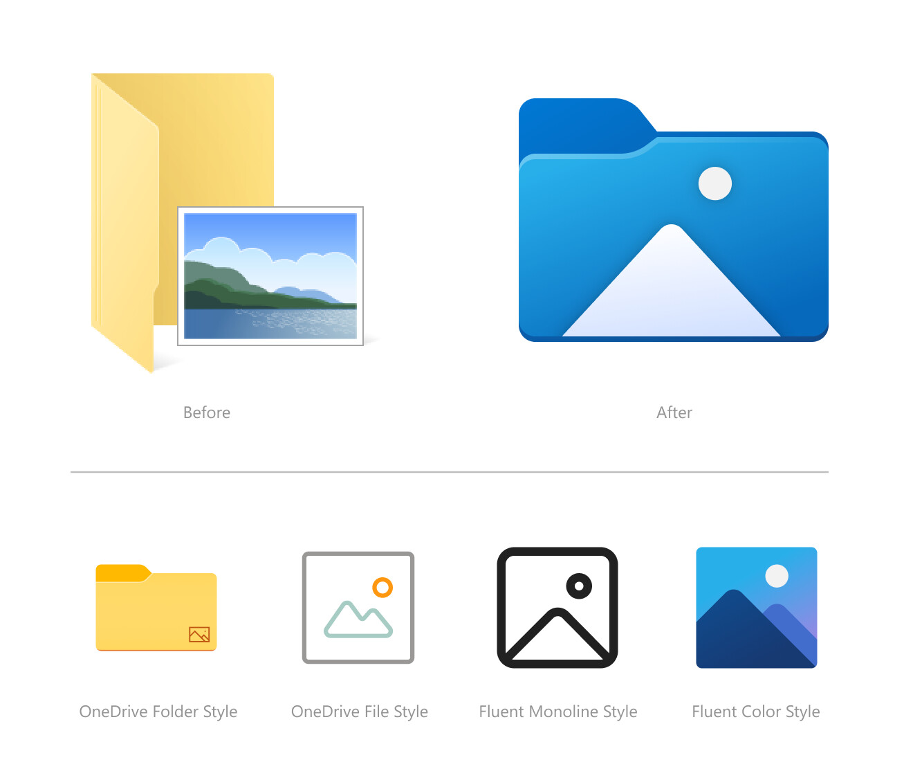
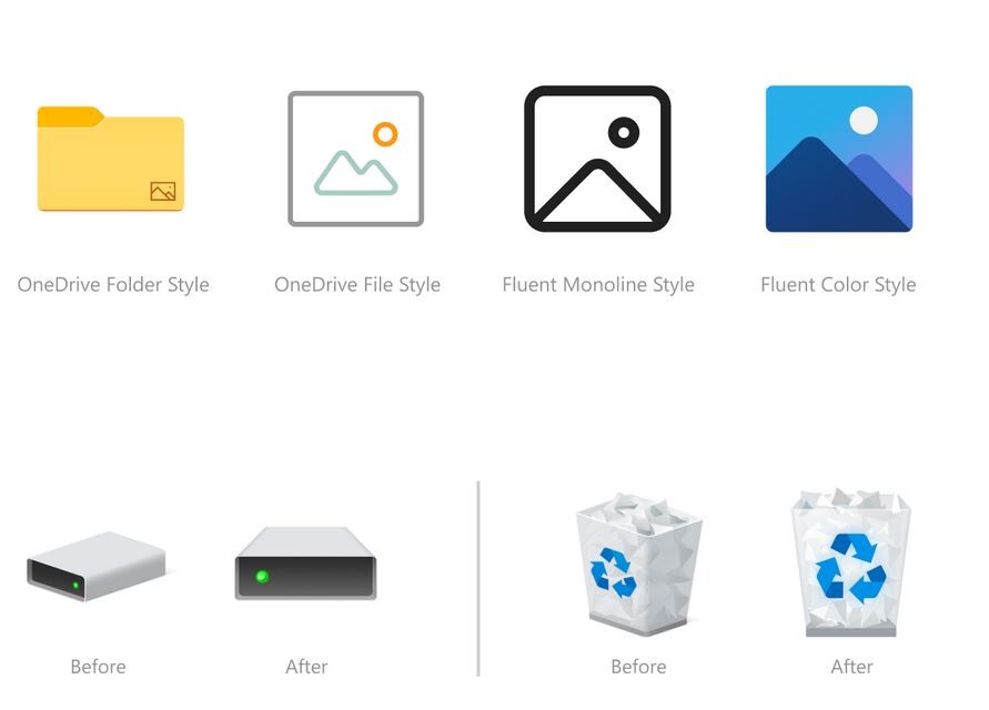
Microsoft is testing a user-interface refresh with an upcoming update to Windows 10. Released for testing with Insider Preview Build 21343, the refresh includes new system icons that are of a significantly different design scheme from the ones you have now. System folders (Desktop, Documents, Downloads, Pictures, Music, etc.,) now come with color-coded icons resembling something from a Windows-knockoff Linux desktop environment. The graphics of the icons appear simpler, and this simplicity probably has something to do with the emergence of remote-desktop/virtual-desktop, where simpler graphics are easier on the network bandwidth, particularly on the side of the VDI server. The current system icons of Windows 10 are evolved from those of previous Windows versions.
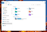
Source: Windows Insider Blog
Add your own comment

83 Comments on Microsoft Tests Colorful New System Icons for Windows 10

#26
Chrispy_
dyonoctisIt's not the same team handling those task. Just because a team is slacking off doesn't mean that the other teams should stop working ;)
If one team is a bare minimum of 9 years behind schedule, and another team has time to do multiple icon updates, perhaps Redmond needs to fire its entire management team for gross misapporopriation of human resources.

Designing new icons for Windows is like cleaning the windows of a building that's on fire.
Posted on Reply
#27
mechtech
windwhirlI think that's supported but it's kinda a mess? Or at least, the interface itself isn't meant to be used in 10-bit color modes (I have read complaints of everything looking washed out, that sort of stuff). Kinda makes sense, since 90% of the world uses 8-bit panels at best (or worse, like 6-bit+FRC), but it's annoying if you have the hardware for it.

Other people also have thrown around the idea that the code that handles color management (WDDM, DWM and/or whatever else) would need a rewrite or something (which might affect drivers too), but that's just an idea some have had. Can't say if it holds or not.

Also, the two main GPU vendors used to limit high-color modes to professional models, I think? (Nvidia with Quadros, AMD with FirePro/Radeon Pro/whatever)
EDIT: AMD doesn't support it unless you're using Dual-Link DVI or DisplayPort, they don't mention HDMI :confused:
www.amd.com/en/support/kb/faq/dh2-008
Windows 10 the not so modern OS. Color, scaling, etc. Things that should have been in the works in the Win 7 SP1 days.

I think AMD consumer cards have supported 10-bit since the RX series? And yes monitors and wired networking has been stale for 10 years, just like windows.
Posted on Reply
#28
dyonoctis
Chrispy_If one team is a bare minimum of 9 years behind schedule, and another team has time to do multiple icon updates, perhaps Redmond needs to fire its entire management team for gross misapporopriation of human resources.

Designing new icons for Windows is like cleaning the windows of a building that's on fire.
It might not be an affair of underemployment of software engineer compared to designer, but rather a planning issue.
Since win 8 Microsoft has switched between several design guideline, and each transition was never complete, and it was incremental. They are generally more focused on new functionality (several desktop, clipboard history, GPU in the task manager, game bar) over finally fixing the overall UX/UI.

I can also imagine that the sheer amount of legacy stuff in windows also make it harder to speed the overhaul with just employing more people. You need people that are familiar with the "old" windows so that you avoid to break stuff and getting flamed by the internet :D . I sometime think that windows is unnecessary complex for it's own good. It's a kind of a weird hybrid where it wants to be a consumer OS while also offering tons of deep options for professionals.
Posted on Reply
#29
Tinchouru1
windwhirlNo. It's chained to Insider builds for now :p
all you have to do is select windows insider developer mode and it's yours! nice

all you have to do is select windows insider developer mode and it's yours! nice


Posted on Reply
#30
CheapMeat
It's just constant breadcrumbs for the dumbest group of Win10 users; the one's that want an Android/iOS experience. There's so many behind the scenes things that still need work on or complete overhauls but you barely see any news about progress on these. I feel like 90% of the news about Win10 is about the UI, for years.

Like here's an interesting thing that Windows should be improved on: hardware/comments/m89634/_/grgnqxtBut it'll probably never happen because the vast majority of users don't care about it and mostly care about the UI. I know they are different departments, etc. But still.
Posted on Reply
#33
TumbleGeorge
Where is my 3D desktop like in sci-fi movies?
Posted on Reply
#34
windwhirl
TumbleGeorgeWhere is my 3D desktop like in sci-fi movies?
You got that with Windows Vista's Flip 3D and nobody wanted it :P
Posted on Reply
#35
Wirko
"colorful"

For people like me, who distinguish between taskbar icons most quickly by colour, new Explorer equals Word equals Outlook.
Posted on Reply
#36
TumbleGeorge
windwhirlYou got that with Windows Vista's Flip 3D and nobody wanted it :p
Well why peoples buying PC's with 8+ cores and expensive G cards with 10G VRAM for home use if they not use them to satisfy a beauty of full color 3d in picture? Everywhere in their machine not only in PC gaming!
Wirko"colorful"

For people like me, who distinguish between taskbar icons most quickly by colour, new Explorer equals Word equals Outlook.
There is a trademark with that word :D don't worry man!
Posted on Reply
#37
rtwjunkie
PC Gaming Enthusiast
Just leave it alone, MS! Enough with the ti nkering with what we use. Create a “test-plane” so to speak, and play with that OS all you want in the lab.
Posted on Reply
#38
Wirko
windwhirlYou got that with Windows Vista's Flip 3D and nobody wanted it :p
With the sole exception of Android and iOS developers and users, several years later.
rtwjunkieJust leave it alone, MS! Enough with the ti nkering with what we use. Create a “test-plane” so to speak, and play with that OS all you want in the lab.
Here's the kind of lab that can safely contain the OS.
Posted on Reply
#39
Tinchouru1
TumbleGeorgeWell why peoples buying PC's with 8+ cores and expensive G cards with 10G VRAM for home use if they not use them to satisfy a beauty of full color 3d in picture? Everywhere in their machine not only in PC gaming!


There is a trademark with that word :D don't worry man!
You can say it without crying ... forever alone
Posted on Reply
#40
Wirko
dyonoctisThey are generally more focused on new functionality (several desktop, clipboard history, GPU in the task manager, game bar) over finally fixing the overall UX/UI.
Granted, new functionality doesn't hurt when it doesn't get in the way. The examples you gave probably don't.
Posted on Reply
#41
Mr Bill
Maybe I can get them to work on my MS-DOS 4.0?
Posted on Reply
#42
Dave65
voltageIts about time! much welcomed. I am so tired of seeing the decades old Manila Folder.
Me too.. Plus seeing all the hate for something new when most just hate to hate makes me want it more..
Posted on Reply
#44
TheUn4seen
Chrispy_Hey Microsoft, how about not making pointless little changes to artwork that nobody cares about, and you first of all finish the underlying OS?

The Windows 95-style Control Panel, which was supposed to be replaced by the Windows 8 settings app nine years ago is still required because you haven't bothered actually making some of the core OS functionality ready for this millennium yet. Multiple times over the last 9 years I have kept reading how the next update/version will finally complete the interface and retire the old Control Panel to stop this schizophrenic dual-interface duplicate/conflicting madness that started with Windows 8 and you keep letting me (and everyone else) down. What's the point of moving features to the settings app, only to have them as a link back to the Windows 9x interface? That's not a re-code, that's just adding another layer of shit on top of something that is already shit.

LIPSTICK.

ON.

A.

PIG.


So yeah, finish making the W10 OS first, and then worry about pointless fettling with icon art. The Feature Creep is getting ridiculous when parts of the OS are still clearly the same tired code that I was using in the WindowsNT days.
As a manufacturer, would you rather spend a lot of money to fix underlying, complex issues most people won't even see of pay an intern a few pennies to do some graphics your less intellectually inclined customers (which is the vast majority of consumers) will see, go "ooh, so shiny, take my money please"? Apple based their whole company on the "See? It's pretty, don't worry about the rest" premise with great success. Microsoft also wants monies from dumb peoples.

Those icons look like they are made based on guidelines for creating content for intellectually disabled people - I did some work for a hospital with patients suffering from various disabilities and I still remember those guidelines. In fact, Windows looks like this since the Win7 - bright colors, limited information available per area so as not to overwhelm the user, oversimplification of every aspect going beyond basic usage pattern and so on.
Posted on Reply
#45
DeathtoGnomes
rtwjunkieJust leave it alone, MS! Enough with the ti nkering with what we use. Create a “test-plane” so to speak, and play with that OS all you want in the lab.
You know damn well m$ doesnt think its pretty enough, they need the good looks to go along with that drama queen flair.

Custom Icons, nuf said.
Posted on Reply
#46
watzupken
Personally, I would prefer if Microsoft focus on the below,
1. Stability of OS - While I agree that there is no bug free software, but I don't think it is acceptable to see teething/ glaring issues with each big release. Especially when majority out there are using Windows Home edition where they can't really opt out of all these updates for long
2. Optimized for better performance - I feel with all the fanciful UI, its making the already bloated OS even more bloated
3. Improve UX - I don't know if its only me, but I noticed that in order to keep the UI clean, they are hiding features/ functions which should ideally be easily assessible.
Posted on Reply
#47
aQi
Finally.....
Posted on Reply
#48
Melvis
Cool welcome back to the 90s MS, step up from the 80s design you been rocking.......but whats the BS about removing control panel? come on MS! Fix your OS not make it worse.
Posted on Reply
#49
windwhirl
MelvisCool welcome back to the 90s MS, step up from the 80s design you been rocking.......but whats the BS about removing control panel? come on MS! Fix your OS not make it worse.
Goddammit people, I keep saying that it's not gonna be removed yet.

No plans for it other than slowly migrating things from Control panel to Settings. And they're taking their sweet time doing it.
Posted on Reply
#50
TumbleGeorge
New icons with increase speed of random read/write/copy of small program files from SSD :D
Posted on Reply
Add your own comment
Apr 25th, 2024 00:29 EDT change timezone

New Forum Posts

Popular Reviews

Controversial News Posts