Sunday, May 17th 2026

Microsoft Brings Back Windows 10-Style Taskbar and Start Menu Customization in Windows 11

If you were a user of the Windows 10 operating system with a customizable Taskbar location, you were familiar with Taskbar customization and different placements. However, Microsoft kept this feature restricted in Windows 11 for a long time. The company is now introducing full support for Taskbar and Start Menu customization, which will be available to Windows Insiders in the Experimental channel over the coming weeks. Specifically, the Taskbar will be movable to the top, bottom, left, or right side of the screen. From there, users will be able to customize icon alignment for each Taskbar position, whether top-aligned, center-aligned, left-aligned, or right-aligned. All it takes is a visit to Settings > Personalization > Taskbar > Taskbar behaviors, where all of the settings will be located. Interestingly, the Taskbar will also offer smaller icons and a reduced presence, which is a nice addition for anyone looking to maximize usable space.

Additionally, Windows Insiders are testing a preview of the revamped Start Menu customization effort, which gives users more meaningful control over Start Menu behavior. One of the changes includes an option to choose between smaller and larger Start sizes, independently hide or show sections like Pinned, Recent, and All, and even remove their name and profile photo for extra privacy during screen sharing or presentations. Previously, these customizations weren't possible, as Windows 11 shipped with a generic Start Menu look for every build. Just as important, Microsoft is separating Start's file recommendations from File Explorer's recent items and jump lists, so disabling recommendations in Start will no longer affect recent activity elsewhere in Windows. At the same time, the company is trying to make the recommendation area more useful by renaming it to Recent, keeping newly installed apps visible, and refining which files appear in that section.

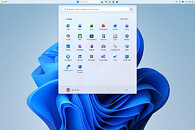
These changes are rolling out in the coming weeks for Windows Insiders, meaning that regular Windows 11 users on versions 24H2, 25H2, and 26H1 will experience them in about a month or so. By the time these updates arrive, we hope to see some of the promised Windows K2 performance and usability improvements as well. This means that the Windows 11 OS will finally integrate these much-desired changes.
Source: Microsoft
Add your own comment

52 Comments on Microsoft Brings Back Windows 10-Style Taskbar and Start Menu Customization in Windows 11

#1
dj-electric
Benedict ChenLi or Games4THAT'S COOL AND CRAZY!

hehe so Fun readnig Techpoiwerup news

Windows optimsiation windows optimisation!!!!!! Sub 65w gaming Pc LINUX wspearkeso nset nsewhole setup mosue sotaaaebrno noeesmsise bcamioa s s creative pebble PLSUI!

Technological developments respecguflly precisefully ina ebcomebetter way

FIRST!!!!

Benedict Chen Luashufi Li edgey elucidatr phaotjm 40 melboure seutps signing!!!
Man, i love the internet...
Posted on Reply
#2
ymdhis
Can't wait until they bring back Windows 10, period.
Posted on Reply
#3
Flanker
ymdhisCan't wait until they bring back Windows 10, period.
Pretty sure a lot of people would love Windows 7 or 10 with latest security and drivers updates
Posted on Reply
#4
Raiden85
So they finally bring back a feature that was available from Windows 95 to Windows 10, slow clap.
Posted on Reply
#5
GoldenTiger
Benedict ChenLi or Games4THAT'S COOL AND CRAZY!

hehe so Fun readnig Techpoiwerup news

Windows optimsiation windows optimisation!!!!!! Sub 65w gaming Pc LINUX wspearkeso nset nsewhole setup mosue sotaaaebrno noeesmsise bcamioa s s creative pebble PLSUI!

Technological developments respecguflly precisefully ina ebcomebetter way

FIRST!!!!

Benedict Chen Luashufi Li edgey elucidatr phaotjm 40 melboure seutps signing!!!
Yeah man! Rabble rabble rabble!
Posted on Reply
#6
GeoffreyA
The giant is waking up from its slumber (to give a bit of credit and encouragement).
Posted on Reply
#7
Vayra86
ymdhisCan't wait until they bring back Windows 10, period.
Why not straight back to 7 while they are at it, along with good times and more relaxed people, minus xbox live?
Posted on Reply
#8
GeoffreyA
FlankerPretty sure a lot of people would love Windows 7 or 10 with latest security and drivers updates
Yes, the funny thing is, Microsoft could sweep critical acclaim from the community overnight, going from zero to hero, by restoring the 7 shell and saying, "Touch be damned."

Probably, many Microsoft engineers would see the sense and desire for this; but imagine convincing the big shots.

"Oh, 7? You do mean NT 7.0? But that's old, almost twenty years' old. Why, in Gates's good name, would anyone want to use that?"

"Well, a big number of the Windows community have expressed a desire for, uhm, NT 6.1. I have got percentages on this sheet."

"A vocal minority, no doubt, who doesn't know what they want. We'll give them what they need, what the majority of Windows users simply love. The modern, Web-native, cloud-first approach computing strives towards. With an agentic flavour, of course."

"But user satisfaction is down."

"Down? Are we to listen to the effusions of a few keyboard warriors contradicting what our latest telemetry tells us?"

"No."

"Here, let's bring up some telemetry. Click, click. All right. Mr. John Slugworth, age 37, works at the City of Cape Town municipality as a clerk. Married to Jenny: see the copious WhatsApp messages. He clicks the Start menu—here, watch the real-time screen feed—10 times while waiting for it to render. Clearly, he gets joy out of using Windows features. I call that a success. Do you?"
Posted on Reply
#9
_JP_
Unfazed.
Btw, will "feature" this use 2GB of RAM?
Posted on Reply
#10
TheDeeGee
I'll stick with StartAllBack's Windows 7 style startmenu, thank you.
Posted on Reply
#11
cinemaware
kony
So brave, stunning, and original! wowow! 1!! /s
ymdhisCan't wait until they bring back Windows 10, period.
It's kinda funny, because I recall people hated Win 10 for years, well, until 11 has appeared.

Overall, the negging posts about Win and MS are kinda boring - of water is wet variety - but, when they call out the real problems with MS, like broken updates, AIfication or lack or privacy, then sure, why not. At least that makes sense.

But repeating the same stuff over and over when there are actually some positive news? That means you're not really interested in change and are doing this on autopilot. This is pretty much what real "slop" is, I'd say.
Posted on Reply
#12
lemonadesoda
Classic Shell FTW. I don't know how people cope without it.
Posted on Reply
#13
kondamin
lemonadesodaClassic Shell FTW. I don't know how people cope without it.
by having what i use most of the time in the task bar and learning a couple key combinations
Benedict ChenLi or Games4THAT'S COOL AND CRAZY!

hehe so Fun readnig Techpoiwerup news

Windows optimsiation windows optimisation!!!!!! Sub 65w gaming Pc LINUX wspearkeso nset nsewhole setup mosue sotaaaebrno noeesmsise bcamioa s s creative pebble PLSUI!

Technological developments respecguflly precisefully ina ebcomebetter way

FIRST!!!!

Benedict Chen Luashufi Li edgey elucidatr phaotjm 40 melboure seutps signing!!!
did someone spin up an instance of chatgtp -5
Posted on Reply
#14
Vayra86
kondamindid someone spin up an instance of chatgtp -5
I guess he used the free version that comes with a box of cereal, post is hilarious. Dont LQ it either, leave it there. Its just right
Posted on Reply
#15
Fluke
Currently I'm using Windhawk to get the taskbar on top as is tradition since Windows 98SE.
But there is another thing that irks me about Windows 11: The multi-click time-wasting mess aka context menu.
It should be single-click and customisable so you decide what program gets to be in there.
Posted on Reply
#16
Vayra86
FlukeCurrently I'm using Windhawk to get the taskbar on top as is tradition since Windows 98SE.
But there is another thing that irks me about Windows 11: The multi-click time-wasting mess aka context menu.
It should be single-click and customisable so you decide what program gets to be in there.
Yeah lovely isn't it 'see more options' and then half the list is the same one you already saw. Its like someone was on crack cocaine designing that nonsense. Its doubly silly that they even make the supposedly compact right click dropdown one line longer by adding that more options thing... and then more options adds what, 2 or 3 more things to it. :roll:


Bonus points for the recycling of an old GUI as well when you finally get to the dropdown where you'll likely be going most :D
Extra bonus points for designing something as more compact and then wasting about double line space for a single option compared to ye olde menu.

Imagine being responsible for this horse manure. Lmao
By the way, check the wild mix of English and Dutch, too 'Share met'? WTF is that supposed to mean, anyway? 'Share' was fine... it was 'Delen' in the old menu :D They are literally trying to reinvent shit they already had figured out (and correctly spelled...) and getting it wrong consistently. Probably helped by AI.


Posted on Reply
#17
Broken Processor
The old start menu just makes sense you click it go to your app with a flick of scroll wheel or into the desired sub category.

It was designed to follow the way people organise things and felt natural and I've no idea why Microslop felt the need to change it into a supermarket strategy where nothing is logical to make you look at more shelves.
Posted on Reply
#18
lexluthermiester
ymdhisCan't wait until they bring back Windows 10, period.
No way, Windows 7, period.
Posted on Reply
#19
GeoffreyA
Vayra86Yeah lovely isn't it 'see more options' and then half the list is the same one you already saw. Its like someone was on crack cocaine designing that nonsense. Its doubly silly that they even make the supposedly compact right click dropdown one line longer by adding that more options thing... and then more options adds what, 2 or 3 more things to it. :roll:


Bonus points for the recycling of an old GUI as well when you finally get to the dropdown where you'll likely be going most :D
Extra bonus points for designing something as more compact and then wasting about double line space for a single option compared to ye olde menu.

Imagine being responsible for this horse manure. Lmao
By the way, check the wild mix of English and Dutch, too 'Share met'? WTF is that supposed to mean, anyway? 'Share' was fine... it was 'Delen' in the old menu :D They are literally trying to reinvent shit they already had figured out (and correctly spelled...) and getting it wrong consistently. Probably helped by AI.


It changes the conventional layout, stretches into two dimensions, and adds unnecessary icons, all increasing cognitive load.
Posted on Reply
#20
arni-gx
AleksandarKIf you were a user of the Windows 10 operating system with a customizable Taskbar location, you were familiar with Taskbar customization and different placements. However, Microsoft kept this feature restricted in Windows 11 for a long time. The company is now introducing full support for Taskbar and Start Menu customization, which will be available to Windows Insiders in the Experimental channel over the coming weeks. Specifically, the Taskbar will be movable to the top, bottom, left, or right side of the screen. From there, users will be able to customize icon alignment for each Taskbar position, whether top-aligned, center-aligned, left-aligned, or right-aligned. All it takes is a visit to Settings > Personalization > Taskbar > Taskbar behaviors, where all of the settings will be located. Interestingly, the Taskbar will also offer smaller icons and a reduced presence, which is a nice addition for anyone looking to maximize usable space.

Additionally, Windows Insiders are testing a preview of the revamped Start Menu customization effort, which gives users more meaningful control over Start Menu behavior. One of the changes includes an option to choose between smaller and larger Start sizes, independently hide or show sections like Pinned, Recent, and All, and even remove their name and profile photo for extra privacy during screen sharing or presentations. Previously, these customizations weren't possible, as Windows 11 shipped with a generic Start Menu look for every build. Just as important, Microsoft is separating Start's file recommendations from File Explorer's recent items and jump lists, so disabling recommendations in Start will no longer affect recent activity elsewhere in Windows. At the same time, the company is trying to make the recommendation area more useful by renaming it to Recent, keeping newly installed apps visible, and refining which files appear in that section.

These changes are rolling out in the coming weeks for Windows Insiders, meaning that regular Windows 11 users on versions 24H2, 25H2, and 26H1 will experience them in about a month or so. By the time these updates arrive, we hope to see some of the promised Windows K2 performance and usability improvements as well. This means that the Windows 11 OS will finally integrate these much-desired changes.
maybe, in the future, in this year, i am going upgrade my OS into win 11 26h2, if they keep showing the progress and positivisme on win 11.
Posted on Reply
#21
TumbleGeorge
lexluthermiesterNo way, Windows 7, period.
But it is possible to be personalized almost like normal start menu... Almost?
Posted on Reply
#22
Chaitanya
ymdhisCan't wait until they bring back Windows 10, period.
Even that was a spyware compared to Win 7 which was true standalone version of Windows.
Posted on Reply
#23
Mysteoa
Vayra86Yeah lovely isn't it 'see more options' and then half the list is the same one you already saw. Its like someone was on crack cocaine designing that nonsense. Its doubly silly that they even make the supposedly compact right click dropdown one line longer by adding that more options thing... and then more options adds what, 2 or 3 more things to it. :roll:


Bonus points for the recycling of an old GUI as well when you finally get to the dropdown where you'll likely be going most :D
Extra bonus points for designing something as more compact and then wasting about double line space for a single option compared to ye olde menu.

Imagine being responsible for this horse manure. Lmao
By the way, check the wild mix of English and Dutch, too 'Share met'? WTF is that supposed to mean, anyway? 'Share' was fine... it was 'Delen' in the old menu :D They are literally trying to reinvent shit they already had figured out (and correctly spelled...) and getting it wrong consistently. Probably helped by AI.


If you look closely, it does say Delen on the top Share option.
Posted on Reply
#24
outlw
FlukeBut there is another thing that irks me about Windows 11: The multi-click time-wasting mess aka context menu.
It should be single-click and customisable so you decide what program gets to be in there.
Vayra86Yeah lovely isn't it 'see more options' and then half the list is the same one you already saw. Its like someone was on crack cocaine designing that nonsense. Its doubly silly that they even make the supposedly compact right click dropdown one line longer by adding that more options thing... and then more options adds what, 2 or 3 more things to it. :roll:
FYI, Holding Shift while Right Clicking gives you the classic menu :cool:
Posted on Reply
#25
FR3D1
Ninja Cat
AleksandarKwhich will be available to Windows Insiders in the Experimental channel over the coming weeks.
If the feature is not yet unlocked in build 26300—and does not appear under "Feature toggles" within Windows Insider—you can enable it using the ViVeTool.

Download and unzip the ViVeTool.
Right-click inside the folder and, while holding down the Ctrl + Shift keys, open the Terminal (this launches it as an administrator).
Type `.\vivetool /enable /id:59213768,61090762` and press Enter.
Deskmodder (de)

Regards,
Fred.
Posted on Reply
Add your own comment
Nov 17th, 2026 13:47 CST change timezone

New Forum Posts

Popular Reviews

TPU on YouTube

Controversial News Posts