Friday, October 3rd 2025

Microsoft Redesigns Microsoft 365 Icons With Brighter, Fluid Visuals
Microsoft has officially unveiled a redesigned icon pack for its core Office apps, which are found within the Microsoft 365 service. The 10 primary application marks now sport brighter colors, a more playful tone, and softer contours inspired by the company's Copilot emblem. This is the first large-scale update since 2018, and it will be available on web, desktop, and mobile platforms in the coming weeks. The 10 core apps include Teams, Word, Excel, PowerPoint, Outlook, OneNote, Defender, OneDrive, Designer, and Clipchamp. All 10 of these core applications now have redesigned icons following fluid forms and vibrant colors. On the surface, these are visual changes, yet the company frames them as a sign of context-aware tools that blend AI assistance with human intent.
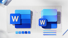
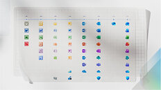
Under the new look, the icons move away from blocky solidity and toward folded, curved forms that suggest motion and approachability. Designers simplified details to keep each mark clear at small sizes. For example, Word now shows three horizontal bars instead of four to improve legibility. The palettes are richer, featuring exaggerated analogous gradients designed to enhance contrast across various displays and support accessibility. Letter plates remain where brand recognition matters, but proportions, texture, and spacing were modernized, so the icons feel cohesive with Copilot and recent Microsoft products. For most people, the change will be a visual refresh, brighter, simpler tiles appearing across their devices, but Microsoft says the icons are intended to reflect a larger evolution in product making where interfaces and AI work together to help people reach their desired outcomes faster.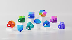
Source:
Microsoft
Under the new look, the icons move away from blocky solidity and toward folded, curved forms that suggest motion and approachability. Designers simplified details to keep each mark clear at small sizes. For example, Word now shows three horizontal bars instead of four to improve legibility. The palettes are richer, featuring exaggerated analogous gradients designed to enhance contrast across various displays and support accessibility. Letter plates remain where brand recognition matters, but proportions, texture, and spacing were modernized, so the icons feel cohesive with Copilot and recent Microsoft products. For most people, the change will be a visual refresh, brighter, simpler tiles appearing across their devices, but Microsoft says the icons are intended to reflect a larger evolution in product making where interfaces and AI work together to help people reach their desired outcomes faster.


47 Comments on Microsoft Redesigns Microsoft 365 Icons With Brighter, Fluid Visuals
After all that three dimensional face is way too old school and change for the sake of change is always good!
Just new fancy icons.
We're still limited to 15 character PC names with no special characters.
We are being conditioned to serve the machine
within a couple of years people will have forgotten we were ever able to remove software or shut down machines
But let's face it, most of Microsoft's best engineers left 10-15 years ago. There's no innovation left. Ever since the smartphone dethroned the PC as the driver of all consumer technology innovation, Microsoft has found itself as a spectator watching from the stands rather than competing on the field of play.
Now all that's left are just some cloud server administrators playing lapdog to Sam Altman & OpenAI.
By 2030 Microsoft is just going to be an enterprise IT staff changing backup tapes and doing the occasional AI cluster hardware upgrade in some datacenter in Boondocksville, Nowhere County. And by 2040 Joe Consumer will refer to Microsoft in the same way people refer to IBM today.
One could say he is a bit silly
Windows, on the other hand, has shown incompetence for a long time. NT's architecture is resilient but they are slowly destroying it, not to mention the deplorable work of the GUI department.
We are almost at the end of 2025 and you still can't have 2 files with the same name (on different folders) opened at the same time.
I feel like everything that MS is doing to Office is giving it a new coat of paint every 3 years.
It reminds me of the trash redesign Google made to their icons a few years ago that transformed them from easily recognizable icons into amorphous figures that all look the same. It's been years and I still have trouble telling them apart on my Android device:
Office365M365 w/Copilot...Yes, icons will solve everything, and soooo many people were complaining about the old ones so I'm stoked that they chose to do that instead of anything I just mentioned.
/s2013 is my pick but honestly anything prior to 2018 is fine. In 2018 the letters started shrinking and the shapes became abstract and indistinct.
it's possible just they dont want/can't or too much time/too complicated ?
no comment :wtf:
People study arts but not ergonomy or have no Idea how to make consistent UIs in terms of usability (not in terms of design).
I find as well "UI fatigue". Most tutorials are useless because companies have the compulsive need to change shortcuts, icon position, features and descriptions several times an year.
Stuff, In general, is absurdly big, with lot of lost space, flat and difficult to navigate.
Old programs arent better because of nostalgy, but because they were consistent, easy to navigate and didn't change feature locations between versions. You could use shortcuts, Alt for description and Tab and arrows to move between things. Accept, Cancel, OK had consistent locations.
MS has demostrated in the last 20 years they are incompetent in terms of UI (not only). After the Windows Mobile, Windows 8, windows ARM fiascos, we've been forced in windows 10 to have less and less features over versions, most usefull "power" tools have been deprecated or slowed down: control panel, system administration, or the new task manager (horribly slow). Not to mention the new notepad which opens files that arent there anymore.
How many windows enterprise machines I've seen with Xbox Bar configuration and updates and services running on their "configuration panel".
Start "area" full of ads, the constantly flashing taskbar with "news", "weather" and "stock" information. FFS. Even windows child accounts have those features enabled by default.
It took 10 years from part of windows 7 to most of windows 10 to develop a high DPI scaling interface. Which dont work with most of old programs and most of the new "no .net" / cross-platform programs, which additionally, because of the lack of windows restrictions have even more abominable UIs, case: Topaz a study case of UI incompetence.
Most young people dont care.
Most old people can't addapt.
I'm in the middle and I hate the "for young and "dumb" looks" and "just powershell it" new strategy.
An UI for a O.S. is to control the O.S. via the UI. control...
New UIs are crearly constructed, like many games, as psychological cages, with loops and item's positions meant to "guide" you, hiding options they don't want you to touch under several layers of incosistent bunches of options. Cases are app permissions on android or google privacy options (can't be more obscure even in with a white background).
IA will help to develop even more obscure UIs thank to our nature to let them capture every click.
We will be noticed by ToS changes to help us better understand how are they using our information, like those new icons.