Tuesday, November 11th 2025

Windows 11 November Update Brings Redesigned Start Menu and Battery Icon
Microsoft has officially rolled out the Windows 11 November Tuesday update, aiming to fix previous bugs and introduce a new design language for the battery icon and Start menu. The update, labeled KB5067035 with build 26200.7121, remains seated on the 25H2 branch. It addresses a highly requested user feature by adding a battery percentage display. This numerical/visual indicator is conveniently located on the Taskbar, providing instant visibility of the remaining charge without any extra steps. Additionally, the battery icon has been redesigned with a larger size and intelligent color shifting to reflect different power states and charging conditions. This will help with easy visualization of the battery charge.
The Start menu has also seen significant changes, starting with adaptive sizing. The interface now scales appropriately based on monitor dimensions, creating a more balanced visual experience. Microsoft has introduced several customization tools, allowing users to control what appears in their workspace. The application library view has been moved to a more accessible location, and users can now add more app shortcuts to the Start menu. Those who find the recommended content section unnecessary can now disable it completely, which is a welcome improvement. We applied the latest update, but we aren't seeing these changes. We assume gradual rollout is in place. Below is Microsoft's explanation of the new Start menu, as well as battery icon comparison from Windows Latest.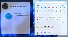
 This Tuesday's update finally addresses the unusual Task Manager duplication bug associated with KB5067036. Previously, this update caused Task Manager to remain open even after being closed, creating a new instance each time a user opened and closed it. Each instance consumed about 20-95 MB of RAM, so if you opened and closed Task Manager 100 times, you could end up with 2 GB of RAM occupied by these persistent instances. Additionally, these background instances could consume CPU resources. Despite being a minimally invasive application, each tskmgr.exe instance used about 0.9% of CPU resources, meaning that 10 instances could reduce your CPU's capacity by almost 10% without you even noticing. Thankfully, this is now resolved.
Sources:
Microsoft, Windows Latest
The Start menu has also seen significant changes, starting with adaptive sizing. The interface now scales appropriately based on monitor dimensions, creating a more balanced visual experience. Microsoft has introduced several customization tools, allowing users to control what appears in their workspace. The application library view has been moved to a more accessible location, and users can now add more app shortcuts to the Start menu. Those who find the recommended content section unnecessary can now disable it completely, which is a welcome improvement. We applied the latest update, but we aren't seeing these changes. We assume gradual rollout is in place. Below is Microsoft's explanation of the new Start menu, as well as battery icon comparison from Windows Latest.


39 Comments on Windows 11 November Update Brings Redesigned Start Menu and Battery Icon
Edit: updated the article to note that it is a gradual rollout.
I haven't bothered to use the actual start menu since I left Windows 7. To be honest, I don't think I know how to use it anymore....just hit the Windows key and type in what I want, I have zero reasons to look at the crap they crammed into the start menu and from what I've seen in images, 11 went out of the way to pretend it's Apple with the start menu and task bar, bleh.
Took them long enough. /this-is-not-sarcasm
Also, this isn't that far from Lenovo's taskbar battery gauge/level, from their Power Manager driver+program (XP/7).
Also, what is with the ridiculous amount of padding used in the start menu?
What do I need linkedin in a startmenu? xbox?
Looks like some kiddies at work. I remember teh days when all those user interface changes with gnome 2. Same boring black and white design.
I want the Windows 98 start menu back with folders and all... Not in design, but in functionality at least.
Restart if necessary.
With a friendly smile,
Fred.
The UI remains poor, agree with Auswolf, loads of excess padding, someone needs to be put in charge of the dev department, bang some heads together, and tell the devs to put back in older UI thats more functional.
The UI I guess in 11 is a in a constant state of flux.